|
 |
clipka <ano### [at] anonymous org> wrote:
> You might have to point our noses straight at the issue you're seeing.
> I'm not noticing any unexpected "non-jet-blackness" nor "fuzziness".
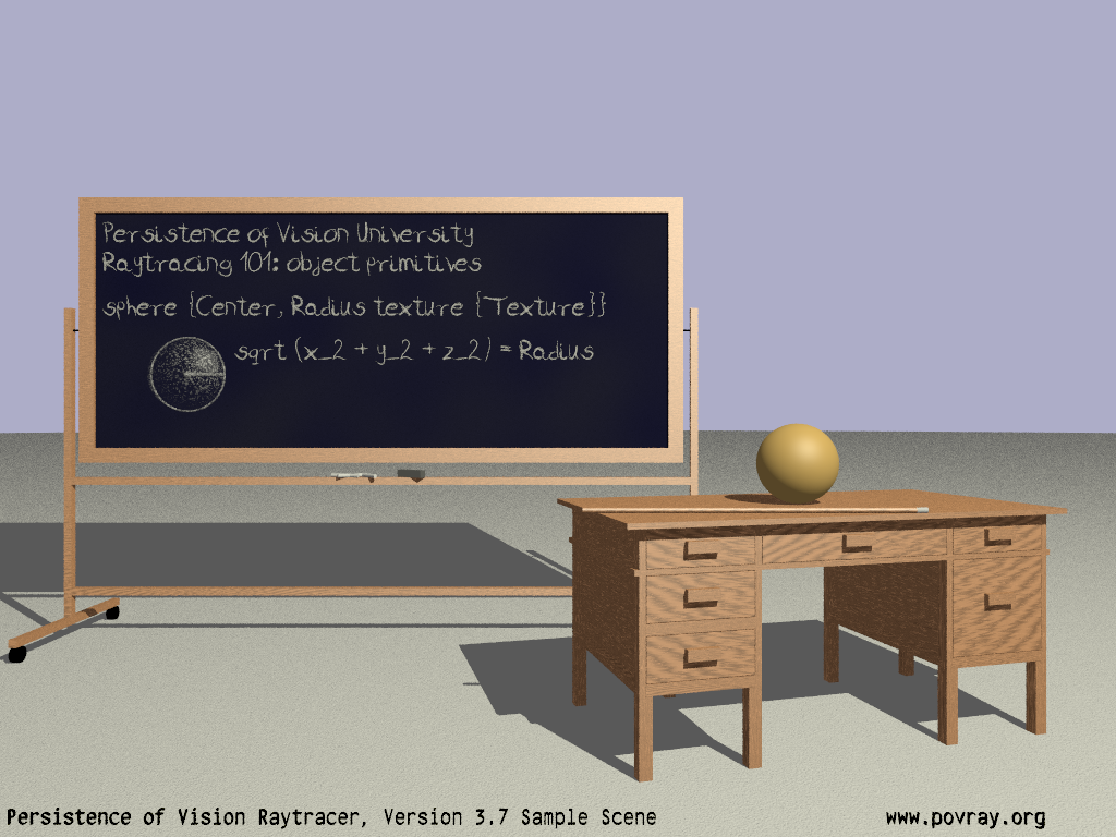
Maybe it's the font - or the antialiasing...
But I have long gotten the sense that when I render text, that it's not as
"crisp" as I would have expected.
jr recommended that I use
+w1024 +h768 +am3 +a0.001 +r2 -j +q9 +ag1
So that's what I'm looking at presently,
The "e"'s in Persistence look, to my eye, "less solidly bounded" or "less fully
and completely filled with black" than I ... would like? Have expected?
The legs of the "n" seem particularly bad. They're ... mottled.
Same with the "r", "m" ...
the "p" in povray, the "g" in org.
I mean, maybe it's not an unexpected thing for most people --- maybe they don't
notice?
I sure don't notice many of the "flaws" and "artefacts" that other people
instantly pick up on.
I will post the current version of the render.
_I_ can detect it at 100%, I don't think I'm completely imagining some sort of
issue at 200%, and at 500%, that first "N" is an atrocity, and "f" is not
looking good either...
> As for the increase in thickness, it causes the text at the left and
> right to appear more "bold" because we're seeing it stretch
> perspectively "into the image", but it inevitably leaves the center
> portion of the text as "unbold" as ever.
Yes, I understand that - aside from scaling perpendicular to the viewing axis,
there's likely not a viable way to bolden text aside from changing over to
another font. But it's a sample scene, so I'm trying to stick with the 3 fonts
that we ship with.
Maybe I'll just scale x*1.something and see if that's good 'nuff. org> wrote:
> You might have to point our noses straight at the issue you're seeing.
> I'm not noticing any unexpected "non-jet-blackness" nor "fuzziness".
Maybe it's the font - or the antialiasing...
But I have long gotten the sense that when I render text, that it's not as
"crisp" as I would have expected.
jr recommended that I use
+w1024 +h768 +am3 +a0.001 +r2 -j +q9 +ag1
So that's what I'm looking at presently,
The "e"'s in Persistence look, to my eye, "less solidly bounded" or "less fully
and completely filled with black" than I ... would like? Have expected?
The legs of the "n" seem particularly bad. They're ... mottled.
Same with the "r", "m" ...
the "p" in povray, the "g" in org.
I mean, maybe it's not an unexpected thing for most people --- maybe they don't
notice?
I sure don't notice many of the "flaws" and "artefacts" that other people
instantly pick up on.
I will post the current version of the render.
_I_ can detect it at 100%, I don't think I'm completely imagining some sort of
issue at 200%, and at 500%, that first "N" is an atrocity, and "f" is not
looking good either...
> As for the increase in thickness, it causes the text at the left and
> right to appear more "bold" because we're seeing it stretch
> perspectively "into the image", but it inevitably leaves the center
> portion of the text as "unbold" as ever.
Yes, I understand that - aside from scaling perpendicular to the viewing axis,
there's likely not a viable way to bolden text aside from changing over to
another font. But it's a sample scene, so I'm trying to stick with the 3 fonts
that we ship with.
Maybe I'll just scale x*1.something and see if that's good 'nuff.
Post a reply to this message
Attachments:
Download 'objectdisplay.png' (625 KB)
Preview of image 'objectdisplay.png'
|
|