 |
 |
|
 |
|
 |
|  |
|  |
|
 |
|
 |
|  |
|  |
|
 |
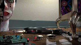
workbench - low camera test render. Sorry about the flies.
Miller
Post a reply to this message
Attachments:
Download 'workbench4.jpg' (330 KB)
Preview of image 'workbench4.jpg'

|
 |
|  |
|  |
|
 |
|
 |
|  |
|  |
|
 |
hi,
"Mike Miller" <mil### [at] gmail com> wrote:
> workbench - low camera test render. Sorry about the flies.
I liked the "splayed" feet on the box, as sketched, better :-). cheers.
regards, jr. com> wrote:
> workbench - low camera test render. Sorry about the flies.
I liked the "splayed" feet on the box, as sketched, better :-). cheers.
regards, jr.
Post a reply to this message
|
 |
|  |
|  |
|
 |
|
 |
|  |
|  |
|
 |
Op 13/04/2023 om 07:52 schreef Mike Miller:
> workbench - low camera test render. Sorry about the flies.
> Miller
Ha ha! I begin to feel like a fly myself!
Something I notice is the high polish/reflectiveness of the workbench. I
would expect it to be more rugged, roughed, tarnished, with burned spots
(soldering gun!) chipped.... certainly not varnished like this. This
looks like my dining-room table (without the flies) ;-)
Otherwise, well done and nice progress.
--
Thomas
Post a reply to this message
|
 |
|  |
|  |
|
 |
|
 |
|  |
|  |
|
 |
Thomas de Groot <tho### [at] degroot org> wrote:
> This looks like my dining-room table
Actually, with the green molding, the hardwood planks, and the single overhead
light, I got the distinct impression that this was on the floor, not on a table.
But the texture of the floor is very impressive - interesting radial scratches
and smear of green paint. That _has_ to be done with an image_map. :O org> wrote:
> This looks like my dining-room table
Actually, with the green molding, the hardwood planks, and the single overhead
light, I got the distinct impression that this was on the floor, not on a table.
But the texture of the floor is very impressive - interesting radial scratches
and smear of green paint. That _has_ to be done with an image_map. :O
Post a reply to this message
|
 |
|  |
|  |
|
 |
|
 |
|  |
|  |
|
 |
Op 13-4-2023 om 12:20 schreef Bald Eagle:
> Thomas de Groot <tho### [at] degroot org> wrote:
>> This looks like my dining-room table
>
> Actually, with the green molding, the hardwood planks, and the single overhead
> light, I got the distinct impression that this was on the floor, not on a table.
>
> But the texture of the floor is very impressive - interesting radial scratches
> and smear of green paint. That _has_ to be done with an image_map. :O
>
>
Well... mike talks about a /workbench/...
--
Thomas org> wrote:
>> This looks like my dining-room table
>
> Actually, with the green molding, the hardwood planks, and the single overhead
> light, I got the distinct impression that this was on the floor, not on a table.
>
> But the texture of the floor is very impressive - interesting radial scratches
> and smear of green paint. That _has_ to be done with an image_map. :O
>
>
Well... mike talks about a /workbench/...
--
Thomas
Post a reply to this message
|
 |
|  |
|  |
|
 |
|
 |
|  |
|  |
|
 |
"jr" <cre### [at] gmail com> wrote:
> hi,
>
> "Mike Miller" <mil### [at] gmail com> wrote:
> hi,
>
> "Mike Miller" <mil### [at] gmail com> wrote:
> > workbench - low camera test render. Sorry about the flies.
>
> I liked the "splayed" feet on the box, as sketched, better :-). cheers.
>
>
> regards, jr.
Thanks. I think I need to beef-up the toes and flare them out some. That was my
first pass.
Mike. com> wrote:
> > workbench - low camera test render. Sorry about the flies.
>
> I liked the "splayed" feet on the box, as sketched, better :-). cheers.
>
>
> regards, jr.
Thanks. I think I need to beef-up the toes and flare them out some. That was my
first pass.
Mike.
Post a reply to this message
|
 |
|  |
|  |
|
 |
|
 |
|  |
|  |
|
 |
Thomas de Groot <tho### [at] degroot org> wrote:
> Op 13/04/2023 om 07:52 schreef Mike Miller:
> > workbench - low camera test render. Sorry about the flies.
> > Miller
>
> Ha ha! I begin to feel like a fly myself!
>
> Something I notice is the high polish/reflectiveness of the workbench. I
> would expect it to be more rugged, roughed, tarnished, with burned spots
> (soldering gun!) chipped.... certainly not varnished like this. This
> looks like my dining-room table (without the flies) ;-)
>
> Otherwise, well done and nice progress.
>
> --
> Thomas
Thanks Thomas.
I agree. It looks more like a polished floor or table, not an old work bench.
I'll drop the reflection down and look at adding more distressed marks as I
progress.
Mike. org> wrote:
> Op 13/04/2023 om 07:52 schreef Mike Miller:
> > workbench - low camera test render. Sorry about the flies.
> > Miller
>
> Ha ha! I begin to feel like a fly myself!
>
> Something I notice is the high polish/reflectiveness of the workbench. I
> would expect it to be more rugged, roughed, tarnished, with burned spots
> (soldering gun!) chipped.... certainly not varnished like this. This
> looks like my dining-room table (without the flies) ;-)
>
> Otherwise, well done and nice progress.
>
> --
> Thomas
Thanks Thomas.
I agree. It looks more like a polished floor or table, not an old work bench.
I'll drop the reflection down and look at adding more distressed marks as I
progress.
Mike.
Post a reply to this message
|
 |
|  |
|  |
|
 |
|
 |
|  |
|  |
|
 |
"Bald Eagle" <cre### [at] netscape net> wrote:
> Thomas de Groot <tho### [at] degroot net> wrote:
> Thomas de Groot <tho### [at] degroot org> wrote:
> > This looks like my dining-room table
>
> Actually, with the green molding, the hardwood planks, and the single overhead
> light, I got the distinct impression that this was on the floor, not on a table.
>
> But the texture of the floor is very impressive - interesting radial scratches
> and smear of green paint. That _has_ to be done with an image_map. :O
Thanks, it is reading more floor than table. I may drop the molding as I work on
the wall detail (outlet plug, tool rack). Yes, it's an image map. :) I have many
materials that include a 'roughness or metallic map' for controlling the
reflections in a PBR environment. I'm struggling to get that look of dull and
reflective on the same surface. A multi layered material is probably the best
solution for that.
Mike org> wrote:
> > This looks like my dining-room table
>
> Actually, with the green molding, the hardwood planks, and the single overhead
> light, I got the distinct impression that this was on the floor, not on a table.
>
> But the texture of the floor is very impressive - interesting radial scratches
> and smear of green paint. That _has_ to be done with an image_map. :O
Thanks, it is reading more floor than table. I may drop the molding as I work on
the wall detail (outlet plug, tool rack). Yes, it's an image map. :) I have many
materials that include a 'roughness or metallic map' for controlling the
reflections in a PBR environment. I'm struggling to get that look of dull and
reflective on the same surface. A multi layered material is probably the best
solution for that.
Mike
Post a reply to this message
|
 |
|  |
|  |
|
 |
|
 |
|  |
|  |
|
 |
"Mike Miller" <mil### [at] gmail com> wrote:
> Thanks Thomas.
> I agree. It looks more like a polished floor or table, not an old work bench.
> I'll drop the reflection down and look at adding more distressed marks as I
> progress.
> Mike.
Table/floor whatever, that is a great wood texture. Looking forwards to all the
Mike Miller 2.0 images coming our way.
Sean com> wrote:
> Thanks Thomas.
> I agree. It looks more like a polished floor or table, not an old work bench.
> I'll drop the reflection down and look at adding more distressed marks as I
> progress.
> Mike.
Table/floor whatever, that is a great wood texture. Looking forwards to all the
Mike Miller 2.0 images coming our way.
Sean
Post a reply to this message
|
 |
|  |
|  |
|
 |
|
 |
|  |
|  |
|
 |
"Mike Miller" <mil### [at] gmail com> wrote:
> Thomas de Groot <tho### [at] degroot com> wrote:
> Thomas de Groot <tho### [at] degroot org> wrote:
> > Op 13/04/2023 om 07:52 schreef Mike Miller:
> > > workbench - low camera test render. Sorry about the flies.
> > > Miller
> >
> > Ha ha! I begin to feel like a fly myself!
> >
> > Something I notice is the high polish/reflectiveness of the workbench. I
> > would expect it to be more rugged, roughed, tarnished, with burned spots
> > (soldering gun!) chipped.... certainly not varnished like this. This
> > looks like my dining-room table (without the flies) ;-)
> >
> > Otherwise, well done and nice progress.
> >
> > --
> > Thomas
>
> Thanks Thomas.
> I agree. It looks more like a polished floor or table, not an old work bench.
> I'll drop the reflection down and look at adding more distressed marks as I
> progress.
> Mike.
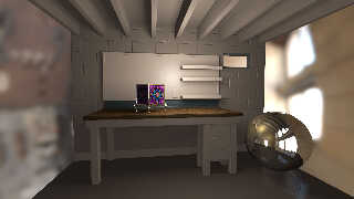
Attached is my current massing for the workbench space. Not much detail yet. I
plan to model a breaker panel, conduit pipes, receptacles, loss wires,.. I hope
once I position the camera showing the bench edge, it will read less like a
floor. I might covert the wall unit to peg board to sell the concept.
Mike. org> wrote:
> > Op 13/04/2023 om 07:52 schreef Mike Miller:
> > > workbench - low camera test render. Sorry about the flies.
> > > Miller
> >
> > Ha ha! I begin to feel like a fly myself!
> >
> > Something I notice is the high polish/reflectiveness of the workbench. I
> > would expect it to be more rugged, roughed, tarnished, with burned spots
> > (soldering gun!) chipped.... certainly not varnished like this. This
> > looks like my dining-room table (without the flies) ;-)
> >
> > Otherwise, well done and nice progress.
> >
> > --
> > Thomas
>
> Thanks Thomas.
> I agree. It looks more like a polished floor or table, not an old work bench.
> I'll drop the reflection down and look at adding more distressed marks as I
> progress.
> Mike.
Attached is my current massing for the workbench space. Not much detail yet. I
plan to model a breaker panel, conduit pipes, receptacles, loss wires,.. I hope
once I position the camera showing the bench edge, it will read less like a
floor. I might covert the wall unit to peg board to sell the concept.
Mike.
Post a reply to this message
Attachments:
Download 'workbench_room.jpg' (157 KB)
Preview of image 'workbench_room.jpg'

|
 |
|  |
|  |
|
 |
|
 |
|  |


![]()