 |
 |
|
 |
|
 |
|  |
|  |
|
 |
|
 |
|  |
|  |
|
 |
After the release of Granite_21 by Thomas de Groot and his collaborators, I
hesitate to share my amateurish attempt at a granite texture. The quality of the
results and the levels of sophistication do not compare (Thomas's granite is far
better than anything I can achieve). However, the approach I took did happen to
lend itself somewhat well to making the veins in the rock so with that in mind
I'll go ahead and show some examples.
The basic technique is to make an array of colors, possibly by sampling a
photograph, then create a multi-layered texture consisting of color_maps that
are partly colored with random array entries, and partly transparent. Increasing
the brightness of just one of the color array entries has the effect of
"lighting up" the layers above it. Selecting different colors to brighten can
create dramatically different and sometimes surprising results.
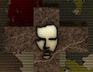
The image attached to this post is the final product for the project I was
working on. The veins are necessarily boring. The next two posts are
developmental experiments and will show the lighting effect more intensely.
I'll post the source code in case anyone is interested but be warned, it's a
little messy.
Have a great day!
Best regards,
Dave Blandston
Post a reply to this message
Attachments:
Download 'granitetest0.jpg' (699 KB)
Preview of image 'granitetest0.jpg'

|
 |
|  |
|  |
|
 |
|
 |
|  |
|  |
|
 |
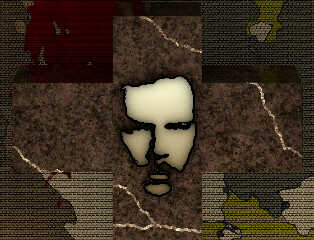
Another example...
Post a reply to this message
Attachments:
Download 'granitetest1.jpg' (657 KB)
Preview of image 'granitetest1.jpg'

|
 |
|  |
|  |
|
 |
|
 |
|  |
|  |
|
 |
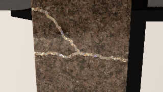
I made a brief attempt to add iridescence. With some fine-tuning it might
work...
Post a reply to this message
Attachments:
Download 'granitetest2.jpg' (85 KB)
Preview of image 'granitetest2.jpg'

|
 |
|  |
|  |
|
 |
|
 |
|  |
|  |
|
 |
Op 25-12-2021 om 09:07 schreef Dave Blandston:
> After the release of Granite_21 by Thomas de Groot and his collaborators, I
> hesitate to share my amateurish attempt at a granite texture. The quality of the
> results and the levels of sophistication do not compare (Thomas's granite is far
> better than anything I can achieve). However, the approach I took did happen to
> lend itself somewhat well to making the veins in the rock so with that in mind
> I'll go ahead and show some examples.
>
No need to be shy :-) Different approaches to identical goals are to be
promoted strongly.
> The basic technique is to make an array of colors, possibly by sampling a
> photograph, then create a multi-layered texture consisting of color_maps that
> are partly colored with random array entries, and partly transparent. Increasing
> the brightness of just one of the color array entries has the effect of
> "lighting up" the layers above it. Selecting different colors to brighten can
> create dramatically different and sometimes surprising results.
>
This, sir, is brilliant! I declare your end result to be better than
mine, especially in close up. The individual grains are much more
natural looking. Very, very well done indeed.
> The image attached to this post is the final product for the project I was
> working on. The veins are necessarily boring. The next two posts are
> developmental experiments and will show the lighting effect more intensely.
>
The veins could use some width variations over their length.
> I'll post the source code in case anyone is interested but be warned, it's a
> little messy.
>
I am certainly interested!
> Have a great day!
>
You provided one! ;-)
--
Thomas
Post a reply to this message
|
 |
|  |
|  |
|
 |
|
 |
|  |
|  |
|
 |
Thomas de Groot <tho### [at] degroot org> wrote:
> The veins could use some width variations over their length.
Oh you caught me being lazy! The variable width feature will be easy to add and
I agree that it's necessary. Thanks for the kind words and suggestion! You're
under-rating Granite_21 though because the color distribution is excellent and
the surface has exactly the right bumpiness, which I know required amazing
knowledge and skill to produce.
By the way, I must confess that by brightening one of the color entries
(actually color pairs), I was expecting to get brightly-colored flakes without
affecting the other layers - the actual result was quite a surprise. Depending
on which color pair one chooses to brighten, the brightness factor may need to
be quite high if that particular color happens to be buried under several other
layers. There's lots of room for improvement!
Sorry for the messy state of the source code. One thing to note is that render
time can be improved by reducing the number of layers. The reason I set it so
high is that when I used a bright green base layer (<.7, 1, 0>) as a test, it
still showed through a little even with 100 layers.
Warmest regards,
Dave Blandston org> wrote:
> The veins could use some width variations over their length.
Oh you caught me being lazy! The variable width feature will be easy to add and
I agree that it's necessary. Thanks for the kind words and suggestion! You're
under-rating Granite_21 though because the color distribution is excellent and
the surface has exactly the right bumpiness, which I know required amazing
knowledge and skill to produce.
By the way, I must confess that by brightening one of the color entries
(actually color pairs), I was expecting to get brightly-colored flakes without
affecting the other layers - the actual result was quite a surprise. Depending
on which color pair one chooses to brighten, the brightness factor may need to
be quite high if that particular color happens to be buried under several other
layers. There's lots of room for improvement!
Sorry for the messy state of the source code. One thing to note is that render
time can be improved by reducing the number of layers. The reason I set it so
high is that when I used a bright green base layer (<.7, 1, 0>) as a test, it
still showed through a little even with 100 layers.
Warmest regards,
Dave Blandston
Post a reply to this message
|
 |
|  |
|  |
|
 |
|
 |
|  |
|  |
|
 |
Op 25/12/2021 om 20:24 schreef Dave Blandston:
> Thomas de Groot <tho### [at] degroot org> wrote:
>> The veins could use some width variations over their length.
>
>
> Oh you caught me being lazy! The variable width feature will be easy to add and
> I agree that it's necessary. Thanks for the kind words and suggestion! You're
> under-rating Granite_21 though because the color distribution is excellent and
> the surface has exactly the right bumpiness, which I know required amazing
> knowledge and skill to produce.
>
Well, well, well, are we going to outcompete each other in praise words
now? ;-) But seriously, comparing the grain build-up/aspect of the two
approaches in close up, I consider yours definitely as better, more
natural, looking. I need to dive into your code to see how you achieved
that, because it was my ultimate if - imo - partly failed goal.
> By the way, I must confess that by brightening one of the color entries
> (actually color pairs), I was expecting to get brightly-colored flakes without
> affecting the other layers - the actual result was quite a surprise. Depending
> on which color pair one chooses to brighten, the brightness factor may need to
> be quite high if that particular color happens to be buried under several other
> layers. There's lots of room for improvement!
>
That is an interesting notion. Investigation is in order.
> Sorry for the messy state of the source code. One thing to note is that render
> time can be improved by reducing the number of layers. The reason I set it so
> high is that when I used a bright green base layer (<.7, 1, 0>) as a test, it
> still showed through a little even with 100 layers.
>
I am not surprised. Layering does not improve render speed.
> Warmest regards,
>
And returned. Have a nice and peaceful Christmas (extended to all you
POV-Ray ladies and gentlemen out there in the big world)
--
Thomas org> wrote:
>> The veins could use some width variations over their length.
>
>
> Oh you caught me being lazy! The variable width feature will be easy to add and
> I agree that it's necessary. Thanks for the kind words and suggestion! You're
> under-rating Granite_21 though because the color distribution is excellent and
> the surface has exactly the right bumpiness, which I know required amazing
> knowledge and skill to produce.
>
Well, well, well, are we going to outcompete each other in praise words
now? ;-) But seriously, comparing the grain build-up/aspect of the two
approaches in close up, I consider yours definitely as better, more
natural, looking. I need to dive into your code to see how you achieved
that, because it was my ultimate if - imo - partly failed goal.
> By the way, I must confess that by brightening one of the color entries
> (actually color pairs), I was expecting to get brightly-colored flakes without
> affecting the other layers - the actual result was quite a surprise. Depending
> on which color pair one chooses to brighten, the brightness factor may need to
> be quite high if that particular color happens to be buried under several other
> layers. There's lots of room for improvement!
>
That is an interesting notion. Investigation is in order.
> Sorry for the messy state of the source code. One thing to note is that render
> time can be improved by reducing the number of layers. The reason I set it so
> high is that when I used a bright green base layer (<.7, 1, 0>) as a test, it
> still showed through a little even with 100 layers.
>
I am not surprised. Layering does not improve render speed.
> Warmest regards,
>
And returned. Have a nice and peaceful Christmas (extended to all you
POV-Ray ladies and gentlemen out there in the big world)
--
Thomas
Post a reply to this message
|
 |
|  |
|  |
|
 |
|
 |
|  |
|  |
|
 |
Thomas de Groot <tho### [at] degroot org> wrote:
> I need to dive into your code to see how you achieved
> that
I cleaned up the code a little and added some comments so it's easier to see
what variables need to be set. The improved code is posted as a reply to the
original post in the "povray.text.scene-files" section.
Kind regards,
Dave Blandston org> wrote:
> I need to dive into your code to see how you achieved
> that
I cleaned up the code a little and added some comments so it's easier to see
what variables need to be set. The improved code is posted as a reply to the
original post in the "povray.text.scene-files" section.
Kind regards,
Dave Blandston
Post a reply to this message
|
 |
|  |
|  |
|
 |
|
 |
|  |
|  |
|
 |
"Dave Blandston" <IsN### [at] protonmail ch> wrote:
> Thomas de Groot <tho### [at] degroot ch> wrote:
> Thomas de Groot <tho### [at] degroot org> wrote:
> > I need to dive into your code to see how you achieved
> > that
>
>
> I cleaned up the code a little and added some comments so it's easier to see
> what variables need to be set. The improved code is posted as a reply to the
> original post in the "povray.text.scene-files" section.
>
> Kind regards,
> Dave Blandston
both approaches look pretty complementary, and I hope they could somewhat merge?
I really like the white veins with iridescence. To make it really fully
functional, it would be great if it could also add some such quartzy "freckles"
smaller and scattered away from the veins(sorry for my unscientific vocabulary)
but maybe just some warp / turbulence would end up providing that ?
This is great ! org> wrote:
> > I need to dive into your code to see how you achieved
> > that
>
>
> I cleaned up the code a little and added some comments so it's easier to see
> what variables need to be set. The improved code is posted as a reply to the
> original post in the "povray.text.scene-files" section.
>
> Kind regards,
> Dave Blandston
both approaches look pretty complementary, and I hope they could somewhat merge?
I really like the white veins with iridescence. To make it really fully
functional, it would be great if it could also add some such quartzy "freckles"
smaller and scattered away from the veins(sorry for my unscientific vocabulary)
but maybe just some warp / turbulence would end up providing that ?
This is great !
Post a reply to this message
|
 |
|  |
|  |
|
 |
|
 |
|  |
|  |
|
 |
"Mr" <nomail@nomail> wrote:
> both approaches look pretty complementary, and I hope they could somewhat merge?
>
> I really like the white veins with iridescence. To make it really fully
> functional, it would be great if it could also add some such quartzy "freckles"
> smaller and scattered away from the veins(sorry for my unscientific vocabulary)
> but maybe just some warp / turbulence would end up providing that ?
Good ideas! Yes, adding flecks is possible. That could be accomplished with a
texture_map or with CSG objects.
I've been working on other stuff and haven't experimented further with
iridescence but I think it might be possible to do much better than the example
image.
Have a wonderful day!
-Dave Blandston
Post a reply to this message
|
 |
|  |
|  |
|
 |
|
 |
|  |
|  |
|
 |
Op 27/12/2021 om 11:48 schreef Dave Blandston:
> "Mr" <nomail@nomail> wrote:
>> both approaches look pretty complementary, and I hope they could somewhat merge?
>>
Indeed. Especially the trick of using colour pairs is a smart one. If
Dave agrees I would like somehow to integrate that in Granite 21, when I
can get to it.
>> I really like the white veins with iridescence. To make it really fully
>> functional, it would be great if it could also add some such quartzy "freckles"
>> smaller and scattered away from the veins(sorry for my unscientific vocabulary)
>> but maybe just some warp / turbulence would end up providing that ?
>
>
> Good ideas! Yes, adding flecks is possible. That could be accomplished with a
> texture_map or with CSG objects.
>
> I've been working on other stuff and haven't experimented further with
> iridescence but I think it might be possible to do much better than the example
> image.
>
Dave, I have started to play with your code. Is there a reason why you
chose to use hex colours? I find them rather counter-intuitive.
--
Thomas
Post a reply to this message
|
 |
|  |
|  |
|
 |
|
 |
|  |


![]()