|
|
|
|
|
|
| |
| |
|
|
|
|
| |
| |
|
|
Thomas de Groot <tho### [at] degroot org> wrote:
> LOL, yes indeed. With different classrooms for different types of
> objects: Basic shapes round, Basic shapes angular, Shapes2, Shapes3,
> Special shapes...
Then there are the classes which no one mentions.
The ones with the racks of yardsticks and switches.
Only known through the hushed whispers and furtive glances in the hallway.
The warnings, writ with trembling hands in secret places.
We knew them only as "Gamma" and "srgb". org> wrote:
> LOL, yes indeed. With different classrooms for different types of
> objects: Basic shapes round, Basic shapes angular, Shapes2, Shapes3,
> Special shapes...
Then there are the classes which no one mentions.
The ones with the racks of yardsticks and switches.
Only known through the hushed whispers and furtive glances in the hallway.
The warnings, writ with trembling hands in secret places.
We knew them only as "Gamma" and "srgb".
Post a reply to this message
|
|
| |
| |
|
|
|
|
| |
| |
|
|
Op 27-6-2021 om 13:13 schreef Bald Eagle:
> Thomas de Groot <tho### [at] degrootorg> wrote:
>
>> LOL, yes indeed. With different classrooms for different types of
>> objects: Basic shapes round, Basic shapes angular, Shapes2, Shapes3,
>> Special shapes...
>
> Then there are the classes which no one mentions.
> The ones with the racks of yardsticks and switches.
> Only known through the hushed whispers and furtive glances in the hallway.
> The warnings, writ with trembling hands in secret places.
>
> We knew them only as "Gamma" and "srgb".
>
Hush! for Clipka's sake! Don't ever mention those....
--
Thomas
Post a reply to this message
|
|
| |
| |
|
|
|
|
| |
| |
|
|
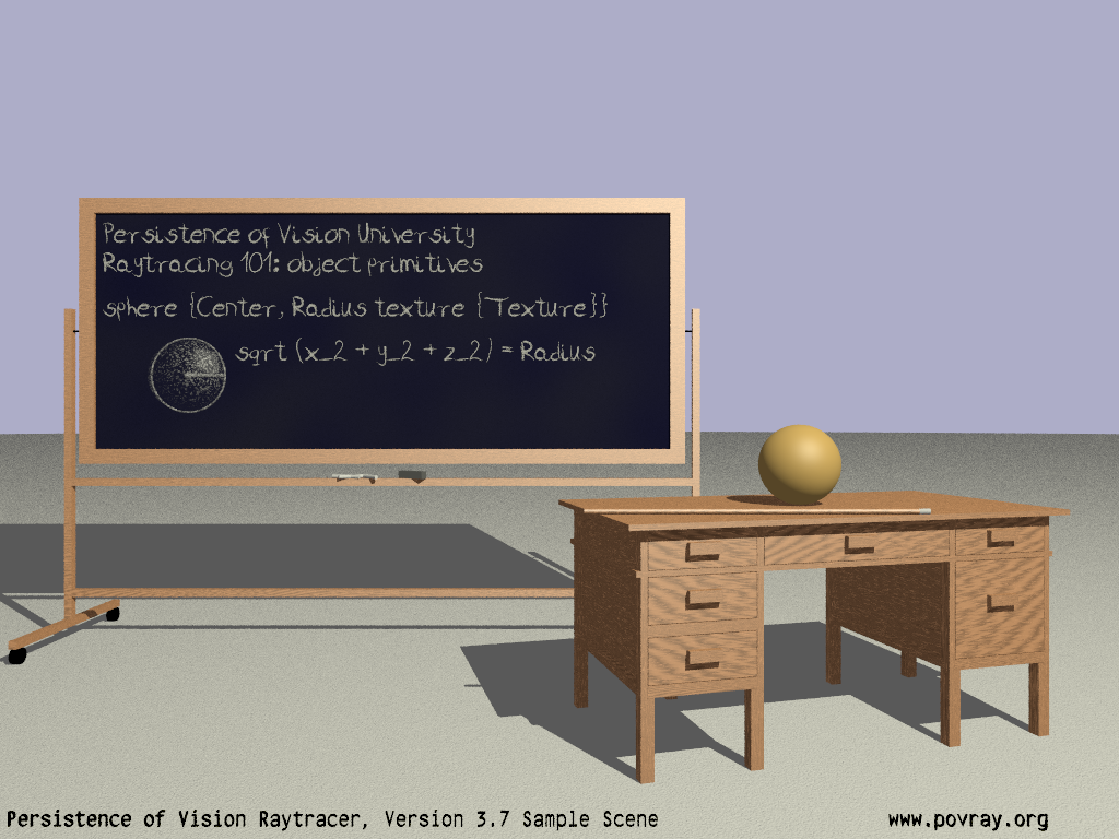
"Bald Eagle" <cre### [at] netscapenet> wrote:
> One of several ideas I've been toying with.
Perhaps someone can tell me what I have been doing wrong with text (the black
text along the bottom) that I get - smears, jaggies, blurriness, phontom
specularity - whatever it is. Most text I try to render is never clear and
razor-sharp.
Is this a me thing or a current POV-Ray implementation thing that converting
text to prisms will/might fix/improve?
(that lettering is "rgb -1" diffuse 0 by the way +w1024 +h768 +A0.01)
Post a reply to this message
|
|
| |
| |
|
|
|
|
| |
| |
|
|
Op 27-6-2021 om 14:25 schreef Bald Eagle:
> "Bald Eagle" <cre### [at] netscapenet> wrote:
>> One of several ideas I've been toying with.
>
> Perhaps someone can tell me what I have been doing wrong with text (the black
> text along the bottom) that I get - smears, jaggies, blurriness, phontom
> specularity - whatever it is. Most text I try to render is never clear and
> razor-sharp.
>
> Is this a me thing or a current POV-Ray implementation thing that converting
> text to prisms will/might fix/improve?
>
> (that lettering is "rgb -1" diffuse 0 by the way +w1024 +h768 +A0.01)
>
I /think/ what troubles you is the 'Thickness' of the characters? Not
sure if I am correct though. What is the distance between the text and
the background? Otherwise itlooks ok to me.
--
Thomas
Post a reply to this message
|
|
| |
| |
|
|
|
|
| |
| |
|
|
Thomas de Groot <tho### [at] degrootorg> wrote:
> I /think/ what troubles you is the 'Thickness' of the characters? Not
> sure if I am correct though. What is the distance between the text and
> the background? Otherwise itlooks ok to me.
I have played with the thickness, and the color and the finish. The text along
the bottom is placed with screen.inc so I'm guessing it's at 1 unit in front of
the perspective camera - and the "background is a plane at y=0, with
#declare Camera_Location = <0.0, 20, -72>*0.75;
#declare Camera_Look_At = <0, 15, 0>;
The thickness used to be 0.02, and then I changed it to 0.1 which made it a
little "bolder", but didn't get rid of the weird non-jet-black parts and the
fuzziness.
I can live with it for most things, but I'm doing the work to make the sample
scene look _better_, so it would nice to have something as simple as text
actually look good to the rest of the world. ;)
Post a reply to this message
|
|
| |
| |
|
|
|
|
| |
| |
|
|
Am 27.06.2021 um 17:26 schrieb Bald Eagle:
> The thickness used to be 0.02, and then I changed it to 0.1 which made it a
> little "bolder", but didn't get rid of the weird non-jet-black parts and the
> fuzziness.
You might have to point our noses straight at the issue you're seeing.
I'm not noticing any unexpected "non-jet-blackness" nor "fuzziness".
As for the increase in thickness, it causes the text at the left and
right to appear more "bold" because we're seeing it stretch
perspectively "into the image", but it inevitably leaves the center
portion of the text as "unbold" as ever.
Post a reply to this message
|
|
| |
| |
|
|
|
|
| |
| |
|
|
clipka <ano### [at] anonymousorg> wrote:
> You might have to point our noses straight at the issue you're seeing.
> I'm not noticing any unexpected "non-jet-blackness" nor "fuzziness".
Maybe it's the font - or the antialiasing...
But I have long gotten the sense that when I render text, that it's not as
"crisp" as I would have expected.
jr recommended that I use
+w1024 +h768 +am3 +a0.001 +r2 -j +q9 +ag1
So that's what I'm looking at presently,
The "e"'s in Persistence look, to my eye, "less solidly bounded" or "less fully
and completely filled with black" than I ... would like? Have expected?
The legs of the "n" seem particularly bad. They're ... mottled.
Same with the "r", "m" ...
the "p" in povray, the "g" in org.
I mean, maybe it's not an unexpected thing for most people --- maybe they don't
notice?
I sure don't notice many of the "flaws" and "artefacts" that other people
instantly pick up on.
I will post the current version of the render.
_I_ can detect it at 100%, I don't think I'm completely imagining some sort of
issue at 200%, and at 500%, that first "N" is an atrocity, and "f" is not
looking good either...
> As for the increase in thickness, it causes the text at the left and
> right to appear more "bold" because we're seeing it stretch
> perspectively "into the image", but it inevitably leaves the center
> portion of the text as "unbold" as ever.
Yes, I understand that - aside from scaling perpendicular to the viewing axis,
there's likely not a viable way to bolden text aside from changing over to
another font. But it's a sample scene, so I'm trying to stick with the 3 fonts
that we ship with.
Maybe I'll just scale x*1.something and see if that's good 'nuff.
Post a reply to this message
Attachments:
Download 'objectdisplay.png' (625 KB)
Preview of image 'objectdisplay.png'
|
|
| |
| |
|
|
|
|
| |
| |
|
|
Am 28.06.2021 um 02:17 schrieb Bald Eagle:
> _I_ can detect it at 100%, I don't think I'm completely imagining some sort of
> issue at 200%, and at 500%, that first "N" is an atrocity, and "f" is not
> looking good either...
My guess is that what you're unhappy with are just the artifacts
generated by `+am3`.
Anti-aliasing mode 3 is noisy by nature, as it uses pseudo-random jitter
across the entire pixel for supersampling.
Some of your other anti-aliasing settings exacerbate the problem:
`+r2` means you get at most 16 rays, which tends to be not a lot for
sharp contrasts. Using a higher value will not give you totally crisp
edges, but less noisy ones.
`+ag1` means you tend to get unnecessarily poor performance for
comparatively bright areas and unnecessarily poor quality in
comparatively dark ones. Note that `+agN` is NOT the space in which
averages are computed - that's always done in linear space - but rather
the space in which the threshold (`+a0.001`) is applied. A setting of 1,
i.e. linear gamma space, means the threshold allows for _physically_
identical maximum errors in regions of any brightness, but
_perceptually_ those maximum errors are more obvious in low-brightness
regions of the image than in high-brightness regions. Leaving it set to
the default of 2.5 causes POV-Ray to accept _perceptually_ similar
maximum errors regardless of absolute brightness. I strongly recommend
leaving it at the default unless you have very compelling reasons not to
(*).
`+acN` is missing from your settings entirely, although it is one of the
key settings for balancing performance vs. quality in mode 3.
`-j` doesn't hurt, but is completely ignored in mode 3. That mode is
jitter pure. (It may be argued that POV-Ray should possibly issue a
warning when faced with such a contradictory setting.)
(`+a0.001` is fine, no issue there. You could probably get away with a
higher value - `+a0.004` should be perfectly fine, maybe even `+a0.01`.)
(*A valid use case for `+ag1` would be if you tried to compute a depth
map rather than actual colors, and wanted the same absolute precision at
all distances within the range.)
>> As for the increase in thickness, it causes the text at the left and
>> right to appear more "bold" because we're seeing it stretch
>> perspectively "into the image", but it inevitably leaves the center
>> portion of the text as "unbold" as ever.
>
> Yes, I understand that - aside from scaling perpendicular to the viewing axis,
> there's likely not a viable way to bolden text aside from changing over to
> another font. But it's a sample scene, so I'm trying to stick with the 3 fonts
> that we ship with.
You could use two copies of the text object, and offset one of them
horizontally by a tiny value. That should bolden the vertical stems.
> Maybe I'll just scale x*1.something and see if that's good 'nuff.
You mean to shoo away the artifacts you're describing? It would be
surprising if it made any difference.
As for using this approach to bolden the text - it would widen the
vertical stems, but it wouldn't increase the overall "weight" of the font.
Post a reply to this message
|
|
| |
| |
|
|
|
|
| |
| |
|
|
Op 28/06/2021 om 03:31 schreef clipka:
> My guess is that what you're unhappy with are just the artifacts
> generated by `+am3`.
>
Interesting stuff. I am currently using +am3 +a0.01 +ac0.90 +r3 for the
granite project. Those are not the most optimal settings as I want more
speed than quality at this stage, but for 'A Quiet Lane' for instance, I
used up to +am3 +a0.01 +ac0.99 +r6. I seem to remember that +r4 was also
right. Render was not very rapid of course... ;-)
--
Thomas
Post a reply to this message
|
|
| |
| |
|
|
|
|
| |
| |
|
|
"Bald Eagle" <cre### [at] netscapenet> wrote:
> The "e"'s in Persistence look, to my eye, "less solidly bounded" or "less fully
> and completely filled with black" than I ... would like? Have expected?
> The legs of the "n" seem particularly bad. They're ... mottled.
> Same with the "r", "m" ...
> the "p" in povray, the "g" in org.
Here is a possible source of the mottling according to my limited knowledge of
how anti-aliasing works: At the edges of the characters what you get is a
percentage of the texture of the object in question and a percentage of the
background. For example, if the edge of an object lies right in the middle of a
pixel then the color of that pixel will be computed as 50% the texture of the
object and 50% the texture of the background. Since you're using a mottled
texture for the floor, that mottling is being factored into the black texture of
the text where anti-aliasing is being applied to the text edges. To see if this
is the problem just use a solid color for the floor and see if that eliminates
the mottling.
As far as making the text bolder, here is an imperfect solution. (I'm guessing
you're willing to make a slight compromise based on your proposed scale
solution.) This macro will create an object consisting of multiple copies of the
original object offset a little, so the new object will be slightly larger than
the original and will have rounded corners. For your purposes I suggest starting
out with a very thin text object (.0001 for example). If you want to, this can
be used to create a different-colored border around the text. Here's the macro:
#macro CreateBorder_Outer (ObjectToBorder_, Radius_, DeltaTheta_)
#declare BorderedObject = object {
union {
#local Theta = 0;
#while (Theta < 360)
object {ObjectToBorder_ translate <cos (radians (Theta)) * Radius_,
sin (radians (Theta)) * Radius_, 0>}
#local Theta = Theta + DeltaTheta_;
#end //#while
} //union
} //object
#end //macro CreateBorder_Outer
Example:
#local Something = object {text {ttf "Times.ttf" "Hi there." .0001, 0}}
CreateBorder_Outer (Something, .02, 10)
#local SomethingNew = object {
union {
object {BorderedObject texture {pigment {color Yellow}}}
object {Something translate -.0001 * z texture {pigment {color Red}}}
} //union
} //object
object {SomethingNew}
Just an idea...
Kind regards,
Dave Blandston
Suggested motto: "With POV-Ray anything is possible, but nothing is easy"
Post a reply to this message
|
|
| |
| |
|
|
|
|
| |
|
|