 |
 |
|
 |
|
 |
|  |
|  |
|
 |
|
 |
|  |
|  |
|
 |
Hi to all.
Back to POVRAY after some years of "lack of time and so on..."
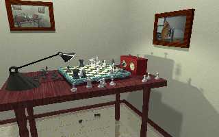
My first new project is a chess game. Here is the result :
I opened a blog with the advance of my next project : http://rayons.eklablog.fr
(blog in french...so I apologize for my poor english).
Post a reply to this message
Attachments:
Download 'scene.png' (1604 KB)
Preview of image 'scene.png'

|
 |
|  |
|  |
|
 |
|
 |
|  |
|  |
|
 |
Welcome back.
Nice to see the POV logo as a chess piece. I like that. A few comments
though.
I believe ambient is not zero in this scene. it looks kind of flat to me
with no serious shadows overall.
The table texture needs more work. I suppose the whole table has just
one texture at the end of the elements union. Legs, table top, etc need
to have their own textures, oriented in a correct way. For instance
tabletop: oriented in the length; legs oriented vertically, etc.
Probably because of the two preceding issues, I have a strange
impression concerning the two leftmost legs. It looks as if they are
side by side instead of behind each other.
Thomas
Post a reply to this message
|
 |
|  |
|  |
|
 |
|
 |
|  |
|  |
|
 |
On 25/08/2012 12:33 PM, Thomas de Groot wrote:
> Nice to see the POV logo as a chess piece. I like that.
So do I. I also like some of the other chess pieces. Is that a white
rook bowing its head?
The recursive image in the top right is a nice touch but I'm not too
sure about the skew-wiff frame.
--
Regards
Stephen
Post a reply to this message
|
 |
|  |
|  |
|
 |
|
 |
|  |
|  |
|
 |
On 25-8-2012 13:53, Stephen wrote:
> The recursive image in the top right is a nice touch but I'm not too
> sure about the skew-wiff frame.
>
Indeed. Again, I believe, a texture issue. Scaling down (and a tiny
bit of translation/rotation) will do the trick.
Thomas
Post a reply to this message
|
 |
|  |
|  |
|
 |
|
 |
|  |
|  |
|
 |
Nice chess set! I was confused by the white rooks, though.
The scene would probably benefit greatly from radiosity lighting
(in 3.7 this should also get rid of the ambient automatically).
Also the lamp could use some surface normals as the highlight looks
a bit artificial, and might need something bright to reflect.
Post a reply to this message
|
 |
|  |
|  |
|
 |
|
 |
|  |
|  |
|
 |
Thanks for your comments.
Indeed, the scene could be rendered with radiosity. It could be a great
improvement. (will try some renders in this way).
The table texture must be greatly improved. I've had lotsof problems with it,
tweaked it a lot and I'm still unsatisfied.
I'll take care of all your advices.
P.S. yes, one of the white rook is bending its head.
Post a reply to this message
|
 |
|  |
|  |
|
 |
|
 |
|  |


![]()