|
|
|
|
|
|
| |
| |
|
|
|
|
| |
| |
|
|
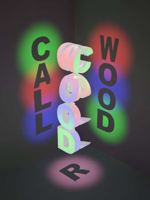
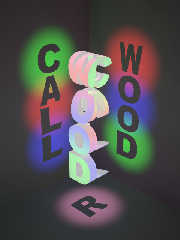
I was surprised at how well this turned out. Only some of the letters were
clipped at the lower right corner--due, no doubt, to W, O, and D not having
lower right corners.
Since (through no fault of my own) I have no middle initial, I used my first
initial and split my surname into 2 parts.
Post a reply to this message
Attachments:
Download 'r_call_wood.jpg' (45 KB)
Preview of image 'r_call_wood.jpg'
|
|
| |
| |
|
|
|
|
| |
| |
|
|
I put the scene file in the binaries at
<web.4920b79c1a0225801695baba0@news.povray.org>
Post a reply to this message
|
|
| |
| |
|
|
|
|
| |
| |
|
|
"Woody" <nomail@nomail> wrote:
> I put the scene file in the binaries at
> <web.4920b79c1a0225801695baba0@news.povray.org>
So the only requirements for the technique to work in every case are that the
font be monospace and that each letter touch all four edges at some point?
Do you mind if I work on the scene and upload it in macro form to the Object
Collection?
-Mike
Post a reply to this message
|
|
| |
| |
|
|
|
|
| |
| |
|
|
Warp <war### [at] tag povrayorg> wrote:
> Woody wrote:
> > Comments? Suggestions? Constructive Criticisms? Apprehensions? Coagualtions?
>
> Why aren't the objects illuminated by the same lights that are
> illuminating the surrounding walls?
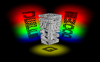
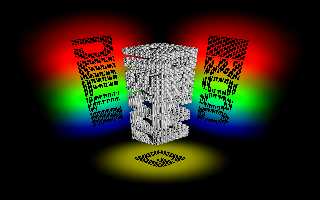
Answer to save face:
That was part of the illusion intended.
Answer demonstraing ignorance:
I couldn't find a way to illuminate all sides of each cube (see attached).
I suppose in retrospect i could of put a light source within the larger blocks.
But I suspect it wouldn't give very distinguishable results.
-Jeff povrayorg> wrote:
> Woody wrote:
> > Comments? Suggestions? Constructive Criticisms? Apprehensions? Coagualtions?
>
> Why aren't the objects illuminated by the same lights that are
> illuminating the surrounding walls?
Answer to save face:
That was part of the illusion intended.
Answer demonstraing ignorance:
I couldn't find a way to illuminate all sides of each cube (see attached).
I suppose in retrospect i could of put a light source within the larger blocks.
But I suspect it wouldn't give very distinguishable results.
-Jeff
Post a reply to this message
Attachments:
Download 'namesake.2008.11.15.e.png' (39 KB)
Preview of image 'namesake.2008.11.15.e.png'
|
|
| |
| |
|
|
|
|
| |
| |
|
|
"Woody" <nomail@nomail> wrote:
> Warp <war### [at] tagpovrayorg> wrote:
> > Woody wrote:
> > > Comments? Suggestions? Constructive Criticisms? Apprehensions? Coagualtions?
> >
> > Why aren't the objects illuminated by the same lights that are
> > illuminating the surrounding walls?
>
> Answer to save face:
>
> That was part of the illusion intended.
>
> Answer demonstraing ignorance:
>
> I couldn't find a way to illuminate all sides of each cube (see attached).
>
> I suppose in retrospect i could of put a light source within the larger blocks.
> But I suspect it wouldn't give very distinguishable results.
>
> -Jeff
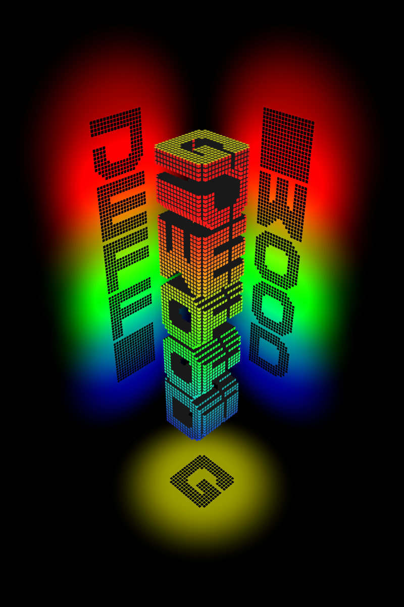
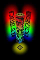
Sorry Warp, wrong image.
Post a reply to this message
Attachments:
Download 'namesake.png' (360 KB)
Preview of image 'namesake.png'
|
|
| |
| |
|
|
|
|
| |
| |
|
|
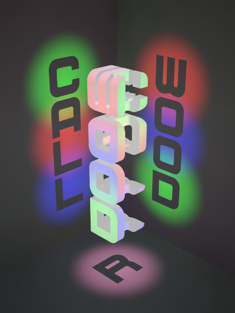
IMO that looks much better than the original.
Post a reply to this message
|
|
| |
| |
|
|
|
|
| |
| |
|
|
"SharkD" <nomail@nomail> wrote:
> "Woody" <nomail@nomail> wrote:
> > I put the scene file in the binaries at
> > <web.4920b79c1a0225801695baba0@news.povray.org>
>
> So the only requirements for the technique to work in every case are that the
> font be monospace and that each letter touch all four edges at some point?
>
> Do you mind if I work on the scene and upload it in macro form to the Object
> Collection?
>
> -Mike
Go right ahead.
I don't know if what you say is the defining rule. I consider it more of an art
than a science.
You might try doing a CSG on each individual blocks rather than a CSG on all
blocks at once. The advantage being that a CSG on all five blocks would put
more constraints on the shapes.
That is I could've probably obtained a shadow of a "G" without using a CSG
intersection on the letter "G" itself, but rather had the shadow be a
combination of 5 different shadows. Will try to upload an example when able.
-Jeff
Post a reply to this message
|
|
| |
| |
|
|
|
|
| |
| |
|
|
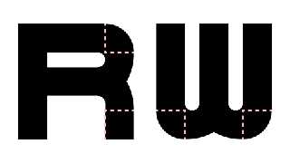
The key was keeping the outer radius of curvature of the corner curves to
no more than the width of a straight line. This meant asymmetrical curves
for the R and W, but I think they're better-looking for it. (Or is that
"less clumsy-looking"?)
--
<Insert witty .sig here>
Post a reply to this message
Attachments:
Download 'r_call_wood-b.jpg' (46 KB)
Download 'r_call_wood-asym.png' (6 KB)
Preview of image 'r_call_wood-b.jpg'
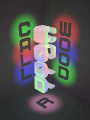
Preview of image 'r_call_wood-asym.png'
|
|
| |
| |
|
|
|
|
| |
| |
|
|
"Cousin Ricky" <ric### [at] yahoocom> wrote:
> The key was keeping the outer radius of curvature of the corner curves to
> no more than the width of a straight line. This meant asymmetrical curves
> for the R and W, but I think they're better-looking for it. (Or is that
> "less clumsy-looking"?)
>
> --
> <Insert witty .sig here>
The font looks nicer, too.
-Mike
Post a reply to this message
|
|
| |
| |
|
|
|
|
| |
| |
|
|
"Cousin Ricky" <ric### [at] yahoocom> wrote:
> The key was keeping the outer radius of curvature of the corner curves to
> no more than the width of a straight line. This meant asymmetrical curves
> for the R and W, but I think they're better-looking for it. (Or is that
> "less clumsy-looking"?)
>
> --
> <Insert witty .sig here>
I would like to continue with this exercise. A couple of questions:
1) In this last image, did you use a font file or design your own letters using
CSG?
2) How would I go about creating a block for the letters S,O and I? Is it
possible?
Mike
Post a reply to this message
|
|
| |
| |
|
|
|
|
| |