|
 |
<!DOCTYPE html PUBLIC "-//W3C//DTD HTML 4.01 Transitional//EN">
<html>
<head>
<meta content="text/html;charset=UTF-8" http-equiv="Content-Type">
<title></title>
</head>
<body bgcolor="#99ff99" text="#000000">
PovManiac nous apporta ses lumieres en ce 2007/09/02 16:52:
<blockquote cite="mid:web.46db228ed7ca429976095700@news.povray.org"
type="cite">
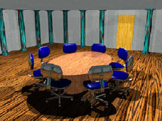
<pre wrap=""> Can anyone advise as to better lighting scheme ???
</pre>
<br>
<hr size="4" width="90%"><img
src="cid:par### [at] netscape net" alt="">
<center><br>
</center>
</blockquote>
<font face="Comic Sans MS">The light is OK. It could be beter, but what
beter means can depend greatly on what you want as mood and in what
epoch that scene is situated.<br>
It can be using several torch-like lights placed around the room, or
some chandeliers. (medieval)<br>
It could be one or several "light pannels": area_light lining the
ceiling. (modern)<br>
It could be harch light comming in trough a window on the right or back
wall.<br>
It could be the whole ceiling sheding light trough radiosity.<br>
<br>
The floor boards have huge grain, way to large compared to that of the
table. It gives a somewhat medieval feel, reinforced by the stone
columns, broken by the modern looking chairs. Try scaling that down,
you can probably scale to the fifth, or smaller, of it's actual
dimention.<br>
<br>
Why post as BMP? 386K for a post stamp sized image is HUGE! beter to
convert to JPG before posting. Your image converted to JPG without
color subsampling at 80% quality, if's now about 10% of it's original
volume.</font><br>
<pre class="moz-signature" cols="80">--
Alain
-------------------------------------------------
You know you've been raytracing too long when you can recite your high school Trig
book from memory. </pre>
</body>
</html> net" alt="">
<center><br>
</center>
</blockquote>
<font face="Comic Sans MS">The light is OK. It could be beter, but what
beter means can depend greatly on what you want as mood and in what
epoch that scene is situated.<br>
It can be using several torch-like lights placed around the room, or
some chandeliers. (medieval)<br>
It could be one or several "light pannels": area_light lining the
ceiling. (modern)<br>
It could be harch light comming in trough a window on the right or back
wall.<br>
It could be the whole ceiling sheding light trough radiosity.<br>
<br>
The floor boards have huge grain, way to large compared to that of the
table. It gives a somewhat medieval feel, reinforced by the stone
columns, broken by the modern looking chairs. Try scaling that down,
you can probably scale to the fifth, or smaller, of it's actual
dimention.<br>
<br>
Why post as BMP? 386K for a post stamp sized image is HUGE! beter to
convert to JPG before posting. Your image converted to JPG without
color subsampling at 80% quality, if's now about 10% of it's original
volume.</font><br>
<pre class="moz-signature" cols="80">--
Alain
-------------------------------------------------
You know you've been raytracing too long when you can recite your high school Trig
book from memory. </pre>
</body>
</html>
Post a reply to this message
Attachments:
Download 'tile_test.jpg' (33 KB)
Preview of image 'tile_test.jpg'

|
 |


![]()