 |
 |
|
 |
|
 |
|  |
|  |
|
 |
|
 |
|  |
|  |
|
 |
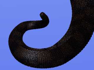
Show & tail? Showing some tail? For what it's worth, here's something:
Charles
Post a reply to this message
Attachments:
Download 'tail.jpg' (224 KB)
Preview of image 'tail.jpg'

|
 |
|  |
|  |
|
 |
|
 |
|  |
|  |
|
 |
Charles C wrote:
> Show & tail? Showing some tail? For what it's worth, here's
> something: Charles
Ooh, *very* nice scales! But it's a bit dark, so it's difficult to see the
exact shape.
Rune
--
http://runevision.com
Post a reply to this message
|
 |
|  |
|  |
|
 |
|
 |
|  |
|  |
|
 |
"Rune" <new### [at] runevision com> wrote:
> Ooh, *very* nice scales!
Thanks!
>But it's a bit dark, so it's difficult to see the
> exact shape.
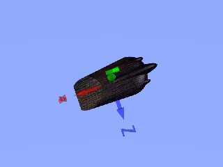
Up close you can see the shape is pretty simple. This is my temporary test
scale. I intend to replace it with a code-generated mesh with a little more
interesting and parameterizable shape, but other parts of the project have
higher priority.
Charles com> wrote:
> Ooh, *very* nice scales!
Thanks!
>But it's a bit dark, so it's difficult to see the
> exact shape.
Up close you can see the shape is pretty simple. This is my temporary test
scale. I intend to replace it with a code-generated mesh with a little more
interesting and parameterizable shape, but other parts of the project have
higher priority.
Charles
Post a reply to this message
Attachments:
Download 'test scale.png' (79 KB)
Preview of image 'test scale.png'

|
 |
|  |
|  |
|
 |
|
 |
|  |
|  |
|
 |
Charles C wrote:
> "Rune" <new### [at] runevision com> wrote:
>> But it's a bit dark, so it's difficult to see the
>> exact shape.
>
> Up close you can see the shape is pretty simple. This is my
> temporary test scale. I intend to replace it with a code-generated
> mesh with a little more interesting and parameterizable shape, but
> other parts of the project have higher priority.
Actually I was thinking more of the overall shape of the tail. For example,
I find it difficult to see if the end of the tail points away from or
towards the camera, since the lighting cues are very sparse.
Rune
--
http://runevision.com com> wrote:
>> But it's a bit dark, so it's difficult to see the
>> exact shape.
>
> Up close you can see the shape is pretty simple. This is my
> temporary test scale. I intend to replace it with a code-generated
> mesh with a little more interesting and parameterizable shape, but
> other parts of the project have higher priority.
Actually I was thinking more of the overall shape of the tail. For example,
I find it difficult to see if the end of the tail points away from or
towards the camera, since the lighting cues are very sparse.
Rune
--
http://runevision.com
Post a reply to this message
|
 |
|  |
|  |
|
 |
|
 |
|  |
|  |
|
 |
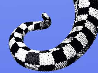
I'm not sure if this variation is much better.
I think the white here looks a little flat. Is there a trick to getting
highlights to show up on white? Yellow looked flat too.
A checker pattern between <1,.5,1> and <0,0,0> was the pattern used to help
control the overall-chroma that I'd been feeding into the macro which
selects which texture each scale uses, (the macro only cares about the
..y/green value for this pattern). But when I switched to using that pigment
directly the color reminded me of the plastic spoons at a certain chain of
ice-cream shops. OTOH highlights did show up pretty well on that color.
Charles
Post a reply to this message
Attachments:
Download 'tail b and w.jpg' (310 KB)
Preview of image 'tail b and w.jpg'

|
 |
|  |
|  |
|
 |
|
 |
|  |
|  |
|
 |
web.4685499988e7aaf7e94cc5130@news.povray.org...
> I'm not sure if this variation is much better.
>
Where isssss the reflecting sssssphere? ;-)
Marc
Post a reply to this message
|
 |
|  |
|  |
|
 |
|
 |
|  |
|  |
|
 |
Charles C nous apporta ses lumieres en ce 2007/06/29 14:04:
> I'm not sure if this variation is much better.
>
> I think the white here looks a little flat. Is there a trick to getting
> highlights to show up on white? Yellow looked flat too.
>
> A checker pattern between <1,.5,1> and <0,0,0> was the pattern used to help
> control the overall-chroma that I'd been feeding into the macro which
> selects which texture each scale uses, (the macro only cares about the
> ..y/green value for this pattern). But when I switched to using that pigment
> directly the color reminded me of the plastic spoons at a certain chain of
> ice-cream shops. OTOH highlights did show up pretty well on that color.
>
> Charles
>
>
>
> ------------------------------------------------------------------------
>
Don't use white but a light gray, like Gray80 or Gray90.
Reduce the diffuse a bit and increase specular or phong.
Increase brilliance.
--
Alain
-------------------------------------------------
'No, `Eureka' is Greek for `This bath is too hot.'' -- Dr. Who
Post a reply to this message
|
 |
|  |
|  |
|
 |
|
 |
|  |


![]()