 |
 |
|
 |
|
 |
|  |
|  |
|
 |
|
 |
|  |
|  |
|
 |
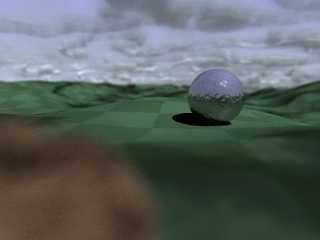
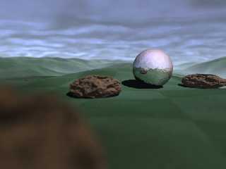
5h 45m later, and voila, I have this new looking scene. Added a rock and
focal blur. Some turbulence to the ground texture. Redid the clouds to
make them less dense. Sphere is now chromelike, but textured as well. I
didn't get the effect I wanted, but it'll work for now.
I was amazed by how much the focal blur does for a scene... it made it look
so much more realistic.
As always, comments and suggestions are welcomed. I would like to thank all
those who commented last time.
Post a reply to this message
Attachments:
Download 'main.jpg' (44 KB)
Preview of image 'main.jpg'

|
 |
|  |
|  |
|
 |
|
 |
|  |
|  |
|
 |
You're going to hate me for this. :-)
I actually liked the first version of your image best. It has a
wonderful surreal feel about it. It had a lot of obvious things "wrong"
with if from a photorealism perspective (textures, shadows), but a lot
of the more subtle things--like the light, and the clouds--were and are
perfect.
BTW, how did you get the shadows on the hills in the first version? It
looks like either an AOI pattern, or else you maybe have the clouds
casting shadows. Either way, its beautiful.
Back to the most recent version :-) the rock looks weird blurred in the
foreground. It's blurred enough that it's hard to tell what it is,
especially since there's nothing else like in in the image. Adding some
more rocks like it elsewhere in the image might help.
I would really like to see some higher resolution renders of the image.
It looks great, and I'd like to see more of it. :-)
--
William Tracy
+-+-+-+-+-+-+-+-+-+-+-+-+-+-+-+-+-+-+-+-+-+
|a|f|i|s|h|i|o|n|a|d|o|@|g|m|a|i|l|.|c|o|m|
+-+-+-+-+-+-+-+-+-+-+-+-+-+-+-+-+-+-+-+-+-+
+-+-+-+-+-+-+-+-+-+-+-+-+-+-+-+-+-+-+
|w|t|r|a|c|y|@|c|a|l|p|o|l|y|.|e|d|u|
+-+-+-+-+-+-+-+-+-+-+-+-+-+-+-+-+-+-+
You know you've been raytracing too long when it takes longer to parse
your input files than it does to render them.
Aaron Gage a.k.a Slartibartfast
Post a reply to this message
|
 |
|  |
|  |
|
 |
|
 |
|  |
|  |
|
 |
> I actually liked the first version of your image best. It has a
> wonderful surreal feel about it. It had a lot of obvious things "wrong"
> with if from a photorealism perspective (textures, shadows), but a lot
> of the more subtle things--like the light, and the clouds--were and are
> perfect.
Thanks, I'll get to work trying to return that surreal aspect to it. I'm a
sucker for photorealism, I normally sway from abstract art. But now that
you mention it, it was very beautiful. I'll try to return it's splendor.
Maybe next time I'll save backups as I pass each stage.
> BTW, how did you get the shadows on the hills in the first version? It
> looks like either an AOI pattern, or else you maybe have the clouds
> casting shadows. Either way, its beautiful.
The shadows are all cast by the clouds actually. I probably need to find
another way to do the clouds... 5.75 hours on one tiny render. It's not
even that good... oh well. We'll see what happens when I add some fog or
mist.
> Back to the most recent version :-) the rock looks weird blurred in the
> foreground. It's blurred enough that it's hard to tell what it is,
> especially since there's nothing else like in in the image. Adding some
> more rocks like it elsewhere in the image might help.
Ah, I see what you mean. I wouldn't have noticed that... probably because I
made the rock. I've added some more... at various focal points, so some
will be blurry and some crisp.
> I would really like to see some higher resolution renders of the image.
> It looks great, and I'd like to see more of it. :-)
This will be a while. As soon as I get my desktop back, I'll start
rendering larger images instead. But until then... it's four hour waits at
this size to see what I need to change.
Thanks! I'll try to keep an artistic mind from now on... I think I like the
surreal images as well as photorealistic... now to decide what images suit
what.
Post a reply to this message
|
 |
|  |
|  |
|
 |
|
 |
|  |
|  |
|
 |
Okay, here's the first large render. 29h 44m 55s
Enjoy!
Post a reply to this message
Attachments:
Download 'main.jpg' (212 KB)
Preview of image 'main.jpg'

|
 |
|  |
|  |
|
 |
|
 |
|  |
|  |
|
 |
"Allen" <nomail@nomail> schreef in bericht
news:web.462e90e4908bbc8eaa6f57330@news.povray.org...
> Okay, here's the first large render. 29h 44m 55s
>
Better, indeed!
IMHO, I would throw out the rock in the foreground. Too smudgy! The
background looks good.
Thomas
Post a reply to this message
|
 |
|  |
|  |
|
 |
|
 |
|  |
|  |
|
 |
On Tue, 24 Apr 2007 19:21:08 EDT, "Allen" <nomail@nomail> wrote:
>Okay, here's the first large render. 29h 44m 55s
>
>Enjoy!
I have to agree with Will about the focal blur. It is a personal
thing I know but I just do not like it. Especially the foreground
rock.
Focal blur is not what the eye effectively sees when looking at the
original object but only what the camera records and reproduces in a
photo. The eye rapidly switches focus as you look at a scene in real
life and with the brain effectively ignoring the rest of the scene
everything looks sharp.
Just my two cents worth.
John
Post a reply to this message
|
 |
|  |
|  |
|
 |
|
 |
|  |
|  |
|
 |
"John" <joh### [at] world com> schreef in bericht
news:qqi033p2h009umcam309ammrstpmp8haph@4ax.com...
>
> I have to agree with Will about the focal blur. It is a personal
> thing I know but I just do not like it. Especially the foreground
> rock.
>
> Focal blur is not what the eye effectively sees when looking at the
> original object but only what the camera records and reproduces in a
> photo. The eye rapidly switches focus as you look at a scene in real
> life and with the brain effectively ignoring the rest of the scene
> everything looks sharp.
>
> Just my two cents worth.
>
I agree with John. My personal ideal of focal blur is that you hardly see
it, because otherwise it imposes itself upon your awareness and destroys the
image.
Thomas com> schreef in bericht
news:qqi033p2h009umcam309ammrstpmp8haph@4ax.com...
>
> I have to agree with Will about the focal blur. It is a personal
> thing I know but I just do not like it. Especially the foreground
> rock.
>
> Focal blur is not what the eye effectively sees when looking at the
> original object but only what the camera records and reproduces in a
> photo. The eye rapidly switches focus as you look at a scene in real
> life and with the brain effectively ignoring the rest of the scene
> everything looks sharp.
>
> Just my two cents worth.
>
I agree with John. My personal ideal of focal blur is that you hardly see
it, because otherwise it imposes itself upon your awareness and destroys the
image.
Thomas
Post a reply to this message
|
 |
|  |
|  |
|
 |
|
 |
|  |


![]()