 |
 |
|
 |
|
 |
|  |
|  |
|
 |
|
 |
|  |
|  |
|
 |
Hi,
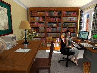
Thought I'd post my latest WIP - an interior lighting study.
Overall, I'm pleased with the results, but I'm still having a few radiosity
issues on which I could use some advice.
1) The computer box seems too bright (there's no direct lighting on it, but
it appears to glow) - setting to ambient 0 helped a bit.
2) Some splotchy shadows at the top of the bookshelves
Any and all constructive criticisms are welcome.
Thanks!
Rob.
http://fitzel.ca/dart/
p.s. here are the radiosity settings I used
pretrace_start 0.08
pretrace_end 0.004
count 400
nearest_count 8
error_bound 0.7
recursion_limit 4 // need 4 if glass on window
low_error_factor 0.8
gray_threshold 0.6
minimum_reuse 0.015
brightness 2.5
adc_bailout 0.01/2
normal off
Post a reply to this message
Attachments:
Download 'reading_table13.jpg' (180 KB)
Preview of image 'reading_table13.jpg'

|
 |
|  |
|  |
|
 |
|
 |
|  |
|  |
|
 |
> Overall, I'm pleased with the results, but I'm still having a few
> radiosity
> issues on which I could use some advice.
>
> 1) The computer box seems too bright (there's no direct lighting on it,
> but
> it appears to glow) - setting to ambient 0 helped a bit.
Shouldn't ambient be 0 for everything when using radiosity?
> 2) Some splotchy shadows at the top of the bookshelves
Yeh, and I also noticed a bright strip down the left of the bookshelf that
probably shouldn't be there.
> Any and all constructive criticisms are welcome.
Try reducing brightness to 1 and increasing the brightness of your sun.
Also, couldn't you do render without the glass in the window, save the
radiosity data, then render again with the glass loading the radiosity data?
Might be quicker and allow you to use higher settings for the same overall
render time.
Post a reply to this message
|
 |
|  |
|  |
|
 |
|
 |
|  |
|  |
|
 |
Nice work, Rob!
What mainly attracts my attention are the books. They are all so well-packed
on their shelves. I would like to see them leaning against each other, and
some shelves with empty spaces. That would make the scene less static, in a
sense.
What disturbs me also is that the books seem all collections, or
encyclopedies. Nothing wrong with that, but again, it makes the scene less
lively. I would prefer to see a variety of sizes and colors, randomly mixed,
alternating with stacks of books or papers. Paper is also what I would like
to see more, elsewhere in the room, lying about, stacked roughly on the
table and desk, filling the waste basket. Now, I know there are two kind of
people: those who like to work in a clean, well-ordered environment, and
those (like me!) who are unable to work there and, instead, work in a
chaotic world of books and papers. So... maybe you are of the first kind,
and then just forget about my comments.
One last comment though :-)
Studying on a wooden chair can become painful after a while. Some nice
cushion would be nice for the buttocks!
Still, a very nice work!
Thomas
Post a reply to this message
|
 |
|  |
|  |
|
 |
|
 |
|  |
|  |
|
 |
"RobF" <nomail@nomail> wrote:
> Hi,
>
> Thought I'd post my latest WIP - an interior lighting study.
>
> Overall, I'm pleased with the results,
The Poser model is very good, quite a natural pose but the room could do
with a bit more clutter IMHO. If I had done this I would be pleased with
it, too.
Stephen
Post a reply to this message
|
 |
|  |
|  |
|
 |
|
 |
|  |
|  |
|
 |
nice work indeed,
like the others wrote allready, the setup seems to clean for a studying
room "in-use".
The womans skirt seems to intersect with the chair. Also it feels like
the model is a littel bit to small in scale.
There is a lighting problem at the wall behind the book cabinet on the
left. There should be shadow, but it's as bright as the walls directly
exposed to the main light source (window).
.... dave
RobF schrieb:
> Hi,
>
> Thought I'd post my latest WIP - an interior lighting study.
>
> Overall, I'm pleased with the results, but I'm still having a few radiosity
> issues on which I could use some advice.
>
> 1) The computer box seems too bright (there's no direct lighting on it, but
> it appears to glow) - setting to ambient 0 helped a bit.
> 2) Some splotchy shadows at the top of the bookshelves
>
> Any and all constructive criticisms are welcome.
>
> Thanks!
>
> Rob.
> http://fitzel.ca/dart/
>
> p.s. here are the radiosity settings I used
> pretrace_start 0.08
> pretrace_end 0.004
> count 400
> nearest_count 8
> error_bound 0.7
> recursion_limit 4 // need 4 if glass on window
> low_error_factor 0.8
> gray_threshold 0.6
> minimum_reuse 0.015
> brightness 2.5
> adc_bailout 0.01/2
> normal off
>
>
>
>
> ------------------------------------------------------------------------
>
Post a reply to this message
|
 |
|  |
|  |
|
 |
|
 |
|  |
|  |
|
 |
RobF nous apporta ses lumieres en ce 18-02-2007 21:03:
> Hi,
>
> Thought I'd post my latest WIP - an interior lighting study.
>
> Overall, I'm pleased with the results, but I'm still having a few radiosity
> issues on which I could use some advice.
>
> 1) The computer box seems too bright (there's no direct lighting on it, but
> it appears to glow) - setting to ambient 0 helped a bit.
> 2) Some splotchy shadows at the top of the bookshelves
also, an overly bright area to it's right. The wall behind the book shelves to
the left is also to bright.
>
> Any and all constructive criticisms are welcome.
>
> Thanks!
>
> Rob.
> http://fitzel.ca/dart/
>
> p.s. here are the radiosity settings I used
> pretrace_start 0.08
> pretrace_end 0.004
reducing pretrece_end to 0.001 often allows you to use more relaxed setinge
elsewhere.
> count 400
you may need to increase the count, maybe around 800 to 1000.
> nearest_count 8
going up to 15~20 forces you to average more values to get the final result. It
may reduce speckling and splotchiness.
> error_bound 0.7
this may be to low, try a value of 1 to 1.5, or even leave it at default value
(1.8). It may reduce the splotchiness.
If error_bound is set to low, it can cause illumination of area that should be
in the shadows, it also increase the render time.
> recursion_limit 4 // need 4 if glass on window
> low_error_factor 0.8
you may try reducing this to less than 0.5 (default)
> gray_threshold 0.6
> minimum_reuse 0.015
using a slightly lower value could help removing some lightign the should not be
there. Be prudent, it can realy have a BIG effect on the rendering time.
> brightness 2.5
> adc_bailout 0.01/2
> normal off
>
>
>
>
> ------------------------------------------------------------------------
>
In a radiosity scene, it's good to add #default{finish{ambient 0}} and make sure
that NO texture have ambient >0, unless the object is *suposed* to glow.
Try placing a black box just barely under the floor, or raising the computer a
tiny bit, you may have "cracks" where your computer touch the floor that let
rays reatch some bright area.
Personaly, I'd start by removing the glass pane during testing, then add it back
in a two pass rendering.
Then, I would remark out the error_bound and low_error_factor as a first test step.
Next, try a higher count with a smaler pretrace_end like 0.002 or 0.001.
May try a low_error_factor of less than 0.5.
--
Alain
-------------------------------------------------
Caught Asleep At Your Work Desk
Just in case your boss catches you asleep at your desk, be ready to blurt out
this excuse #1: I was working smarter - not harder.
Post a reply to this message
|
 |
|  |
|  |
|
 |
|
 |
|  |
|  |
|
 |
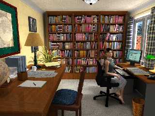
Finally got around to revisiting this scene. I've added clutter and tried to
fix up the lighting and radiosity. Comments welcome.
Rob.
---
www.fitzel.ca/dart/
Post a reply to this message
Attachments:
Download 'reading_table23-5.jpg' (214 KB)
Preview of image 'reading_table23-5.jpg'

|
 |
|  |
|  |
|
 |
|
 |
|  |
|  |
|
 |
RobF wrote:
> Finally got around to revisiting this scene. I've added clutter and tried to
> fix up the lighting and radiosity. Comments welcome.
Great! ...but the girl still looks like a bit small to me. Perhaps is the
perspective, or perhaps other objects are too big. For the rest, the
lighting is very good, and the colors look very realistic (except for the
totally black chair).
--
Jaime
Post a reply to this message
|
 |
|  |
|  |
|
 |
|
 |
|  |
|  |
|
 |
Oh yes! I am much more happy with this version indeed.
I agree with Jaime about proportions/scale. In fact, it looks like the table
(and chair) to the left is/are much higher/bigger than the desk where the
girl is sitting. If I assume that they are parallel to each other, they
should have the same vanishing point on the same horizon. I checked this
roughly, and lo! They seem to have different vanishing points, the table
appearing to have a higher horizon than the desk!
Can you confirm this, or am I totally mistaken? :-)
Thomas
Post a reply to this message
|
 |
|  |
|  |
|
 |
|
 |
|  |
|  |
|
 |
On Thu, 3 May 2007 08:29:18 EDT, "RobF" <nomail@nomail> wrote:
>Finally got around to revisiting this scene. I've added clutter and tried to
>fix up the lighting and radiosity. Comments welcome.
>
I prefer this version, a no-brainer actually. The work that you have done on the
book case paid off as does repositioning things on the tables. I like the clock
and the lighting is much improved. I did a blink comparison with both images
which was interesting you even changed the model's posture slightly. Nice one!
Regards
Stephen
Post a reply to this message
|
 |
|  |
|  |
|
 |
|
 |
|  |


![]()