 |
 |
|
 |
|
 |
|  |
|  |
|
 |
|
 |
|  |
|  |
|
 |
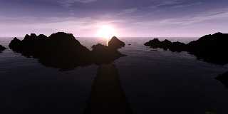
Well, ive spent the better part of the day figuring out how to do procedural
texturing and how to use functions. I added my favorite media sun also.
Please give me comments as this is the only way I can improve this image.
I also changed the ratio to 16:9, widescreen, to give the image a more
photographic feel. Soon I will take the time to make some media clouds,
but that will be a while, as I still need to get the underlying structure
set.
Regards,
Allen
Post a reply to this message
Attachments:
Download 'adwaves2.jpg' (148 KB)
Preview of image 'adwaves2.jpg'

|
 |
|  |
|  |
|
 |
|
 |
|  |
|  |
|
 |
On Mon, 8 May 2006 01:07:14 EDT, "Allen" <nomail@nomail> wrote:
>Well, ive spent the better part of the day figuring out how to do procedural
>texturing and how to use functions. I added my favorite media sun also.
>Please give me comments as this is the only way I can improve this image.
>I also changed the ratio to 16:9, widescreen, to give the image a more
>photographic feel. Soon I will take the time to make some media clouds,
>but that will be a while, as I still need to get the underlying structure
>set.
>
>Regards,
>Allen
I think the sun is much too white and much too bright. All the phots
I have taken at this time of day have a much redder sun and you can
always see the suns disk.
John
Post a reply to this message
|
 |
|  |
|  |
|
 |
|
 |
|  |
|  |
|
 |
John is right, and his comment gave me an idea for you, Allen:
if you want to use this scene as animation, you could add a small simple
function to the sun, which will make it the more orange-red (and darker) the
more it is moving (rotated) down to the horizon. The animation's clock value
increases or decreases the values of the red, green and blue parts of the
sun's colors.
The islands are looking to lose. Make a lagoon, or have the individual
islands not so tall, they just look more than rocks than a softly shaped
island.
But never mind my critics - I like your scene!
Greetings,
Sven
"Allen" <nomail@nomail> schrieb im Newsbeitrag
news:web.445ed2021fdd406848972c730@news.povray.org...
> Well, ive spent the better part of the day figuring out how to do
> procedural
> texturing and how to use functions. I added my favorite media sun also.
> Please give me comments as this is the only way I can improve this image.
> I also changed the ratio to 16:9, widescreen, to give the image a more
> photographic feel. Soon I will take the time to make some media clouds,
> but that will be a while, as I still need to get the underlying structure
> set.
>
> Regards,
> Allen
>
Post a reply to this message
|
 |
|  |
|  |
|
 |
|
 |
|  |
|  |
|
 |
I think the image is great despite other comments.
The sun not being red enough could simply be camera exposure
differences. I don't see any problem with the way it is now, but an
orange disc (with halo) would also do the trick.
As for the islands... did Allen mentioned somewhere that they were large
islands? I immediately recognized them as rocks, given the sense of
scale the waves portrayed. I think they look great and the stage is now
set for something interesting to happen.
One thing that did catch my eye was the media sun's reflection on the
water. Are you using a long cylinder orientated to point at the camera?
At far distances, the cylinder (if thats whats going on here) casts a
nice reflection in the water, but close up the sun actually appears to
cast a shadow on the water. Using media in unrealistic ways can have
unwanted side effects. To remedy this, you might want to throw no
reflection and no shadow tags on the cylinder and produce the glare on
the water another way. In this scene you could get away with cutting
the cylinder short so the end of the reflection is hidden by the rocks.
However, if the full path of the reflection is going to be visible you
will notice a sharp line where it cuts off. The cylinder also converges
to a point on the horizon making it seem like the sun is a point. You
might want to use a spherical pigment on the sky sphere to produce the
sun's reflection.
Skip
Post a reply to this message
|
 |
|  |
|  |
|
 |
|
 |
|  |
|
 |


![]()