 |
 |
|
 |
|
 |
|  |
|  |
|
 |
|
 |
|  |
|  |
|
 |
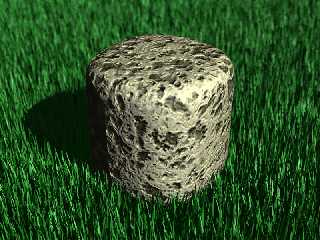
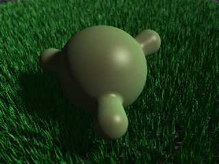
Trying out some grass. The second image is a bit sparse.
(How do I attach two images to one post btw?)
L
-
Post a reply to this message
Attachments:
Download 'grass.jpg' (209 KB)
Preview of image 'grass.jpg'

|
 |
|  |
|  |
|
 |
|
 |
|  |
|  |
|
 |
Here's the other, similar...
Post a reply to this message
Attachments:
Download 'blobtoy.jpg' (169 KB)
Preview of image 'blobtoy.jpg'

|
 |
|  |
|  |
|
 |
|
 |
|  |
|  |
|
 |
"Loki" <nomail@nomail> wrote:
> Trying out some grass. The second image is a bit sparse.
> (How do I attach two images to one post btw?)
>
> L
> -
Looks good. Very lush. I don't know if I'd want to walk on it though. Too
sharp. Maybe some mesh and smooth triangles?
- Ricky
Post a reply to this message
|
 |
|  |
|  |
|
 |
|
 |
|  |
|  |
|
 |
"triple_r" <nomail@nomail> wrote:
> Too sharp. Maybe some mesh and smooth triangles?
>
> - Ricky
Yeah, that's the next thing, making the individual blades more realistic -
they're very primitive in those shots.
L
-
Post a reply to this message
|
 |
|  |
|  |
|
 |
|
 |
|  |
|  |
|
 |
Heh. That must have taken a stupid amount of time to render... Looks
good tho! (Altho the brown thing looks slightly stuck on - I can't work
out why.)
Post a reply to this message
|
 |
|  |
|  |
|
 |
|
 |
|  |
|  |
|
 |
Emerald Orchid <voi### [at] dev null> wrote:
> Heh. That must have taken a stupid amount of time to render... Looks
> good tho! (Altho the brown thing looks slightly stuck on - I can't work
> out why.)
Didn't take long actually, even with the focal blur. The stone thing needs
some work, but I just wanted to put something in the scene alongside the
grass. Apart from improving the general shape and textureof the blades the
next trick is variable blade lengths, and also I'd like to be able to
define areas within the grass patch which are flattened, as if objects
really are in contact with the blades.
L
- null> wrote:
> Heh. That must have taken a stupid amount of time to render... Looks
> good tho! (Altho the brown thing looks slightly stuck on - I can't work
> out why.)
Didn't take long actually, even with the focal blur. The stone thing needs
some work, but I just wanted to put something in the scene alongside the
grass. Apart from improving the general shape and textureof the blades the
next trick is variable blade lengths, and also I'd like to be able to
define areas within the grass patch which are flattened, as if objects
really are in contact with the blades.
L
-
Post a reply to this message
|
 |
|  |
|  |
|
 |
|
 |
|  |
|  |
|
 |
> Didn't take long actually, even with the focal blur. The stone thing needs
> some work, but I just wanted to put something in the scene alongside the
> grass. Apart from improving the general shape and textureof the blades the
> next trick is variable blade lengths, and also I'd like to be able to
> define areas within the grass patch which are flattened, as if objects
> really are in contact with the blades.
Ah, grass... such a simple idea, but...
The blades are different sizes. Some are frayed at the ends. (Perhaps
slightly brown too.) In generall, all the blades vary slightly in
colour. Few people realise, but there's actually more than one *kind* of
grass. (As in, there are several species. And it's not uncommon for them
to coexist in the same space.) And then there's thicker patches, and
thinner patches, and patches where people have walked or other objects
have flattened the grass. And then if the grass has been mowed there may
be cut marks, and bits of clippings left over. And........
Fortunately, most images don't have that much grass in them! ;-)
But despite all that, what you have looks fairly good as it is. Manages
to look suitably "random" without looking stupid.
Post a reply to this message
|
 |
|  |
|  |
|
 |
|
 |
|  |
|  |
|
 |
Emerald Orchid <voi### [at] dev null> wrote:
> Fortunately, most images don't have that much grass in them! ;-)
>
> But despite all that, what you have looks fairly good as it is. Manages
> to look suitably "random" without looking stupid.
Actually I only wanted to get this vaguely correct. The idea for a scene I
intend to use it in isn't as close-up as those examples I posted so
hopefully I won't need to implement too much more detail. Some extra
stragglyness would be nice, and slight variations in colour (particularly
patchy areas of lighter, drier grass) but I expect the general effect to be
ok. The grass won't be the focal point of the image anyway. I'm more
concerned with getting objects to nestle in the grass convincingly.
L
- null> wrote:
> Fortunately, most images don't have that much grass in them! ;-)
>
> But despite all that, what you have looks fairly good as it is. Manages
> to look suitably "random" without looking stupid.
Actually I only wanted to get this vaguely correct. The idea for a scene I
intend to use it in isn't as close-up as those examples I posted so
hopefully I won't need to implement too much more detail. Some extra
stragglyness would be nice, and slight variations in colour (particularly
patchy areas of lighter, drier grass) but I expect the general effect to be
ok. The grass won't be the focal point of the image anyway. I'm more
concerned with getting objects to nestle in the grass convincingly.
L
-
Post a reply to this message
|
 |
|  |
|  |
|
 |
From: Alain
Subject: Re: Grass experiment (How do I attach two images to one post btw?)
Date: 3 May 2005 20:17:20
Message: <42781490$1@news.povray.org>
|
|
 |
|  |
|  |
|
 |
Loki nous apporta ses lumieres en ce 2005-05-03 11:16:
> (How do I attach two images to one post btw?)
>
You are sing Mozilla. After you have attached the first image, you just repeat the
process for the
second and other files. You will see the various files in a list following the first.
Alain
Post a reply to this message
|
 |
|  |
|  |
|
 |
|
 |
|  |
|  |
|
 |
Loki wrote:
> Emerald Orchid <voi### [at] dev null> wrote:
>
>>Fortunately, most images don't have that much grass in them! ;-)
>>
>>But despite all that, what you have looks fairly good as it is. Manages
>>to look suitably "random" without looking stupid.
>
>
> Actually I only wanted to get this vaguely correct. The idea for a scene I
> intend to use it in isn't as close-up as those examples I posted so
> hopefully I won't need to implement too much more detail. Some extra
> stragglyness would be nice, and slight variations in colour (particularly
> patchy areas of lighter, drier grass) but I expect the general effect to be
> ok.
I've seen people do grass with two layers: one green, one yellow/brown,
with the brown grass being a bit smaller and thinner. It looks quite
convincing if it's done right.
-Xplo null> wrote:
>
>>Fortunately, most images don't have that much grass in them! ;-)
>>
>>But despite all that, what you have looks fairly good as it is. Manages
>>to look suitably "random" without looking stupid.
>
>
> Actually I only wanted to get this vaguely correct. The idea for a scene I
> intend to use it in isn't as close-up as those examples I posted so
> hopefully I won't need to implement too much more detail. Some extra
> stragglyness would be nice, and slight variations in colour (particularly
> patchy areas of lighter, drier grass) but I expect the general effect to be
> ok.
I've seen people do grass with two layers: one green, one yellow/brown,
with the brown grass being a bit smaller and thinner. It looks quite
convincing if it's done right.
-Xplo
Post a reply to this message
|
 |
|  |
|  |
|
 |
|
 |
|  |


![]()