 |
 |
|
 |
|
 |
|  |
|  |
|
 |
|
 |
|  |
|  |
|
 |
Hi All
I've got round to doing another image, and as always inspired by
other posts on this newsgroup.
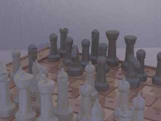
It's a chess set built to accomodate blind and partially sighted people.
On my gallery page there's a detailed description of the scene, an 800x600
version plus the source code, all hand coded CSG.
http://www.zeropps.uklinux.net/gallery.html
Post a reply to this message
Attachments:
Download 'blchess.jpg' (22 KB)
Preview of image 'blchess.jpg'

|
 |
|  |
|  |
|
 |
|
 |
|  |
|  |
|
 |
What is wrong with the image gamma?
I did a "stretch contrast" on it in the GIMP and it looked a LOT better.
Post a reply to this message
|
 |
|  |
|  |
|
 |
|
 |
|  |
|  |
|
 |
Daniel Matthews wrote:
>
> What is wrong with the image gamma?
It works perfectly. My guess is that you have previously designed
scenes to be viewed directly through a monitor and it's distortions.
You have built the scenes so that they cancel the distortions applied
by the monitor.
When povray does the gamma correction (assumed_gamma 1) the scenes
no longer have to be designed to cancel the monitor's distortions.
_____________
Kari Kivisalo
Post a reply to this message
|
 |
|  |
|  |
|
 |
|
 |
|  |
|  |
|
 |
Not my image, his, the one posted here.
No full shadow or highlight values.
Look at it as a histogram.
Kari Kivisalo wrote:
> Daniel Matthews wrote:
>>
>> What is wrong with the image gamma?
>
> It works perfectly. My guess is that you have previously designed
> scenes to be viewed directly through a monitor and it's distortions.
> You have built the scenes so that they cancel the distortions applied
> by the monitor.
>
> When povray does the gamma correction (assumed_gamma 1) the scenes
> no longer have to be designed to cancel the monitor's distortions.
>
>
> _____________
> Kari Kivisalo
Post a reply to this message
|
 |
|  |
|  |
|
 |
|
 |
|  |
|  |
|
 |
Daniel Matthews wrote:
>
> Not my image, his, the one posted here.
I was sleepwalking then :) Based on Steve's other works I would say
it's supposed look that way.
_____________
Kari Kivisalo
Post a reply to this message
|
 |
|  |
|  |
|
 |
|
 |
|  |
|  |
|
 |
On Fri, 07 Sep 2001 12:49:47 +0300, Kari Kivisalo wrote:
>Daniel Matthews wrote:
>>
>> Not my image, his, the one posted here.
>
>I was sleepwalking then :) Based on Steve's other works I would say
>it's supposed look that way.
And no prizes for guessing who's radiosity settings I used:-)
--
Cheers
Steve email mailto:ste### [at] zeropps uklinux uklinux net
%HAV-A-NICEDAY Error not enough coffee 0 pps.
web http://www.zeropps.uklinux.net/
or http://start.at/zero-pps
4:25pm up 55 days, 18:31, 2 users, load average: 1.01, 1.04, 1.01 net
%HAV-A-NICEDAY Error not enough coffee 0 pps.
web http://www.zeropps.uklinux.net/
or http://start.at/zero-pps
4:25pm up 55 days, 18:31, 2 users, load average: 1.01, 1.04, 1.01
Post a reply to this message
|
 |
|  |
|  |
|
 |
|
 |
|  |
|  |
|
 |
>Based on Steve's other works I would say it's supposed look that way.
Ouch!
Post a reply to this message
|
 |
|  |
|  |
|
 |
|
 |
|  |
|  |
|
 |
Thomas Lake wrote:
>
> >Based on Steve's other works I would say it's supposed look that way.
>
> Ouch!
I see a more detailed description of the situation is required. Someone
says the image lacks contrast. I see Steve's gallery and the source file
and based on this information I say he has chosen not to put more contrast
in the image. That's it. There is no more explicit or implicit information
in that statement. Really. Thats all. You have imagined things.
_____________
Kari Kivisalo
Post a reply to this message
|
 |
|  |
|  |
|
 |
|
 |
|  |
|  |
|
 |
> I see a more detailed description of the situation is required. Someone
> says the image lacks contrast. I see Steve's gallery and the source file
> and based on this information I say he has chosen not to put more contrast
> in the image. That's it. There is no more explicit or implicit information
> in that statement. Really. Thats all. You have imagined things.
Sorry my bad:-)
Post a reply to this message
|
 |
|  |
|  |
|
 |
|
 |
|  |


![]()