|
 |
This is my 1st post here, I hope that I do everything ok (attachments
settings)
Thoes are icons for my commercial program (files scanner).
Ofcourse in program they would be smaller :)
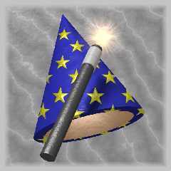
a1.bmp "wizard" - cone differenced with smaller cone, 2 cylinders making
Wand, and Media for "magic glow"
Texture is too small - that resluted in ugly pixelized of stars, but I
noticed it after my 640x640 5 hours rendering was finished, so I will
correct it next time. This is maybe not very notacible, but blue-yellow
stars texutre is a material may, "stars" area has reflection, while "blue"
area has normal (bumps) + phong. I like this image most.
400 lines + 220 in include file (radiosity+bacground)
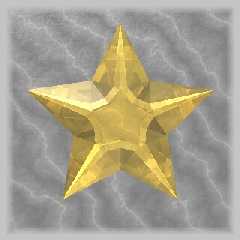
a2.bmp "star" - this is a mesh. I have a problem - star is way to sharp and
I'm thinking of some way of blurring it.
150 lines + 220 in include file (radiosity+bacground)
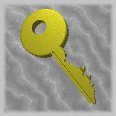
a3.bmp "key" - key "ear"/"head" is made from cone, torus, diff. cone.
"teeth" is intersection of 2 Polygons. First is like :
| |
| >
| >
'/ etc
and second is rotate by x*90 to first one
230 lines + 220 in include file (radiosity+bacground)
a1.bmp took 5 h on 1,7 GHz 640x480 AA - due to media and to high quality
radiosity. Radiosity in all images is not only radiosity settings, but
alsow - scene is sorrounded by "sphere" of about 100 light sources - they
are making ambience, but in difference to i.e. sky_sphere + ambient - this
ambient light DO effect specular/phong. Effect of this "light sphere" is
not very notacible, but at last I am honest ;)
Making all images took me about 20 h to write (about 3-5 h when NOT
including test rendering time) in
all commenst are welcome
--
> A jedyne co czytam, ze to terrorysci internetowi z echelonu planuja
> kolejny atak na centrale TPSA
- Expert vel Jacek (obecnie gol### [at] poczta onet onet pl) pl)
Post a reply to this message
Attachments:
Download 'a1.jpg' (98 KB)
Download 'a2.jpg' (35 KB)
Download 'a3.jpg' (34 KB)
Preview of image 'a1.jpg'

Preview of image 'a2.jpg'

Preview of image 'a3.jpg'

|
 |
|
 |
These look nice. My own experience with using POV for creating icons has
been disappointing. By the time I shrank the images down to the required
size the "detail" actually became "noise" and made the icons hard to
understand. I tried using a paint program to sharpen the images and reduce
the number of colours, but in the end I had to give it up in favour of a
more "cartoonish" look. I hope you have better luck.
"Rafal 'Raf256' Maj" <raf### [at] raf256 com> wrote in message
news:Xns### [at] 204 com> wrote in message
news:Xns### [at] 204 213 213 191 191 226...
> This is my 1st post here, I hope that I do everything ok (attachments
> settings)
> 226...
> This is my 1st post here, I hope that I do everything ok (attachments
> settings)
>
Post a reply to this message
|
 |
|
 |
"Spock" <spo### [at] nospam com> wrote in news:3d395014$1@news.povray.org
> These look nice. My own experience with using POV for creating icons
> has been disappointing. By the time I shrank the images down to the
> required size the "detail" actually became "noise" and made the icons
> hard to understand. I tried using a paint program to sharpen the
> images and reduce the number of colours, but in the end I had to give
> it up in favour of a more "cartoonish" look. I hope you have better
> luck.
I use it on buttons, so they are 44x44 and fullcolor. Ofcourse I use
antialais. The dont look noise, and all are nice... maybe instead of last
(key) because key is little too dark on greay background.
--
> A jedyne co czytam, ze to terrorysci internetowi z echelonu planuja
> kolejny atak na centrale TPSA
- Expert vel Jacek (obecnie gol### [at] poczta com> wrote in news:3d395014$1@news.povray.org
> These look nice. My own experience with using POV for creating icons
> has been disappointing. By the time I shrank the images down to the
> required size the "detail" actually became "noise" and made the icons
> hard to understand. I tried using a paint program to sharpen the
> images and reduce the number of colours, but in the end I had to give
> it up in favour of a more "cartoonish" look. I hope you have better
> luck.
I use it on buttons, so they are 44x44 and fullcolor. Ofcourse I use
antialais. The dont look noise, and all are nice... maybe instead of last
(key) because key is little too dark on greay background.
--
> A jedyne co czytam, ze to terrorysci internetowi z echelonu planuja
> kolejny atak na centrale TPSA
- Expert vel Jacek (obecnie gol### [at] poczta onet onet pl) pl)
Post a reply to this message
|
 |
|
 |
> I use it on buttons, so they are 44x44 and fullcolor. Ofcourse I use
> antialais. The dont look noise, and all are nice... maybe instead of last
> (key) because key is little too dark on greay background.
I have the best results for icons when I render them at their icon size (ie
44x44) with heavy AA (+A0.0 +AM2 +R4)
-tgq
Post a reply to this message
|
 |


![]()