|
|
|
|
|
|
| |
| |
|
|
|
|
| |
| |
|
|
kurtz le pirate <kur### [at] free fr> wrote:
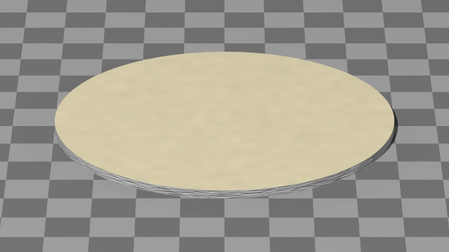
> Yes, the texture/material of the cardboard is not right.
>
> Numerous attempts have been made, but none have been very satisfactory.
> I am open to suggestions on this matter.
https://www.youtube.com/watch?v=lHaFHPz46kM
-BE fr> wrote:
> Yes, the texture/material of the cardboard is not right.
>
> Numerous attempts have been made, but none have been very satisfactory.
> I am open to suggestions on this matter.
https://www.youtube.com/watch?v=lHaFHPz46kM
-BE
Post a reply to this message
|
|
| |
| |
|
|
|
|
| |
| |
|
|
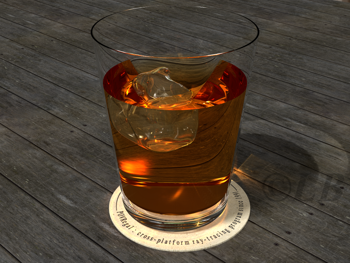
hi,
kurtz le pirate <kur### [at] freefr> wrote:
> On 11/02/2026 11:04, kurtz le pirate wrote:
> > One or more suggestions for further improvement ?
>
> Yes, the texture/material of the cardboard is not right.
agree with BE, it does look very "inviting" :-). I think the wood is quite
dark, and a "sun-bleached" version would set off the drink better.
regards, jr.
Post a reply to this message
|
|
| |
| |
|
|
|
|
| |
| |
|
|
Am 11.02.26 um 17:18 schrieb kurtz le pirate:
> On 11/02/2026 11:04, kurtz le pirate wrote:
>>
>> Hello,
>>
>> One or more suggestions for further improvement ?
>>
>
>
>
> Yes, the texture/material of the cardboard is not right.
>
> Numerous attempts have been made, but none have been very satisfactory.
> I am open to suggestions on this matter.
>
>
>
>
Jaime Vives Piqueres gave some beer coasters in (archived only):
https://web.archive.org/web/20120621193854/http://www.ignorancia.org/uploads/zips/barrabar.zip
Other nice cardboard-objects can be found in:
http://www.povcomp.com/entries/85.php
Best regards
Michael
Post a reply to this message
|
|
| |
| |
|
|
|
|
| |
| |
|
|
kurtz le pirate <kur### [at] freefr> wrote:
> Hello,
>
> One or more suggestions for further improvement ?
This looks really good. I think adding a small rounded bevel to the top of the
liquid will give it a more realistic surface tension effect.
Post a reply to this message
|
|
| |
| |
|
|
|
|
| |
| |
|
|
On 2026-02-11 12:18 (-4), kurtz le pirate wrote:
>
> Yes, the texture/material of the cardboard is not right.
>
> Numerous attempts have been made, but none have been very satisfactory.
> I am open to suggestions on this matter.
Something I whipped up this evening.
---%<-----%<--[BEGIN CODE]--%<-----%<---
intersection
{ cylinder
{ 0, 0.2 * y, 4.1
pigment { rgb <1, 0.9, 0.6> }
normal { bumps 0.1 scale 0.3 }
}
cylinder
{ -0.1 * y, 0.3 * y, 4
pigment { rgb 0.6 }
normal
{ crackle -0.5
scale <1, 0.1, 1> * 0.5
}
}
}
--->%----->%---[END CODE]--->%----->%---
Post a reply to this message
Attachments:
Download 'kurtz-coaster.jpg' (27 KB)
Preview of image 'kurtz-coaster.jpg'
|
|
| |
| |
|
|
|
|
| |
| |
|
|
kurtz le pirate <kur### [at] freefr> wrote:
> On 11/02/2026 11:04, kurtz le pirate wrote:
> >
> > Hello,
> >
> > One or more suggestions for further improvement ?
> >
>
>
>
> Yes, the texture/material of the cardboard is not right.
>
> Numerous attempts have been made, but none have been very satisfactory.
> I am open to suggestions on this matter.
>
>
>
>
> --
> kurtz le pirate
> compagnie de la banquise
Awsome work on the model, composition and texture placement ! It looks
promissing.
You should separate the side and top parts of the glass supporting cardboard,
giving them different textures, just as a real cutout showing the darker
cardboard structure (probably some round form factored crackle (aka circcular
celled voronoi) on the side of the cylinder, but the lighter more grainy (rough
phong with large fade out) currently almost there should be reserved for the top
facing printed paper aspect. it do more justice to it by contrast. (if there was
one in POV (can't remember) you may turn that to Oren Nayar Blinn with max
roughness/sigma everywhere)
About the table, It's diffuse color value is somehow too high :it does not show
the lighting of the room / specular of the table come into play...
Finally some effects :
maybe some photons based caustics could happen if light came proportionally more
from a narrow focused spotlight.
As an ultimate final step, maybe the very minimal atmospheric media in the room
would add to this also as per Blender exporter default settings:
type 1 Isotropic 35 samples with a very dark diffusion color <0.001, 0.001,
0.001> absorption scale 0.00002
Post a reply to this message
|
|
| |
| |
|
|
|
|
| |
| |
|
|
Hi(gh)!
Am 11.02.26 um 12:50 schrieb Bald Eagle:
> kurtz le pirate <kur### [at] freefr> wrote:
>> Hello,
>>
>> One or more suggestions for further improvement ?
>
> Use the keywords "open" and "hollow" so that I can reach into the screen and
> taste it?
Don't drink and code! Programmers run on caffeine, not alcohol...
See you in Khyberspace!
Yadgar
--
VBI BENE, IBI BACTRIA!
Post a reply to this message
|
|
| |
| |
|
|
|
|
| |
| |
|
|
On 11/02/2026 11:04, kurtz le pirate wrote:
>
> Hello,
>
> One or more suggestions for further improvement ?
>
>
A few improvements. I'm working on it little by little.
The surface of the liquid isn't flat anymore, but it doesn't make much
of a difference. A new texture for the desk.
--
kurtz le pirate
compagnie de la banquise
Post a reply to this message
Attachments:
Download 'whisky_glass_menisque.png' (1762 KB)
Preview of image 'whisky_glass_menisque.png'

|
|
| |
| |
|
|
|
|
| |
| |
|
|
On 19/04/2026 18:49, kurtz le pirate wrote:
> The surface of the liquid isn't flat anymore, but it doesn't make much
> of a difference. A new texture for the desk.
>
Much better and natural now, I see the coaster is also improved.
--
YB
Post a reply to this message
|
|
| |
| |
|
|
|
|
| |
| |
|
|
kurtz le pirate <kur### [at] freefr> wrote:
> On 11/02/2026 11:04, kurtz le pirate wrote:
> >
> > Hello,
> >
> > One or more suggestions for further improvement ?
> >
> >
>
> A few improvements. I'm working on it little by little.
>
> The surface of the liquid isn't flat anymore, but it doesn't make much
> of a difference. A new texture for the desk.
>
>
>
>
>
>
>
> --
> kurtz le pirate
> compagnie de la banquise
Yes this liquid is much more nuanced and appealing. The scale of the new wood
texture seems too small : it features screws that we would expect to also appear
in a normal bumb, plus not reveal to repeat as much if bigger.
For smoked oak wood, the following page shows low reflectivity but the
interaction with bitmap is hard to assign. Maybe start with a grey material to
get the shininess right...?
https://gustafs.com/knowledge-hub/surfaces/ligt-reflection-values/
Post a reply to this message
|
|
| |
| |
|
|
|
|
| |