 |
 |
|
 |
|
 |
|  |
|  |
|
 |
|
 |
|  |
|  |
|
 |
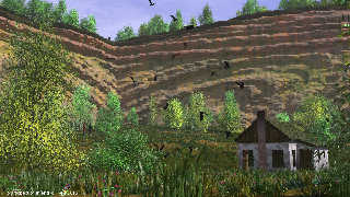
This was the first scene I started on this TC-RTC Challenge. Needless to
say that I am far from happy about it all. Somehow, I feel disappointed
and unenthusiastic about it at this stage.
Thomas
Post a reply to this message
Attachments:
Download 'elements of geology1_05.jpg' (412 KB)
Preview of image 'elements of geology1_05.jpg'

|
 |
|  |
|  |
|
 |
|
 |
|  |
|  |
|
 |
Thomas de Groot <tho### [at] degroot org> wrote:
> This was the first scene I started on this TC-RTC Challenge. Needless to
> say that I am far from happy about it all. Somehow, I feel disappointed
> and unenthusiastic about it at this stage.
>
> Thomas
May be you can raise the camera a bit. The figure at the top is very hard to
recognize, even if it will be not at a realistic scale, try to double it's size.
Sometimes such things are working visually. E.g. the flamingoes in my "Rock 'n'
Roll" scene (Sphinx-Round) are some 5 meters high. No one has noticed this so
far and recogniced just flamingoes. I use this very carefully but sometimes it
helps.
Otherwise I cannot see a real flaw with this one. The only idea I came up with
is that you posted an idea to texture the leafs of trees with different colors
some months ago and that this one could be a good test for this idea.
Best regards,
Micheal org> wrote:
> This was the first scene I started on this TC-RTC Challenge. Needless to
> say that I am far from happy about it all. Somehow, I feel disappointed
> and unenthusiastic about it at this stage.
>
> Thomas
May be you can raise the camera a bit. The figure at the top is very hard to
recognize, even if it will be not at a realistic scale, try to double it's size.
Sometimes such things are working visually. E.g. the flamingoes in my "Rock 'n'
Roll" scene (Sphinx-Round) are some 5 meters high. No one has noticed this so
far and recogniced just flamingoes. I use this very carefully but sometimes it
helps.
Otherwise I cannot see a real flaw with this one. The only idea I came up with
is that you posted an idea to texture the leafs of trees with different colors
some months ago and that this one could be a good test for this idea.
Best regards,
Micheal
Post a reply to this message
|
 |
|  |
|  |
|
 |
|
 |
|  |
|  |
|
 |
Thomas de Groot <tho### [at] degroot org> wrote:
> This was the first scene I started on this TC-RTC Challenge. Needless to
> say that I am far from happy about it all. Somehow, I feel disappointed
> and unenthusiastic about it at this stage.
>
> Thomas
Maybe making the rockface darker to give more contrast, I think it is a good
concept and again good use of foliage. It does look a bit like there are plants
growing inside the house though and I think if I lived in a valley like that I
would not bother with houseplants ;-)
Sean org> wrote:
> This was the first scene I started on this TC-RTC Challenge. Needless to
> say that I am far from happy about it all. Somehow, I feel disappointed
> and unenthusiastic about it at this stage.
>
> Thomas
Maybe making the rockface darker to give more contrast, I think it is a good
concept and again good use of foliage. It does look a bit like there are plants
growing inside the house though and I think if I lived in a valley like that I
would not bother with houseplants ;-)
Sean
Post a reply to this message
|
 |
|  |
|  |
|
 |
|
 |
|  |
|  |
|
 |
On 12-6-2013 0:23, s.day wrote:
>
> Maybe making the rockface darker to give more contrast, I think it is a good
> concept and again good use of foliage. It does look a bit like there are plants
> growing inside the house though and I think if I lived in a valley like that I
> would not bother with houseplants ;-)
>
A darker rockface is indeed an interesting idea. I need to work on the
foliage colour a bit more. It is too bright in places.
There are no plants in the house. What you see is the reflection of the
trees in the window panes ;-) I may need to reduce the reflection though.
Thanks for your comments. Gives me some hope again that I am on the
right track. I was rather unsure about this, maybe because I worked a
bit too long on the scene.
Thomas
Post a reply to this message
|
 |
|  |
|  |
|
 |
|
 |
|  |
|  |
|
 |
On 11-6-2013 22:08, MichaelJF wrote:
> May be you can raise the camera a bit. The figure at the top is very hard to
> recognize, even if it will be not at a realistic scale, try to double it's size.
> Sometimes such things are working visually. E.g. the flamingoes in my "Rock 'n'
> Roll" scene (Sphinx-Round) are some 5 meters high. No one has noticed this so
> far and recogniced just flamingoes. I use this very carefully but sometimes it
> helps.
Yes, the camera is a bit too low indeed and needs to clear the grass. I
also have often used that trick with sizes, even to gradually scaling up
objects with distance. The eyes are completely fooled. I may do this
here too, but then I also need to adjust the size of trees up there. On
the other hand, I wanted to give a measure of the sheer size of the
cliff itself...
>
> Otherwise I cannot see a real flaw with this one. The only idea I came up with
> is that you posted an idea to texture the leafs of trees with different colors
> some months ago and that this one could be a good test for this idea.
Thanks for your kind comments. Not too bad then after all. Concerning
the leaves, yes, I might try that although my technique was not as good
as Norbert Kern's. However, excellent suggestion. Some work to do then ;-)
Thomas
Post a reply to this message
|
 |
|  |
|  |
|
 |
|
 |
|  |
|  |
|
 |
Maybe more relief in the rocks (isosurfface)
Post a reply to this message
|
 |
|  |
|  |
|
 |
|
 |
|  |
|  |
|
 |
On 12-6-2013 22:00, BertvdB wrote:
> Maybe more relief in the rocks (isosurfface)
As is, an isosurface does not make a difference as the rocks are based
on an image map. I can switch between the two. However, I could add some
functions to work on the relief. Again however, I want the rock face to
look eroded, without too much small details sticking out.
Thomas
Post a reply to this message
|
 |
|  |
|  |
|
 |
|
 |
|  |
|  |
|
 |
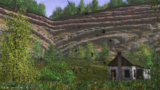
Integrating different hints, results in this image.
The rock face could be darker; I first opted to have the relief given a
lighter hue.
Thomas
Post a reply to this message
Attachments:
Download 'elements of geology1_06.jpg' (408 KB)
Preview of image 'elements of geology1_06.jpg'

|
 |
|  |
|  |
|
 |
|
 |
|  |
|  |
|
 |
> On 12-6-2013 22:00, BertvdB wrote:
>> Maybe more relief in the rocks (isosurfface)
>
> As is, an isosurface does not make a difference as the rocks are based
> on an image map. I can switch between the two. However, I could add some
> functions to work on the relief. Again however, I want the rock face to
> look eroded, without too much small details sticking out.
>
> Thomas
>
Erosion often add details... With small details sticking both in and out.
Post a reply to this message
|
 |
|  |
|  |
|
 |
|
 |
|  |
|  |
|
 |
On 14-6-2013 19:46, Alain wrote:
>
> Erosion often add details... With small details sticking both in and out.
True, but it also smooths surfaces :-)
The rock face intends to show both: erosion of the incompetent parts as
crevices; smoothing of the competent hard layers.
Thomas
Post a reply to this message
|
 |
|  |
|  |
|
 |
|
 |
|  |


![]()