|
 |
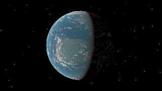
A second take on this planet. I tripled the density of the scattering,
added some icecaps, reduced the lights that lit the dark side, and added
a turbulence warp to the clouds to make them look more like weather fronts.
Code at the end.
Regards,
John
//--- start of planet03.inc
#ifndef(PlanetTrans)
#local PlanetTrans = transform { }
#end
#local textIce = texture {
pigment { rgb 1 }
finish { ambient 0 diffuse 1 }
}
#local textWater = texture {
pigment { rgb <0,.01,.04> }
finish { diffuse 1 ambient 0 specular .125 roughness .02 }
}
#local textOcean = texture { gradient y
texture_map {
[.07 textIce ]
[.07 textWater ]
[.93 textWater ]
[.93 textIce ]
}
scale 10
warp { turbulence .25 }
scale 1/10
scale 2.01
translate y
}
#local pattCap = pigment { gradient y
color_map {
[.10 rgb 1]
[.10 rgb 0]
[.90 rgb 0]
[.90 rgb 1]
}
scale 10
warp { turbulence .25 }
scale 1/10
scale 2.01
translate y
}
#local textDry = texture {
pigment { granite
pigment_map {
[.7 granite translate y*5
color_map {
[.5 rgb <.125,.2,.1> ]
[.5 rgb <.35,.3,.25> ]
}
]
[.8 rgb <.125,.1,.075> ]
}
}
normal { granite
normal_map {
[.7 granite .01 ]
[.8 granite 1 scale .01]
}
}
}
#local textLand = texture {
pigment_pattern { pattCap }
texture_map {
[0 textDry scale 3]
[1 textIce ]
}
}
union {
sphere { 0,1
texture {
granite scale 3
texture_map {
[.5 textOcean scale 1/3]
[.5 textLand scale 1/3]
}
}
scale 6e3
}
sphere { 0,1 hollow
texture { pigment { rgbt <1,1,1,1> } }
interior {
media { scattering { 2, <.2,.6,1>*.03 } }
}
scale 6010
}
sphere { 0,1 hollow
texture {
pigment { granite turbulence 1 lambda 4
color_map {
[.65 rgbt 1]
[.66 rgb 1]
}
scale 2
warp { turbulence 1 lambda 1.5 omega .4 }
}
finish { ambient 0 diffuse 1 }
}
scale 6009
}
transform PlanetTrans
}
//--- end of planet03.inc
Post a reply to this message
Attachments:
Download 'planet2.png' (177 KB)
Preview of image 'planet2.png'

|
 |
|
 |
I really like this--possibly for an unintended reason: It looks kind of like an
artist's rendition to me (like something that astronomical artist Chesley
Bonestell would have done.) I realize you're going for more 'realism' than
that--but I like it! As such, it would be nice to have a bit more back-side
illumination, rather than the total realism of absence of reflected light.
(Admittedly, I seem to always appreciate a more 'painterly' approach to renders,
rather than stark realism. It depends on the subject, of course.)
Post a reply to this message
|
 |


![]()