 |
 |
|
 |
|
 |
|  |
|  |
|
 |
|
 |
|  |
|  |
|
 |
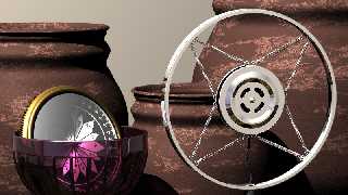
I've been working on a scene using a couple of objects that I was never
really happy with the way I'd initially displayed them ... The compass
was difficult because it has such a low profile. I like how it's
beginning to look now that I've placed it in the goblet (btw: amethyst
glass). The microphone shows a lot more detail, but I'm not too happy
with the reflection of the room. The floor, ceilings and walls have
individual textures ... I was trying to mitigate the appearance of the
corners by applying gradients and different finish attributes, but only
got so far. Is that what an HDR light map could help with? I've
certainly admired some for the recent posts using that technique, but
haven't a clue where to start! Any good ref material on how to get
started with HDR and povray out there ... (if that's what I should be
going after)
Post a reply to this message
Attachments:
Download 'wip.png' (559 KB)
Preview of image 'wip.png'

|
 |
|  |
|  |
|
 |
|
 |
|  |
|  |
|
 |
While HDR lighting can really help with a realistic lighting arrangement, this
can still be simulated with hand light sources. What really makes a difference
for textures, espescially ones with some reflectivity, is the environment.
Reflective textures look dull and uninteresting unless they have something to
reflect. One way to do this is to model an entire scene (a lot of work). The
other is with an environment map. For environment maps, I usually use full
360deg panoramas mapped to a large containing sphere (hollow so media can work).
You can use LDR (low dynamic renage: jpg, png, bmp, etc) but if you understand
how dynamic range works, these can be lacking as what should be bright
reflections end up dull , espescially on textures with low reflectivity. Using
HDR (high dynamic range: .hdr) is nice as, if they are done well, they maintain
the bright spots in reflections.
A few sources I have for .hdrs:
http://www.hdrlabs.com/sibl/archive.html (recent find with lots of good quality
ones)
http://www.openfootage.net/?cat=15 (also a fairly good quality resource)
there are many other out there, but these are my favourites at present (I
currently have over 350 in my collection).
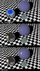
For example I have attached a scene that I have rendered with 3 different
environments: a) plain sky sphere, b) LDR (jpg version of the HDR used) c) HDR.
For this scene, I have only used a single point light, which doesn't
necessarilty match the lighting expected from the environment mpa.
You should be able to see how the environment makes the textures more
interesting, and how the HDR shows the highlights better.
Standard implementation would be mapping it to a sky_sphere or to a large
physical sphere (hollow for media to work). I prefer the physical sphere, as I
can use 'ambient' to increase/decrease the brightness of the map used.
sphere{0, 12000 hollow
pigment{image_map {hdr "HDR.hdr" map_type 1}}
finish{diffuse 0 ambient 1}
}
Note:
- map_type 1 maps the image spherically
- you can change ambient to change the brightness of the map
- hdr is only supported in 3.7 (or megaPOV), not 3.6
Post a reply to this message
Attachments:
Download 'envmapex.png' (237 KB)
Preview of image 'envmapex.png'

|
 |
|  |
|  |
|
 |
|
 |
|  |
|  |
|
 |
Jim Holsenback <jho### [at] povray org> wrote:
> I've been working on a scene using a couple of objects that I was never
> really happy with the way I'd initially displayed them ... The compass
> was difficult because it has such a low profile. I like how it's
> beginning to look now that I've placed it in the goblet (btw: amethyst
> glass).
Nice scene, Jim. Perhaps you could "weight" each item's contribution to the
scene. That is, the image rectangle bounding the scene should either: display an
entire object plus 1/3 of its width/height, or only display 1/3-2/3 of each
object. But that's a personal preference, of course :)
For some reason, the amethyst bowl looks more "red" in its preview than it does
for the full-sized image. Maybe there's a newsgroup gamma discrepancy present?
Sam org> wrote:
> I've been working on a scene using a couple of objects that I was never
> really happy with the way I'd initially displayed them ... The compass
> was difficult because it has such a low profile. I like how it's
> beginning to look now that I've placed it in the goblet (btw: amethyst
> glass).
Nice scene, Jim. Perhaps you could "weight" each item's contribution to the
scene. That is, the image rectangle bounding the scene should either: display an
entire object plus 1/3 of its width/height, or only display 1/3-2/3 of each
object. But that's a personal preference, of course :)
For some reason, the amethyst bowl looks more "red" in its preview than it does
for the full-sized image. Maybe there's a newsgroup gamma discrepancy present?
Sam
Post a reply to this message
|
 |
|  |
|  |
|
 |
|
 |
|  |
|  |
|
 |
The sIBL method is especially nice: using 3 image maps, one as a background, one
as reflection, and one as a lighting environment. Have you had any method of
using an image map as just a light source and another as just a source of
reflection? I would imagine two surrounding spheres, an outer sphere that acts
just as a light map for illumination, and a slightly inner sphere that lets
light pass through but visible only on reflective surfaces.
Post a reply to this message
|
 |
|  |
|  |
|
 |
|
 |
|  |
|  |
|
 |
On 02/09/2011 11:11 PM, Samuel Benge wrote:
> Jim Holsenback <jho### [at] povray org> wrote:
>> I've been working on a scene using a couple of objects that I was never
>> really happy with the way I'd initially displayed them ... The compass
>> was difficult because it has such a low profile. I like how it's
>> beginning to look now that I've placed it in the goblet (btw: amethyst
>> glass).
>
> Nice scene, Jim. Perhaps you could "weight" each item's contribution to the
> scene. That is, the image rectangle bounding the scene should either: display an
> entire object plus 1/3 of its width/height, or only display 1/3-2/3 of each
> object. But that's a personal preference, of course :)
ha-ha ... thanks for the little lesson in composition. generally I like
the lines in the scene (l to r) but maybe this might explain why i was
feeling like it wasn't completely "there" yet org> wrote:
>> I've been working on a scene using a couple of objects that I was never
>> really happy with the way I'd initially displayed them ... The compass
>> was difficult because it has such a low profile. I like how it's
>> beginning to look now that I've placed it in the goblet (btw: amethyst
>> glass).
>
> Nice scene, Jim. Perhaps you could "weight" each item's contribution to the
> scene. That is, the image rectangle bounding the scene should either: display an
> entire object plus 1/3 of its width/height, or only display 1/3-2/3 of each
> object. But that's a personal preference, of course :)
ha-ha ... thanks for the little lesson in composition. generally I like
the lines in the scene (l to r) but maybe this might explain why i was
feeling like it wasn't completely "there" yet
Post a reply to this message
|
 |
|  |
|  |
|
 |
|
 |
|  |
|  |
|
 |
On 02/09/2011 11:16 AM, Trevor G Quayle wrote:
> A few sources I have for .hdrs:
> http://www.hdrlabs.com/sibl/archive.html (recent find with lots of good quality
> ones)
> http://www.openfootage.net/?cat=15 (also a fairly good quality resource)
> there are many other out there, but these are my favourites at present (I
> currently have over 350 in my collection).
>
> For example I have attached a scene that I have rendered with 3 different
> environments: a) plain sky sphere, b) LDR (jpg version of the HDR used) c) HDR.
> For this scene, I have only used a single point light, which doesn't
> necessarilty match the lighting expected from the environment mpa.
>
>
> You should be able to see how the environment makes the textures more
> interesting, and how the HDR shows the highlights better.
>
> Standard implementation would be mapping it to a sky_sphere or to a large
> physical sphere (hollow for media to work). I prefer the physical sphere, as I
> can use 'ambient' to increase/decrease the brightness of the map used.
>
> sphere{0, 12000 hollow
> pigment{image_map {hdr "HDR.hdr" map_type 1}}
> finish{diffuse 0 ambient 1}
> }
hey thanks for the links and the little demo ... i'm thinking that part
of my problem is the "cubic" environment i'm working with. going to try
a single wall behind the objects, with a spherical env ... maybe this is
why i can't seem to finish a scene (i'm always messing with my setup)
Post a reply to this message
|
 |
|  |
|  |
|
 |
|
 |
|  |
|  |
|
 |
"Stephen Klebs" <skl### [at] gmail com> wrote:
> The sIBL method is especially nice: using 3 image maps, one as a background, one
> as reflection, and one as a lighting environment. Have you had any method of
> using an image map as just a light source and another as just a source of
> reflection? I would imagine two surrounding spheres, an outer sphere that acts
> just as a light map for illumination, and a slightly inner sphere that lets
> light pass through but visible only on reflective surfaces.
I tend to use only one map, the full HDR panorama. This gets both reflected and
is used to generate the lighting in my light system. The lighting method I use,
being a rational method that samples the map and proportions using a median-cut
method, would likely not gain any advantage using the lower resolution
'convoluted' map. I typically also use it for the background, but will usually
try to obscure it or focal blur it. I may try the high-res background plate
sometime, but then you get restricted on your viewing angle.
-tgq com> wrote:
> The sIBL method is especially nice: using 3 image maps, one as a background, one
> as reflection, and one as a lighting environment. Have you had any method of
> using an image map as just a light source and another as just a source of
> reflection? I would imagine two surrounding spheres, an outer sphere that acts
> just as a light map for illumination, and a slightly inner sphere that lets
> light pass through but visible only on reflective surfaces.
I tend to use only one map, the full HDR panorama. This gets both reflected and
is used to generate the lighting in my light system. The lighting method I use,
being a rational method that samples the map and proportions using a median-cut
method, would likely not gain any advantage using the lower resolution
'convoluted' map. I typically also use it for the background, but will usually
try to obscure it or focal blur it. I may try the high-res background plate
sometime, but then you get restricted on your viewing angle.
-tgq
Post a reply to this message
|
 |
|  |
|  |
|
 |
|
 |
|  |
|  |
|
 |
On 02/09/2011 11:16 AM, Trevor G Quayle wrote:
> You should be able to see how the environment makes the textures more
> interesting, and how the HDR shows the highlights better.
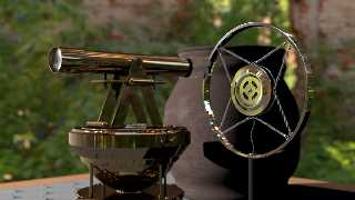
Thanks for the pointers to the hdr resources ... I used the abandoned
paper mill as a light map and yikes ... what a difference
Post a reply to this message
Attachments:
Download 'hdrtest.png' (603 KB)
Preview of image 'hdrtest.png'

|
 |
|  |
|  |
|
 |
|
 |
|  |
|  |
|
 |
On 12/02/2011 8:06 PM, Jim Holsenback wrote:
> Thanks for the pointers to the hdr resources ... I used the abandoned
> paper mill as a light map and yikes ... what a difference
Too true, it looks Brill.
--
Regards
Stephen
Post a reply to this message
|
 |
|  |
|  |
|
 |
|
 |
|  |
|  |
|
 |
Jim Holsenback <jho### [at] povray org> wrote:
> Thanks for the pointers to the hdr resources ... I used the abandoned
> paper mill as a light map and yikes ... what a difference
Yes, it's amazing what IBL can do for a shot; this looks really nice Jim.
-------------------------------------------------
www.McGregorFineArt.com org> wrote:
> Thanks for the pointers to the hdr resources ... I used the abandoned
> paper mill as a light map and yikes ... what a difference
Yes, it's amazing what IBL can do for a shot; this looks really nice Jim.
-------------------------------------------------
www.McGregorFineArt.com
Post a reply to this message
|
 |
|  |
|  |
|
 |
|
 |
|  |


![]()