 |
 |
|
 |
|
 |
|  |
|  |
|
 |
|
 |
|  |
|  |
|
 |
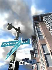
Here's a modified image from several years ago
Post a reply to this message
Attachments:
Download 'street.jpg' (184 KB)
Preview of image 'street.jpg'

|
 |
|  |
|  |
|
 |
|
 |
|  |
|  |
|
 |
"jhu" <nomail@nomail> wrote in message
news:web.4b42eb0da026e95b42146b200@news.povray.org...
> Here's a modified image from several years ago
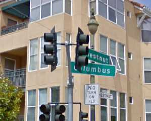
Hey ... there's a corner of Chestnut and Columbus in San Francisco ...
coincidence?
BTW: I revisit old images from time to time as well ... when I learn
something or a technique I didn't know before.
Post a reply to this message
|
 |
|  |
|  |
|
 |
|
 |
|  |
|  |
|
 |
"Jim Holsenback" <jho### [at] povray org> schreef in bericht
news:4b431df6@news.povray.org...
> "jhu" <nomail@nomail> wrote in message
> news:web.4b42eb0da026e95b42146b200@news.povray.org...
>> Here's a modified image from several years ago
>
> Hey ... there's a corner of Chestnut and Columbus in San Francisco ...
> coincidence?
>
> BTW: I revisit old images from time to time as well ... when I learn
> something or a technique I didn't know before.
>
When/where was/is the older version? would be nice to compare. Good stuff!
Yes, I regularly revisit older scenes too.
Thomas org> schreef in bericht
news:4b431df6@news.povray.org...
> "jhu" <nomail@nomail> wrote in message
> news:web.4b42eb0da026e95b42146b200@news.povray.org...
>> Here's a modified image from several years ago
>
> Hey ... there's a corner of Chestnut and Columbus in San Francisco ...
> coincidence?
>
> BTW: I revisit old images from time to time as well ... when I learn
> something or a technique I didn't know before.
>
When/where was/is the older version? would be nice to compare. Good stuff!
Yes, I regularly revisit older scenes too.
Thomas
Post a reply to this message
|
 |
|  |
|  |
|
 |
|
 |
|  |
|  |
|
 |
Jim Holsenback wrote:
>> "jhu" <nomail@nomail> wrote in message
>> news:web.4b42eb0da026e95b42146b200@news.povray.org...
>>> Here's a modified image from several years ago
>>
>> Hey ... there's a corner of Chestnut and Columbus in San Francisco
>> ... coincidence?
>>
Taylor St. is not on the signpost. It's a three street intersection in
SF.
Post a reply to this message
|
 |
|  |
|  |
|
 |
|
 |
|  |
|  |
|
 |
pan wrote:
> Taylor St. is not on the signpost. It's a three street intersection in SF.
isn't that a third sign viewed edge-on under the columnus sign?
Nice image BTW. The signs look a bit artificial, maybe due
to a combination of being very clean, partly oversaturated
and suffering from some aliasing.
Post a reply to this message
|
 |
|  |
|  |
|
 |
|
 |
|  |
|  |
|
 |
Christian Froeschlin wrote:
> columnus
should have been "columbus" as I'm sure everyone correctly guessed ;)
Post a reply to this message
|
 |
|  |
|  |
|
 |
|
 |
|  |
|  |
|
 |
Christian Froeschlin <chr### [at] chrfr de> wrote:
> pan wrote:
>
> > Taylor St. is not on the signpost. It's a three street intersection in SF.
>
> isn't that a third sign viewed edge-on under the columnus sign?
>
> Nice image BTW. The signs look a bit artificial, maybe due
> to a combination of being very clean, partly oversaturated
> and suffering from some aliasing.
Yes the 3rd sign is viewed on edge so it's not seen very well, but it's there.
I've been trying to make the signs look less artificial; it's a little tough. de> wrote:
> pan wrote:
>
> > Taylor St. is not on the signpost. It's a three street intersection in SF.
>
> isn't that a third sign viewed edge-on under the columnus sign?
>
> Nice image BTW. The signs look a bit artificial, maybe due
> to a combination of being very clean, partly oversaturated
> and suffering from some aliasing.
Yes the 3rd sign is viewed on edge so it's not seen very well, but it's there.
I've been trying to make the signs look less artificial; it's a little tough.
Post a reply to this message
|
 |
|  |
|  |
|
 |
|
 |
|  |
|  |
|
 |
Try some weathering on the textures. An easy change that can make a big impact.
Most things in real life have some variation in their coloring / dents / dings /
grime / bird @&#!.. you get the point. =)
> Yes the 3rd sign is viewed on edge so it's not seen very well, but it's there.
> I've been trying to make the signs look less artificial; it's a little tough.
Post a reply to this message
|
 |
|  |
|  |
|
 |
|
 |
|  |
|  |
|
 |
Christian Froeschlin <chr### [at] chrfr de> wrote:
> Nice image BTW. The signs look a bit artificial, maybe due
> to a combination of being very clean, partly oversaturated
> and suffering from some aliasing.
The signs also look 2-dimensional. Perhaps some thickness will help. de> wrote:
> Nice image BTW. The signs look a bit artificial, maybe due
> to a combination of being very clean, partly oversaturated
> and suffering from some aliasing.
The signs also look 2-dimensional. Perhaps some thickness will help.
Post a reply to this message
|
 |
|  |
|  |
|
 |
|
 |
|  |
|  |
|
 |
Christian Froeschlin <chr### [at] chrfr de> wrote:
> pan wrote:
>
> > Taylor St. is not on the signpost. It's a three street intersection in SF.
>
> isn't that a third sign viewed edge-on under the columnus sign?
>
> Nice image BTW. The signs look a bit artificial, maybe due
> to a combination of being very clean, partly oversaturated
> and suffering from some aliasing.
Check out the real signpost. de> wrote:
> pan wrote:
>
> > Taylor St. is not on the signpost. It's a three street intersection in SF.
>
> isn't that a third sign viewed edge-on under the columnus sign?
>
> Nice image BTW. The signs look a bit artificial, maybe due
> to a combination of being very clean, partly oversaturated
> and suffering from some aliasing.
Check out the real signpost.
Post a reply to this message
Attachments:
Download 'taylor_st.jpg' (65 KB)
Preview of image 'taylor_st.jpg'

|
 |
|  |
|  |
|
 |
|
 |
|  |


![]()