 |
 |
|
 |
|
 |
|  |
|  |
|
 |
|
 |
|  |
|  |
|
 |
Hi there,
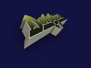
Here's the completed Dokken logo. It was fun and challenging because the tips of
all the points are rounded and the edges are also rounded over, which
complicated things quite a bit.
Comments and criticism are always welcome.
Regards,
Dave Blandston
Post a reply to this message
Attachments:
Download 'dokken [green].png' (194 KB)
Preview of image 'dokken [green].png'
![dokken [green].png](/povray.binaries.images/attachment/%3Cweb.4a4d6d07581d7674ed14c4120%40news.povray.org%3E/dokken%20%5Bgreen%5D.png?preview=1)
|
 |
|  |
|  |
|
 |
|
 |
|  |
|  |
|
 |
> Hi there,
>
> Here's the completed Dokken logo. It was fun and challenging because the
> tips of
> all the points are rounded and the edges are also rounded over, which
> complicated things quite a bit.
>
> Comments and criticism are always welcome.
That looks great!
Post a reply to this message
|
 |
|  |
|  |
|
 |
|
 |
|  |
|  |
|
 |
Dave Blandston wrote:
> Hi there,
>
> Here's the completed Dokken logo. It was fun and challenging because the tips of
> all the points are rounded and the edges are also rounded over, which
> complicated things quite a bit.
>
> Comments and criticism are always welcome.
>
> Regards,
> Dave Blandston
>
>
> ------------------------------------------------------------------------
>
Beautiful job! Worth savoring.
Post a reply to this message
|
 |
|  |
|  |
|
 |
|
 |
|  |
|  |
|
 |
Thanks for the kind words!
Regards,
Dave Blandston
Post a reply to this message
|
 |
|  |
|  |
|
 |
|
 |
|  |
|  |
|
 |
Dave Blandston wrote:
> Comments and criticism are always welcome.
Nicely done! :)
--
~Mike
Post a reply to this message
|
 |
|  |
|  |
|
 |
|
 |
|  |
|  |
|
 |
"Dave Blandston" <nomail@nomail> wrote:
>
> Comments and criticism are always welcome.
Agree, looks great! Would be interesting to see it tilted and rotated to show
off the 3D look some more!
Post a reply to this message
|
 |
|  |
|  |
|
 |
|
 |
|  |
|  |
|
 |
"SafePit" <ste### [at] reids4fun com> wrote:
> "Dave Blandston" <nomail@nomail> wrote:
> >
> > Comments and criticism are always welcome.
>
> Agree, looks great! Would be interesting to see it tilted and rotated to show
> off the 3D look some more!
Here's an angle similar to the "Tooth And Nail" cover. I think the artist
cheated a little on the perspective but I'm experimenting with POV's camera
settings to try to reduce the amount the logo "shrinks" in the distance.
Regards,
Dave Blandston com> wrote:
> "Dave Blandston" <nomail@nomail> wrote:
> >
> > Comments and criticism are always welcome.
>
> Agree, looks great! Would be interesting to see it tilted and rotated to show
> off the 3D look some more!
Here's an angle similar to the "Tooth And Nail" cover. I think the artist
cheated a little on the perspective but I'm experimenting with POV's camera
settings to try to reduce the amount the logo "shrinks" in the distance.
Regards,
Dave Blandston
Post a reply to this message
Attachments:
Download 'dokken.png' (186 KB)
Preview of image 'dokken.png'

|
 |
|  |
|  |
|
 |
|
 |
|  |
|  |
|
 |
Nice!
Could be interesting in orange too.
;-)
Paolo
>Dave Blandston on date 08/07/2009 09:30 wrote:
> "SafePit" <ste### [at] reids4fun com> wrote:
>> "Dave Blandston" <nomail@nomail> wrote:
>>> Comments and criticism are always welcome.
>> Agree, looks great! Would be interesting to see it tilted and rotated to show
>> off the 3D look some more!
>
> Here's an angle similar to the "Tooth And Nail" cover. I think the artist
> cheated a little on the perspective but I'm experimenting with POV's camera
> settings to try to reduce the amount the logo "shrinks" in the distance.
>
> Regards,
> Dave Blandston
>
>
> ------------------------------------------------------------------------
> com> wrote:
>> "Dave Blandston" <nomail@nomail> wrote:
>>> Comments and criticism are always welcome.
>> Agree, looks great! Would be interesting to see it tilted and rotated to show
>> off the 3D look some more!
>
> Here's an angle similar to the "Tooth And Nail" cover. I think the artist
> cheated a little on the perspective but I'm experimenting with POV's camera
> settings to try to reduce the amount the logo "shrinks" in the distance.
>
> Regards,
> Dave Blandston
>
>
> ------------------------------------------------------------------------
>
Post a reply to this message
|
 |
|  |
|  |
|
 |
|
 |
|  |
|  |
|
 |
"Dave Blandston" <nomail@nomail> wrote:
> Here's an angle similar to the "Tooth And Nail" cover. I think the artist
> cheated a little on the perspective but I'm experimenting with POV's camera
> settings to try to reduce the amount the logo "shrinks" in the distance.
Very cool -- shows off the 3D look of the logo. Good luck with the camera
settings, I'm always tweaking and never quite happy.
Post a reply to this message
|
 |
|  |
|  |
|
 |
|
 |
|  |
|  |
|
 |
Paolo Gibellini <p.g### [at] gmail com> wrote:
> Nice!
> Could be interesting in orange too.
> ;-)
> Paolo
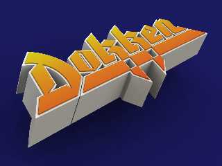
I think I got the camera adjusted properly to match the Tooth And Nail cover.
Did somebody say orange?
Regards,
Dave Blandston com> wrote:
> Nice!
> Could be interesting in orange too.
> ;-)
> Paolo
I think I got the camera adjusted properly to match the Tooth And Nail cover.
Did somebody say orange?
Regards,
Dave Blandston
Post a reply to this message
Attachments:
Download 'dokken.png' (307 KB)
Preview of image 'dokken.png'

|
 |
|  |
|  |
|
 |
|
 |
|  |


![]()