 |
 |
|
 |
|
 |
|  |
|  |
|
 |
|
 |
|  |
|  |
|
 |
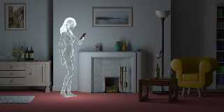
I've been playing with my IRTC entry from last year (the one that's
still on the IRTC home page!), with an end to putting a poster of it on
Zazzle. This will take some time, because I suspect it should be R-rated
in deference to Zazzle's slightly OTT content guidelines and, as I
previously mentioned, there is an issue with UK credit cards for age
validation at the moment.
However, I'm happy with the image itself, so I thought I'd post a
reduced version here. It differs from the original in several ways.
Firstly, I've completely changed the lighting. Radiosity is still used,
but only to deepen the shadows; the light is now cast be two crossed
area_lights roughly the same size as the ghost. This has the effect of
making everything much smoother, and does away with the lighting
artifacts. Secondly, and slightly more trivially, I've added some
objects in the room to provide a more detailed scene.
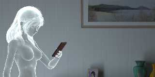
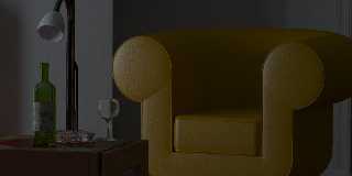
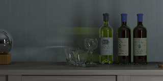
My only real issue is the photons used on the glasses and bottles in the
corner (see detail image). It looks better with than without, but
doesn't quite look like the ghost is causing them, despite using the
area_light keyword in the light source's photons block.
Anyway, hope y'all like the images.
Bill
Post a reply to this message
Attachments:
Download 'irtc_absence.jpg' (90 KB)
Download 'gl_detail03.jpg' (70 KB)
Download 'gl_detail02.jpg' (64 KB)
Download 'gl_detail01.jpg' (70 KB)
Preview of image 'irtc_absence.jpg'

Preview of image 'gl_detail03.jpg'

Preview of image 'gl_detail02.jpg'

Preview of image 'gl_detail01.jpg'

|
 |
|  |
|  |
|
 |
|
 |
|  |
|  |
|
 |
A magnificent image, Bill. The lighting is very smooth and very convincing.
I certainly like the photons, although indeed it seems difficult to relate
them to the ghost, but on the other hand, without, the scene would be less
'interesting'.
Thomas
Post a reply to this message
|
 |
|  |
|  |
|
 |
|
 |
|  |
|  |
|
 |
"Thomas de Groot" <t.d### [at] inter nlDOTnet> wrote in message
news:4704eba5$1@news.povray.org...
>A magnificent image, Bill. The lighting is very smooth and very convincing.
>I certainly like the photons, although indeed it seems difficult to relate
>them to the ghost, but on the other hand, without, the scene would be less
>'interesting'.
>
> Thomas
Still a great image.
I assume that the message of the picture is about the implicit absent
bereaved, what with the scattered 2 and 1 themes.
I can't help thinking that if the ghost were in the imperfect form of an old
woman, the dramatic impact would shift and the issue of nudity would become
irrelevant.
DLM nlDOTnet> wrote in message
news:4704eba5$1@news.povray.org...
>A magnificent image, Bill. The lighting is very smooth and very convincing.
>I certainly like the photons, although indeed it seems difficult to relate
>them to the ghost, but on the other hand, without, the scene would be less
>'interesting'.
>
> Thomas
Still a great image.
I assume that the message of the picture is about the implicit absent
bereaved, what with the scattered 2 and 1 themes.
I can't help thinking that if the ghost were in the imperfect form of an old
woman, the dramatic impact would shift and the issue of nudity would become
irrelevant.
DLM
Post a reply to this message
|
 |
|  |
|  |
|
 |
|
 |
|  |
|  |
|
 |
"dlm" <me### [at] address invalid> wrote:
> "Thomas de Groot" <t.d### [at] inter invalid> wrote:
> "Thomas de Groot" <t.d### [at] inter nlDOTnet> wrote in message
> news:4704eba5$1@news.povray.org...
> >A magnificent image, Bill. The lighting is very smooth and very convincing.
> >I certainly like the photons, although indeed it seems difficult to relate
> >them to the ghost, but on the other hand, without, the scene would be less
> >'interesting'.
My thoughts exactly, Thomas, and thank you.
> I assume that the message of the picture is about the implicit absent
> bereaved, what with the scattered 2 and 1 themes.
Well, the absence of the departed was in my mind, but you are quite correct,
it works either way.
> I can't help thinking that if the ghost were in the imperfect form of an old
> woman, the dramatic impact would shift and the issue of nudity would become
> irrelevant.
> DLM
True, but much harder to do and less pretty to look at! That never occurred
to me to be honest, what with the practicalities involved. Aren't ghosts
supposed to reflect who you think you are? ;-) And anyway, who's to say
that the lady in question didn't shuffle off her mortal coil before her
time... :-(
Bill nlDOTnet> wrote in message
> news:4704eba5$1@news.povray.org...
> >A magnificent image, Bill. The lighting is very smooth and very convincing.
> >I certainly like the photons, although indeed it seems difficult to relate
> >them to the ghost, but on the other hand, without, the scene would be less
> >'interesting'.
My thoughts exactly, Thomas, and thank you.
> I assume that the message of the picture is about the implicit absent
> bereaved, what with the scattered 2 and 1 themes.
Well, the absence of the departed was in my mind, but you are quite correct,
it works either way.
> I can't help thinking that if the ghost were in the imperfect form of an old
> woman, the dramatic impact would shift and the issue of nudity would become
> irrelevant.
> DLM
True, but much harder to do and less pretty to look at! That never occurred
to me to be honest, what with the practicalities involved. Aren't ghosts
supposed to reflect who you think you are? ;-) And anyway, who's to say
that the lady in question didn't shuffle off her mortal coil before her
time... :-(
Bill
Post a reply to this message
|
 |
|  |
|  |
|
 |
|
 |
|  |
|  |
|
 |
Bill Pragnell <bil### [at] hotmail com> wrote:
> I've been playing with my IRTC entry from last year (the one that's
>...
> Anyway, hope y'all like the images.
>
> Bill
I am speechless.
Except, how am I going to learn this ghost effect? Please maybe?
aQ com> wrote:
> I've been playing with my IRTC entry from last year (the one that's
>...
> Anyway, hope y'all like the images.
>
> Bill
I am speechless.
Except, how am I going to learn this ghost effect? Please maybe?
aQ
Post a reply to this message
|
 |
|  |
|  |
|
 |
|
 |
|  |
|  |
|
 |
I have loved this image since I first saw it.
my $0.02 worth here:
There should be something reflected in the glass covering the photos on
the wall and the lamp. The Lack of any sort of reflection there makes
the scene look like it was done on a 2 wall sitcom stage.
Anything: the same bookshelf, or a wall with a window, door and drapes -
even a patterned plane with amorphous shapes - placed behind the camera
and reflecting in the scene objects would give the scene more realism.
That said...
AWESOME WORK.
B
Post a reply to this message
|
 |
|  |
|  |
|
 |
|
 |
|  |
|  |
|
 |
Bill Pragnell <bil### [at] hotmail com> wrote:
> I've been playing with my IRTC entry from last year (the one that's
> still on the IRTC home page!),
[snip]
I think that this is looking better and better.
But thinking about it, it seems to me that the ghost is emitting too much
light and you can see too much from here glow. (She must have over done her
Weetabix:) To be this bright I think you would need your night vision and
that would mean loosing the colour from the scene. Or you could add an
external light that was seeping into the room and slightly illuminating it.
Stephen com> wrote:
> I've been playing with my IRTC entry from last year (the one that's
> still on the IRTC home page!),
[snip]
I think that this is looking better and better.
But thinking about it, it seems to me that the ghost is emitting too much
light and you can see too much from here glow. (She must have over done her
Weetabix:) To be this bright I think you would need your night vision and
that would mean loosing the colour from the scene. Or you could add an
external light that was seeping into the room and slightly illuminating it.
Stephen
Post a reply to this message
|
 |
|  |
|  |
|
 |
|
 |
|  |
|  |
|
 |
"Stephen" <mcavoys_AT_aolDOT.com> wrote in message
news:web.47063badae3c8c78726bd13c0@news.povray.org...
> Bill Pragnell <bil### [at] hotmail com> wrote:
>> I've been playing with my IRTC entry from last year (the one that's
>> still on the IRTC home page!),
>
> [snip]
>
> I think that this is looking better and better.
Agreed. It really is an excellent image and idea which is *well*
executed imo. (Nice one Bill).
> But thinking about it, it seems to me that the ghost is emitting too much
> light and you can see too much from here glow.
I wonder what would happen if that uplight was used instead for the main
lighting, and the intensity of the lady ghost was turned down a little? My
point being that the uplight would mostly be on the ceiling, casting light
over the ceiling and some of the room, but the lady ghost may 'stand out'
more as a ghost (not that she doesn't now). Worth experimenting I reckon
with such a good scene as this. (Keep your variations Bill!) ;)
(She must have over done her
> Weetabix:)
LOL! :) Did you mean her 'Ready Brek'?
~Steve~
> Stephen
>
> com> wrote:
>> I've been playing with my IRTC entry from last year (the one that's
>> still on the IRTC home page!),
>
> [snip]
>
> I think that this is looking better and better.
Agreed. It really is an excellent image and idea which is *well*
executed imo. (Nice one Bill).
> But thinking about it, it seems to me that the ghost is emitting too much
> light and you can see too much from here glow.
I wonder what would happen if that uplight was used instead for the main
lighting, and the intensity of the lady ghost was turned down a little? My
point being that the uplight would mostly be on the ceiling, casting light
over the ceiling and some of the room, but the lady ghost may 'stand out'
more as a ghost (not that she doesn't now). Worth experimenting I reckon
with such a good scene as this. (Keep your variations Bill!) ;)
(She must have over done her
> Weetabix:)
LOL! :) Did you mean her 'Ready Brek'?
~Steve~
> Stephen
>
>
Post a reply to this message
|
 |
|  |
|  |
|
 |
|
 |
|  |
|  |
|
 |
"alphaQuad" <alp### [at] earthlink net> wrote:
> I am speechless.
I'll take that as a positive comment! :)
> Except, how am I going to learn this ghost effect? Please maybe?
Well, it wasn't that easy to be honest. I took the DAZ model, posed it and
exported it as a .obj file. Then I opened it in Blender, plugged any holes
(mainly in the face), shrank it very slightly along its normals, then saved
it as a separate .obj file. Now I have two copies of the mesh, one very
slightly smaller than the other.
Next, I converted them to POV-Ray using PoseRay, and put them together as a
union. The inner mesh was textured a dark blue, and the outer mesh was made
transparent and filled with emitting media. In this way, you get a thin
shell over the mesh surface that is brighter at grazing angles because of
the additional viewing ray length, giving a glowing outline effect.
If desired, the inner mesh can be differenced from the outer mesh, then the
ghost will be fully transparent. Making the mesh fully closed is important,
otherwise holes will show up as saturated by the media colour. It's also
important to scale the mesh along its normals - using scale in POV-Ray will
not work.
The hair was imported into POV-Ray as a separate mesh and completely filled
with the same media.
(there may be a simpler way to do this with clever pigments, but I'm not
sure...)
Bill net> wrote:
> I am speechless.
I'll take that as a positive comment! :)
> Except, how am I going to learn this ghost effect? Please maybe?
Well, it wasn't that easy to be honest. I took the DAZ model, posed it and
exported it as a .obj file. Then I opened it in Blender, plugged any holes
(mainly in the face), shrank it very slightly along its normals, then saved
it as a separate .obj file. Now I have two copies of the mesh, one very
slightly smaller than the other.
Next, I converted them to POV-Ray using PoseRay, and put them together as a
union. The inner mesh was textured a dark blue, and the outer mesh was made
transparent and filled with emitting media. In this way, you get a thin
shell over the mesh surface that is brighter at grazing angles because of
the additional viewing ray length, giving a glowing outline effect.
If desired, the inner mesh can be differenced from the outer mesh, then the
ghost will be fully transparent. Making the mesh fully closed is important,
otherwise holes will show up as saturated by the media colour. It's also
important to scale the mesh along its normals - using scale in POV-Ray will
not work.
The hair was imported into POV-Ray as a separate mesh and completely filled
with the same media.
(there may be a simpler way to do this with clever pigments, but I'm not
sure...)
Bill
Post a reply to this message
|
 |
|  |
|  |
|
 |
|
 |
|  |
|  |
|
 |
Bryan Valencia <no### [at] way com> wrote:
> There should be something reflected in the glass covering the photos on
> the wall and the lamp. The Lack of any sort of reflection there makes
> the scene look like it was done on a 2 wall sitcom stage.
Hmm, I know what you mean, but I'd probably have to fake it. The light drops
off quite rapidly, so anything reflected would be extremely subtle and might
just look confusing, if visible at all. The glass ball is the only object
that really betrays the (intentional) simplicity of the setting.
Anyway, who says there's glass covering the photos? ;-)
> AWESOME WORK.
Thanks! com> wrote:
> There should be something reflected in the glass covering the photos on
> the wall and the lamp. The Lack of any sort of reflection there makes
> the scene look like it was done on a 2 wall sitcom stage.
Hmm, I know what you mean, but I'd probably have to fake it. The light drops
off quite rapidly, so anything reflected would be extremely subtle and might
just look confusing, if visible at all. The glass ball is the only object
that really betrays the (intentional) simplicity of the setting.
Anyway, who says there's glass covering the photos? ;-)
> AWESOME WORK.
Thanks!
Post a reply to this message
|
 |
|  |
|  |
|
 |
|
 |
|  |


![]()