 |
 |
|
 |
|
 |
|  |
|  |
|
 |
|
 |
|  |
|  |
|
 |
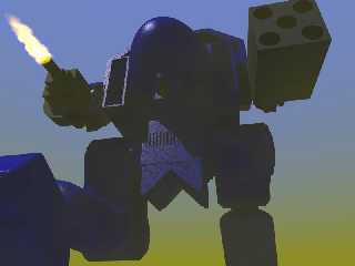
Attached is a WIP. Any suggestions. Things I know need doing are putting a
barrel hole into the chin mounted gun. The artifact around the flame (
caused by the fog ), Some greebling on the box gun and perhaps under the
foot. Any other suggestions or advice gladly accepted.
I'll be posting the code for the scene in p.t.s-f. The Mech is a fully
posable model generated by macro, so if anyone wants to animate it, I'd love
to see it.
--
#####-----#####-----#####
POV Tips and Hints at ...
http://povman.blogspot.com/
Post a reply to this message
Attachments:
Download 'BlueMech.jpg' (31 KB)
Preview of image 'BlueMech.jpg'

|
 |
|  |
|  |
|
 |
|
 |
|  |
|  |
|
 |
I forgot to say, the image was inspired by the cover of a book I'm reading.
http://www.amazon.co.uk/exec/obidos/ASIN/0451458931/qid%3D1148979859/026-1858057-4899608
--
#####-----#####-----#####
POV Tips and Hints at ...
http://povman.blogspot.com/
Post a reply to this message
|
 |
|  |
|  |
|
 |
|
 |
|  |
|  |
|
 |
I think you have a decent mech model there, but it's very obscured by poor
lighting and fog. Because of your light source's position, most of the model
is in shadow, and without radiosity that just makes it look like a dark
blob. Reconsider the primary light source's position, and then consider
adding a fill light and maybe a back light.
As far as the fog goes, the yellow color at the bottom is a little too
greenish IMO, and overall it desaturates your model a lot because it's in
the way. Maybe thin it out a little, or replace it with a more interesting
backround.
- Slime
[ http://www.slimeland.com/ ]
Post a reply to this message
|
 |
|  |
|  |
|
 |
|
 |
|  |
|  |
|
 |
>I think you have a decent mech model there, but it's very obscured by poor
> lighting and fog. Because of your light source's position, most of the
> model
> is in shadow, and without radiosity that just makes it look like a dark
> blob. Reconsider the primary light source's position, and then consider
> adding a fill light and maybe a back light.
>
> As far as the fog goes, the yellow color at the bottom is a little too
> greenish IMO, and overall it desaturates your model a lot because it's in
> the way. Maybe thin it out a little, or replace it with a more interesting
> backround.
Your right , so I've dropped the fog, added a fill light. I spent last
night Greebling. Next I'll try adding some clouds, then perhaps some
missile smoke trails...
--
#####-----#####-----#####
POV Tips and Hints at ...
http://povman.blogspot.com/
Post a reply to this message
|
 |
|  |
|  |
|
 |
|
 |
|  |


![]()