 |
 |
|
 |
|
 |
|  |
|  |
|
 |
|
 |
|  |
|  |
|
 |
Howdy,
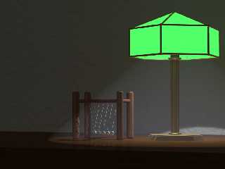
Not 100% happy with this but it's almost there .....
Besides the light bulb in the lamp, theres a light (shadowless) with short
fade distance up and behind the camera postion.
I used focal blur and a touch of emmission/scattering media inside a cone
for the affect from the lamp.
What am I missing? A few more items on the table?
Jim
Post a reply to this message
Attachments:
Download 'Kinetic Toy.png' (501 KB)
Preview of image 'Kinetic Toy.png'

|
 |
|  |
|  |
|
 |
|
 |
|  |
|  |
|
 |
Jim Holsenback wrote:
> Howdy,
>
> Not 100% happy with this but it's almost there .....
>
> Besides the light bulb in the lamp, theres a light (shadowless) with short
> fade distance up and behind the camera postion.
>
> I used focal blur and a touch of emmission/scattering media inside a cone
> for the affect from the lamp.
>
> What am I missing? A few more items on the table?
>
> Jim
>
>
>
Hi.
IMHO, by the fact that you use shadowless features you already miss
something. The shadow of the lower part of the green lamp should be seen
on the wall. Besides that, you have an hexagonal lamp and a conical
"spotlight" : it doesn't fit either.
If I were you I would try this :
- fill the entire room with media. I've done so with a pic I'm working
on, a room entirely filled with media which reacts only to a
light-source outside the room, and materializing a "light beam" (you'll
see it in this month's IRTC ;-) ).
- let the lamp do the job, adjusting filtering on the green material, so
that it does not let too mush light pass through.
- another way to make the light look better would be the "pass-through"
feature : make it pass through the hexagon, to get a more accurate light
effect (using that and a light_group might get a very good result
without being too much time-consuming).
- The ambience created with the scattering media is a bit dusty, but the
desk is really clean. Maybe you should try to add something on it
(items, or even dust).
Just my two cents, but nice pic.
BTW : what is that white artefact, in the center of the pic ?
Regis.
Post a reply to this message
|
 |
|  |
|  |
|
 |
|
 |
|  |
|  |
|
 |
regdo wrote:
> BTW : what is that white artefact, in the center of the pic ?
>
> Regis.
Forget about this, just a display bug on my screen ! ;-)
Regis
Post a reply to this message
|
 |
|  |
|  |
|
 |
|
 |
|  |
|  |
|
 |
Nice work, but you're not quite there yet. :-)
Rather than using clumsy words, I google'd to find a few photos that might
inspire you:
http://www.fotosearch.fr/bigcomps/phd/PHD260/SS12014.jpg
http://www.ashlingdesigns.com/ducks.html
http://www.allfunkystuff.net/images/Images%20Lamp/disneyprincess.jpg
Notice the lampshade materials. There are many other types of materials, of
course. These photos aren't the best, but I suggest you keep working a
little on your lampshade because its going to carry the scene anyway. Its
the lamp, people will notice first. Its the brightest object, its large,
and its almost in front of the camera. Well, I have never seen a lampshade
with such a "perfect" diffusion, like in your picture. I can't see the bulb
at all. Such diffusion may be perfect in a sense, but not particulary
interesting.
I also found another photo that has a really nice mood, perhaps you can use
it for something. Notice the beautiful light properties and the wood
structure.
http://www.itchy-animation.co.uk/tutorials/03-candles.jpg
I also think your camera location is a little odd. Its straight forward
which is a rather uncommon choice for a scene like this (unless you're
lying in bed?) Think: What is the purpose here? What am I trying to show
off? Currently your camera almost "hides" the scene, because it reduces the
feeling of depth. Also, the shape of the lamp is difficult to recognise
when it appears so asymmetric.
Good luck! :-)
Regards,
Hugo
Post a reply to this message
|
 |
|  |
|  |
|
 |
|
 |
|  |
|  |
|
 |
Thanks for the BOTH the inputs .....
I'm going after the lamp shade material suggestion. I also think filling the
room with media instead of just under the lamp shade is a good idea too.
Thanks Again!!! Jim
Post a reply to this message
|
 |
|  |
|  |
|
 |
|
 |
|  |
|
 |


![]()