 |
 |
|
 |
|
 |
|  |
|  |
|
 |
|
 |
|  |
|  |
|
 |
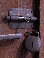
To relax a bit after the POVCOMP deadline stress, I've done a quick
test scene to see how easy/difficult is to work "a la professional" with
photographic textures. The modeling was done on Wings, except for the
wood isosurfaces, and the textures come from www.mayang.com. As it
turned too easy to just map the image textures, but also a bit faked, I
expend some time "proceduralizing" them.
At the end, as it was expected being a POV-Ray user, I get a feel of
"that's just too quick", but I must admit that I like the results.
--
Jaime
Post a reply to this message
Attachments:
Download 'pestillo-6pp.jpg' (75 KB)
Preview of image 'pestillo-6pp.jpg'

|
 |
|  |
|  |
|
 |
|
 |
|  |
|  |
|
 |
"Jaime Vives Piqueres" <jai### [at] ignorancia org> wrote in message
news:41fe74a8@news.povray.org
> To relax a bit after the POVCOMP deadline stress, I've done a
> quick test scene to see how easy/difficult is to work "a la
> professional" with photographic textures. The modeling was done on
> Wings, except for the wood isosurfaces, and the textures come from
> www.mayang.com. As it turned too easy to just map the image
> textures, but also a bit faked, I expend some time
> "proceduralizing" them.
>
> At the end, as it was expected being a POV-Ray user, I get a
> feel of "that's just too quick", but I must admit that I like the
> results.
The hole where the key goes in looks a little funny. It seems as if the
metal is infinitely thin for some reason, or like someone has painted on a
black key-hole shape. Maybe if the edges were rounded so you could see a
little tiny bit inside the hole it would add to the realism. org> wrote in message
news:41fe74a8@news.povray.org
> To relax a bit after the POVCOMP deadline stress, I've done a
> quick test scene to see how easy/difficult is to work "a la
> professional" with photographic textures. The modeling was done on
> Wings, except for the wood isosurfaces, and the textures come from
> www.mayang.com. As it turned too easy to just map the image
> textures, but also a bit faked, I expend some time
> "proceduralizing" them.
>
> At the end, as it was expected being a POV-Ray user, I get a
> feel of "that's just too quick", but I must admit that I like the
> results.
The hole where the key goes in looks a little funny. It seems as if the
metal is infinitely thin for some reason, or like someone has painted on a
black key-hole shape. Maybe if the edges were rounded so you could see a
little tiny bit inside the hole it would add to the realism.
Post a reply to this message
|
 |
|  |
|  |
|
 |
|
 |
|  |
|  |
|
 |
Jaime Vives Piqueres wrote:
>
> As it ... I expend some time "proceduralizing" them.
Here's the best part, and you just glossed over it. Share more about how
you "proceduraliz[ed]" the photos.
> At the end, as it was expected being a POV-Ray user, I get a feel of
> "that's just too quick", but I must admit that I like the results.
photo reel.
-Shay
Post a reply to this message
|
 |
|  |
|  |
|
 |
|
 |
|  |
|  |
|
 |
scott wrote:
> The hole where the key goes in looks a little funny. It seems as if the
> metal is infinitely thin for some reason, or like someone has painted on a
> black key-hole shape. Maybe if the edges were rounded so you could see a
> little tiny bit inside the hole it would add to the realism.
You got me: the hole was poorly done, and was a simple extrusion to
the inside. I will try with Wings "intrude", and also making rounded
edges as you suggested, thanks!
--
Jaime
Post a reply to this message
|
 |
|  |
|  |
|
 |
|
 |
|  |
|  |
|
 |
Shay wrote:
>> As it ... I expend some time "proceduralizing" them.
>
> Here's the best part, and you just glossed over it. Share more about how
> you "proceduraliz[ed]" the photos.
Sorry, I was to explain it on the first post, but when I was
finishing the first paragraph I had to leave the house... damn
customers! Anyhow, here is the pending explanation:
In the case of the rusted metal, I made two textures from it, one
with a bit of specular and other with reflection, using the same image
also for the bump_map pattern.
Then I used a grayscale version of the image (using a function and
".gray") to act as pattern for a texture_map, which blends together both
finishes (that's a sort of "finish_map"). The pattern uses a scaled
turbulence (<.01,.01,1>) to hide a bit the planar mapping on the base
textures. I made two versions of this texture_map: for the most polished
parts I used a smooth map, while for the rusty parts the map changes
more abruptly and exposes only a little the reflecting texture.
And for the wood I simply used "filter all .9" on the image_map,
placing another layer bellow with a standard wood texture. This allows
to change the overall tone of the wood, maintaining the look of the
photographic texture. I later applied this also to the metal texture, so
I can change the coloring of the metal too (copper, bronze, iron,
etc...). I'm thinking now it would be nice to do a "Proceduralize()"
macro...
> photo reel.
Thanks, that's what I was trying to test: how easy it is to achieve
photorealism by using photographic textures.
--
Jaime
Post a reply to this message
|
 |
|  |
|  |
|
 |
|
 |
|  |
|  |
|
 |
Jaime Vives Piqueres wrote:
>
> To relax a bit after the POVCOMP deadline stress, I've done a quick
> test scene to see how easy/difficult is to work "a la professional" with
> photographic textures. The modeling was done on Wings, except for the
> wood isosurfaces, and the textures come from www.mayang.com. As it
> turned too easy to just map the image textures, but also a bit faked, I
> expend some time "proceduralizing" them.
>
> At the end, as it was expected being a POV-Ray user, I get a feel of
> "that's just too quick", but I must admit that I like the results.
>
> --
> Jaime
Very nice work on the door and latch. Certain parts still look too
"procedural" though, like the lock and the corners of the latch "pad"
where you can see some rough tessellation. You know this would probably
look really good if you backed the camera off just a bit.
Post a reply to this message
|
 |
|  |
|  |
|
 |
|
 |
|  |
|  |
|
 |
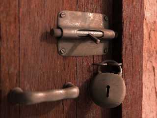
Thomas Lake wrote:
> Very nice work on the door and latch. Certain parts still look too
> "procedural" though, like the lock and the corners of the latch "pad"
> where you can see some rough tessellation.
Yep... but it's easy to solve with Wings3d: just select the
offending faces and smooth again.
> You know this would probably
> look really good if you backed the camera off just a bit.
Totally right, but I didn't think of it. Now that you said it, I
figured it would be nice to show a bit of the wall too. Thanks!
--
Jaime
Post a reply to this message
Attachments:
Download 'pestillo-10.jpg' (80 KB)
Preview of image 'pestillo-10.jpg'

|
 |
|  |
|  |
|
 |
|
 |
|  |
|  |
|
 |
Jaime Vives Piqueres wrote:
> Thomas Lake wrote:
>
>> Very nice work on the door and latch. Certain parts still look too
>> "procedural" though, like the lock and the corners of the latch "pad"
>> where you can see some rough tessellation.
>
>
> Yep... but it's easy to solve with Wings3d: just select the
> offending faces and smooth again.
>
>> You know this would probably look really good if you backed the camera
>> off just a bit.
>
>
> Totally right, but I didn't think of it. Now that you said it, I
> figured it would be nice to show a bit of the wall too. Thanks!
>
> --
> Jaime
>
>
> ------------------------------------------------------------------------
>
Really nice Jaime. I want to say you have a feel for metal, but of
course, all your textures are superb. Now, you converted the map to a (
pattern? or pigment ? ) function then used in a texture with a texture
map, but this could have been done equally with the image_map keyword,
correct?
Post a reply to this message
|
 |
|  |
|  |
|
 |
|
 |
|  |
|  |
|
 |
Jaime Vives Piqueres wrote:
> Thomas Lake wrote:
>
>> Very nice work on the door and latch. Certain parts still look too
>> "procedural" though, like the lock and the corners of the latch "pad"
>> where you can see some rough tessellation.
>
>
> Yep... but it's easy to solve with Wings3d: just select the
> offending faces and smooth again.
>
>> You know this would probably look really good if you backed the camera
>> off just a bit.
>
>
> Totally right, but I didn't think of it. Now that you said it, I
> figured it would be nice to show a bit of the wall too. Thanks!
Much nicer!
As Darren points out though the padlock looks a little off. Perhaps it's
the fact that it looks too round, almost cartoonish. I know that some
old padlocks look a bit like this but I think even old ones tend to have
a flatter face. Here are some examples:
http://www.charleslocksmith.com/Working_Padlocks.htm
Post a reply to this message
|
 |
|  |
|  |
|
 |
|
 |
|  |
|  |
|
 |
To me, the problem with the padlock is that it LOOKS empty, devoid of all
fuction, i.e. it has no tumblers inside. I'm not sure why it looks that
way, or what you can do to fix it, but it looks like a hollow tin shell.
I like the image, though. The textures certainly came out nicely, however
you did them.
-S
5TF!
Post a reply to this message
|
 |
|  |
|  |
|
 |
|
 |
|  |


![]()