 |
 |
|
 |
|
 |
|  |
|  |
|
 |
From: Derek Chen-Becker
Subject: Work in progress - spatial composition
Date: 15 Dec 2004 10:14:31
Message: <41c054d7@news.povray.org>
|
|
 |
|  |
|  |
|
 |
Hi,
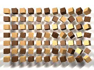
I've been toying around with this composition for a while and it's
to the point where I like it, but I think it could be refined a little
more. I spent a lot of time trying to get the wood textures to look
natural, and the finish is supposed to look burnished/oil rubbed. Comments?
Thanks,
Derek
Post a reply to this message
Attachments:
Download 'image.jpg' (140 KB)
Preview of image 'image.jpg'

|
 |
|  |
|  |
|
 |
|
 |
|  |
|  |
|
 |
Very nice textures, Derek. I'am wondering how do they look on a bigger
surface. Maybe putting one bigger cube would be a good opportunity to show
more of your beautiful textures?
In my opinion the image will be more interesting if you put there one object
different from the cubes. Maybe something bigger or with different shape,
colour or finish, or maybe just one piece placed free, without row/column
alignment. A kind of accent in your composition.
Anyway I like your image as it is.
Przemek
Post a reply to this message
|
 |
|  |
|  |
|
 |
From: Derek Chen-Becker
Subject: Re: Work in progress - spatial composition
Date: 15 Dec 2004 14:15:39
Message: <41c08d5b@news.povray.org>
|
|
 |
|  |
|  |
|
 |
Przemek Loesch wrote:
> Very nice textures, Derek. I'am wondering how do they look on a bigger
> surface. Maybe putting one bigger cube would be a good opportunity to show
> more of your beautiful textures?
The textures I'm using are actually just the standard T_Wood8 and
T_Wood10. Most of the work in getting them to look right was coming up
with good transformations to show the grain and keep them from looking
like bulls eyes.
> In my opinion the image will be more interesting if you put there one object
> different from the cubes. Maybe something bigger or with different shape,
> colour or finish, or maybe just one piece placed free, without row/column
> alignment. A kind of accent in your composition.
Hmmm. I hadn't thought of offsetting the composition, but that could
work well. I'll play around with that. Thanks for the comments!
Derek
Post a reply to this message
|
 |
|  |
|  |
|
 |
|
 |
|  |
|  |
|
 |
"Derek Chen-Becker" <pov### [at] chen-becker org> wrote in message
news:41c054d7@news.povray.org...
Comments?
That's nice. I agree with your 'oiled' statement on the lighter wood
blocks, I think you've got that just right. I've Linseed oiled a few cricket
bats in my time, and that's where I draw my conclusion from. Not sure about
the darker wood though and I'm guessing that it's simply because it is a
darker wood that I can't see the same.
Why not try reflection on the darker wood and leaving the lighter wood the
same? I think that might give a good contrast between the two.
~Steve~
> Thanks,
>
> Derek
>
-------------------------------------------------------------------------------- org> wrote in message
news:41c054d7@news.povray.org...
Comments?
That's nice. I agree with your 'oiled' statement on the lighter wood
blocks, I think you've got that just right. I've Linseed oiled a few cricket
bats in my time, and that's where I draw my conclusion from. Not sure about
the darker wood though and I'm guessing that it's simply because it is a
darker wood that I can't see the same.
Why not try reflection on the darker wood and leaving the lighter wood the
same? I think that might give a good contrast between the two.
~Steve~
> Thanks,
>
> Derek
>
--------------------------------------------------------------------------------
Post a reply to this message
|
 |
|  |
|  |
|
 |
|
 |
|  |
|  |
|
 |
Derek Chen-Becker nous apporta ses lumieres ainsi en ce 2004-12-15
10:14... :
> Hi,
> I've been toying around with this composition for a while and it's
> to the point where I like it, but I think it could be refined a little
> more. I spent a lot of time trying to get the wood textures to look
> natural, and the finish is supposed to look burnished/oil rubbed.
> Comments?
>
> Thanks,
>
> Derek
>
> ------------------------------------------------------------------------
>
Your area_light show some artifacts. look like you are using adaptive
with a to low value, try 1 or 2 with an area_light at least 5 (for
adaptive 1) or 9 (for adaptive 2). I commonly use area_light of 17*17,
sometimes even more, with adaptive 0 or 1 for extra smooth shadows and
fast renders.
Ex.: area_light x*2, y*2, 17, 17 adaptive 1 circular orient jitter
//with those values jitter is less usefull
Some variable reflection, along with fresnel can be nice. Don't forget
to add a "dummy" interior with an ior value if you use fresnel.
Put some small, possibly randomized, rotation on the textures. The grain
is to parallel to the sides.
Take what you like, discard the rest.
Alain
Post a reply to this message
|
 |
|  |
|  |
|
 |
|
 |
|  |


![]()