 |
 |
|
 |
|
 |
|  |
|  |
|
 |
|
 |
|  |
|  |
|
 |
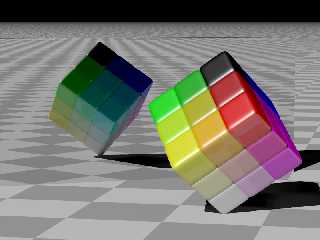
A quick sketch of an idea I had. If I end up developing it I hope to
replace the ugly checkered floor with something else (either texture or
objects placed on it) that can illustrate the slightly reflective
texture of the cubes. I'll need to replace the mirror with something
more...natural, or else just add a second cube to the image.
Post a reply to this message
Attachments:
Download 'color-cube.jpg' (115 KB)
Preview of image 'color-cube.jpg'

|
 |
|  |
|  |
|
 |
|
 |
|  |
|  |
|
 |
Nice. I really like this. It makes me think of Alain's marble bowling
animations. Do you think you could animate this and have the individual
cubes slide apart and fall to the floor and bounce around a little bit like
dice till they came to a stop? Since these aren't spheres that might be
harder to do... then again maybe not. Personally I think I'd leave the
mirror. The animation would make it clear that we were looking at one cube
and a mirror and not two cubes. The mirror could also serve as a wall the
cubes could bounce into. As is it took me a little while to figure out what
the black line running across the top of the scene was. Maybe it would
look better with a frame around the mirror. Still very nice. I like the
subject.
Carl
Post a reply to this message
|
 |
|  |
|  |
|
 |
|
 |
|  |
|  |
|
 |
Could you post the "finish" you used on the cubes. I love that look!
"Edward Coffey" <eco### [at] swiftdsl com com au> wrote in message
news:402b3806@news.povray.org...
> A quick sketch of an idea I had. If I end up developing it I hope to
> replace the ugly checkered floor with something else (either texture or
> objects placed on it) that can illustrate the slightly reflective
> texture of the cubes. I'll need to replace the mirror with something
> more...natural, or else just add a second cube to the image.
>
----------------------------------------------------------------------------
---- au> wrote in message
news:402b3806@news.povray.org...
> A quick sketch of an idea I had. If I end up developing it I hope to
> replace the ugly checkered floor with something else (either texture or
> objects placed on it) that can illustrate the slightly reflective
> texture of the cubes. I'll need to replace the mirror with something
> more...natural, or else just add a second cube to the image.
>
----------------------------------------------------------------------------
----
Post a reply to this message
|
 |
|  |
|  |
|
 |
|
 |
|  |
|  |
|
 |
> Do you think you could animate this and have the individual
> cubes slide apart and fall to the floor and bounce around a little bit like
> dice till they came to a stop? Since these aren't spheres that might be
> harder to do... then again maybe not.
Should be pretty easy using Christoph Hormann's SimPOV or MegaPOV 1.0
which has the SimPOV-patch included.
SimPOV Homepage:
http://www-public.tu-bs.de:8080/~y0013390/simpov/index.html
MegaPOV Homepage:
http://megapov.inetart.net/
HTH,
Florian
Post a reply to this message
|
 |
|  |
|  |
|
 |
|
 |
|  |
|  |
|
 |
"Edward Coffey" <eco### [at] swiftdsl com com au> wrote in message
news:402b3806@news.povray.org...
> A quick sketch of an idea I had. If I end up developing it I hope to
> replace the ugly checkered floor with something else (either texture or
> objects placed on it) that can illustrate the slightly reflective
> texture of the cubes. I'll need to replace the mirror with something
> more...natural, or else just add a second cube to the image.
Looks cool! That one cube on the corner seems black and out of place -- was
that intentional? au> wrote in message
news:402b3806@news.povray.org...
> A quick sketch of an idea I had. If I end up developing it I hope to
> replace the ugly checkered floor with something else (either texture or
> objects placed on it) that can illustrate the slightly reflective
> texture of the cubes. I'll need to replace the mirror with something
> more...natural, or else just add a second cube to the image.
Looks cool! That one cube on the corner seems black and out of place -- was
that intentional?
Post a reply to this message
|
 |
|  |
|  |
|
 |
|
 |
|  |
|  |
|
 |
Florian Brucker wrote:
>
>> Do you think you could animate this and have the individual
>> cubes slide apart and fall to the floor and bounce around a little bit
>> like
>> dice till they came to a stop? Since these aren't spheres that might be
>> harder to do... then again maybe not.
>
>
> Should be pretty easy using Christoph Hormann's SimPOV or MegaPOV 1.0
> which has the SimPOV-patch included.
I'll have to have a look at that. My computer might as well be rendering
an animation at the moment, there's something wrong with the graphics
adaptor which makes it crash randomly when used in anything other than
text-mode :?(
Post a reply to this message
|
 |
|  |
|  |
|
 |
|
 |
|  |
|  |
|
 |
Felbrigg wrote:
> Could you post the "finish" you used on the cubes. I love that look!
Sure, the texture is just a simple solid pigment and the following
finish settings:
specular 1
roughness 0.03
reflection 0.1
It's really very simple - I think it's partly the radiosity (especially
in the image reflected in the mirror) and partly the scale and position
of the checker pattern (I tweaked it specifically to show off the
"reflection 0.1" aspect of the finish) that make this finish look okay.
I should probably give it angle dependant reflection one day.
Post a reply to this message
|
 |
|  |
|  |
|
 |
|
 |
|  |
|  |
|
 |
Dan P wrote:
> Looks cool! That one cube on the corner seems black and out of place -- was
> that intentional?
I'd like it to fit in more, but it definitely is supposed to be black.
The cube represents a simplified RGB colorspace, each axis of the cube
represents one of the three primary colors - Red, Green and Blue. The
cube at the top is obviously color <0,0,0>, the one at the bottom is
<1,1,1>, the other 6 corner cubes are <1,0,0>, <1,1,0>, <0,1,0>,
<0,1,1>, <0,0,1> and <1,0,1>. I built it to be configurable, so you can
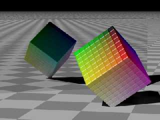
just plug in the number of cubes you want along each edge. Here's one
rendered with 8x8x8 cubes (well, superellipsoids actually, which makes
it hard to know exactly where in the y axis to place the object to get
it to stand on its end - I rendered this one with the same translation
as the 3x3x3 version so the white superellipsoid sticks through the floor):
Post a reply to this message
Attachments:
Download 'color-cube8.jpg' (33 KB)
Preview of image 'color-cube8.jpg'

|
 |
|  |
|  |
|
 |
|
 |
|  |
|  |
|
 |
Among other things, Edward Coffey wrote:
> (well, superellipsoids actually, which makes
> it hard to know exactly where in the y axis to place the object to get
> it to stand on its end - I rendered this one with the same translation
> as the 3x3x3 version so the white superellipsoid sticks through the
> floor):
The function/macro "trace" could be useful for that.
--
light_source{9+9*x,1}camera{orthographic look_at(1-y)/4angle 30location
9/4-z*4}light_source{-9*z,1}union{box{.9-z.1+x clipped_by{plane{2+y-4*x
0}}}box{z-y-.1.1+z}box{-.1.1+x}box{.1z-.1}pigment{rgb<.8.2,1>}}//Jellby
Post a reply to this message
|
 |
|  |
|  |
|
 |
|
 |
|  |
|  |
|
 |
"Edward Coffey" <eco### [at] swiftdsl com com au> wrote in message
news:402be6ff@news.povray.org...
> Dan P wrote:
> > Looks cool! That one cube on the corner seems black and out of place --
was
> > that intentional?
>
> I'd like it to fit in more, but it definitely is supposed to be black.
> The cube represents a simplified RGB colorspace, each axis of the cube
> represents one of the three primary colors - Red, Green and Blue. The
> cube at the top is obviously color <0,0,0>, the one at the bottom is
> <1,1,1>, the other 6 corner cubes are <1,0,0>, <1,1,0>, <0,1,0>,
> <0,1,1>, <0,0,1> and <1,0,1>. I built it to be configurable, so you can
> just plug in the number of cubes you want along each edge. Here's one
> rendered with 8x8x8 cubes (well, superellipsoids actually, which makes
> it hard to know exactly where in the y axis to place the object to get
> it to stand on its end - I rendered this one with the same translation
> as the 3x3x3 version so the white superellipsoid sticks through the
floor):
>
Ah, got it! This picture just makes me want to grab it and start spinning
parts of it :-)
Great concept!!! If you render the cubes so that you can see all sides, you
could make money off a poster for artists. I can totally see this on a
designer's wall!!!!! au> wrote in message
news:402be6ff@news.povray.org...
> Dan P wrote:
> > Looks cool! That one cube on the corner seems black and out of place --
was
> > that intentional?
>
> I'd like it to fit in more, but it definitely is supposed to be black.
> The cube represents a simplified RGB colorspace, each axis of the cube
> represents one of the three primary colors - Red, Green and Blue. The
> cube at the top is obviously color <0,0,0>, the one at the bottom is
> <1,1,1>, the other 6 corner cubes are <1,0,0>, <1,1,0>, <0,1,0>,
> <0,1,1>, <0,0,1> and <1,0,1>. I built it to be configurable, so you can
> just plug in the number of cubes you want along each edge. Here's one
> rendered with 8x8x8 cubes (well, superellipsoids actually, which makes
> it hard to know exactly where in the y axis to place the object to get
> it to stand on its end - I rendered this one with the same translation
> as the 3x3x3 version so the white superellipsoid sticks through the
floor):
>
Ah, got it! This picture just makes me want to grab it and start spinning
parts of it :-)
Great concept!!! If you render the cubes so that you can see all sides, you
could make money off a poster for artists. I can totally see this on a
designer's wall!!!!!
Post a reply to this message
|
 |
|  |
|  |
|
 |
|
 |
|  |


![]()