 |
 |
|
 |
|
 |
|  |
|  |
|
 |
|
 |
|  |
|  |
|
 |
Hello everybody.
Every time you install Windows NT, the default background colour is always
rgb <0, 0.5, 0.5>. I think this is the most boring and annoying colour that
is mathematically possible! I hate it! I wish I could reverse-engineer the
whole operating system and just annyalate every single occurance of this
retchid colour!
But anyway, since that's not possible, I have another idea. I thought I
could create a nice backdrop image and beam it to all our computers over the
network, then remotely edit the registry to set it to use it. (When no one
is logged in at least. I found out how to change the settings used when *no
one* is logged on - while I was on a course actually! Usefull... now I can
make it so that the NumLock key doesn't keep switching off every single
frigging time you log out!)
Anyway, that psuedo-random ramble leads us back to the subject of POV-Ray.
If I'm going to put a nice backdrop on all the computers, first I need to
create such a backdrop! And what's the best drawing tool in the universe?
(Oh ok, maybe that's overstating it ;-) I thought if I'm going to have a
standard backdrop it should probably have the company logo in it. Other than
that, I was pretty clueless.
After many different ideas (rippling water, various hi-tech texturing
options, maybe a cloud of smoke...) I eventually came up with bubbles -
because even an inferior being like myself get (just about) get bubbles to
work!
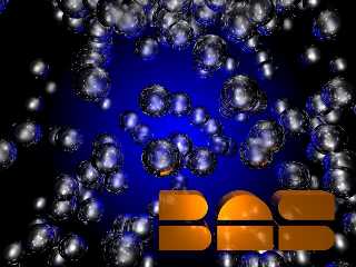
The first image shows what I came up with. Each "bubble" is a transparent
sphere with fresnel variable reflection and an IOR of 1/1.33 (the idea being
to make it look like it's a bubble of AIR surrounded by WATER - is my logic
correct?) The image looked great... but when I tried to use it as a
backdrop, I discovered that a clump of bubbles down the left-side somewhat
obscured all the icons. To remedy this, I turned the highlights on the
bubbles down, and then I flipped the bubble positions along the X-axis. (The
positions are random; I suppose I could have tried using a different seed
value instead...) The image attached is what I got AFTER having done these
things.
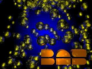
Still a bit obscure, so I tried making the lighting yellow instead of white.
(The blue glow is an ambient=1 texture on a distant plane.) Since the logo
is orange (and has metallic reflection) it makes no difference there. With
the highlights now being yellow, the icons show up better IMHO... Opinions?
By the way... does anyone know of a cheap algorithm for "randomly" placing
the spheres a little more evenly? I mean, I want to have slight gaps and
slight clumps, but I'd like it to be a little more even. (And perhaps have
the bubbles avoid the left side slightly.) Most particularly, I don't want
the bubbles to intersect each other! (This scene already takes way too long
to render without using a merge!)
Just for the purpose of avoiding intersections, I could simply store an
array of bubble coordinates and radii, and which each new sphere against
that... anyone know of a cheaper way?
Thanks.
Andrew.
PS. You have no IDEA how closely that logo matches the real thing!!! I'm
really proud that I got it so right... Even the colour is right! (The "S"
was the hardest part... the top and bottom don't line up; if you line them
up it looks wrong. So you have to slightly un-align them to get the correct
optical illusion!)
Post a reply to this message
Attachments:
Download 'BAS6.jpg' (83 KB)
Download 'BAS7.jpg' (90 KB)
Preview of image 'BAS6.jpg'

Preview of image 'BAS7.jpg'

|
 |
|  |
|  |
|
 |
|
 |
|  |
|  |
|
 |
Andrew Coppin wrote:
>
> Hello everybody.
Hi.
> With the highlights now being yellow, the icons show up better IMHO... Opinions?
From a strictly first impression, I prefer the first image... looks again...
...yep, I like the first image better.
--
Ken Tyler
Post a reply to this message
|
 |
|  |
|  |
|
 |
|
 |
|  |
|  |
|
 |
Neeeeeeeeeat. I like the first image as well.
Aaron
"Ken" <tyl### [at] pacbell net> wrote in message
news:3EABFC09.4251CB59@pacbell.net...
>
>
> Andrew Coppin wrote:
> >
> > Hello everybody.
>
> Hi.
>
> > With the highlights now being yellow, the icons show up better IMHO...
Opinions?
>
> From a strictly first impression, I prefer the first image... looks
again...
> ...yep, I like the first image better.
>
> --
> Ken Tyler net> wrote in message
news:3EABFC09.4251CB59@pacbell.net...
>
>
> Andrew Coppin wrote:
> >
> > Hello everybody.
>
> Hi.
>
> > With the highlights now being yellow, the icons show up better IMHO...
Opinions?
>
> From a strictly first impression, I prefer the first image... looks
again...
> ...yep, I like the first image better.
>
> --
> Ken Tyler
Post a reply to this message
|
 |
|  |
|  |
|
 |
|
 |
|  |
|  |
|
 |
Yeah, I definitely prefer the first one too (esp. before I turned down the
shininess...) But like I said, you can't make out the icons above it. The
yellow isn't too hot though (the logo is already orange, so you need a
contrast really). I tried it with red and green lights, but it looked
Andrew.
Post a reply to this message
|
 |
|  |
|  |
|
 |
|
 |
|  |
|  |
|
 |
/* Hi Andrew,
The first picture looks much better than the second! What about shifting
the blue glow to the left to let the icons stand out more?
Aligning of rounded and non-rounded objects is difficult, only a mis-
alignment will look right. You can see this by close inspection of
characters standing on their base line: those with a round bottom
actually are slightly below the base line!
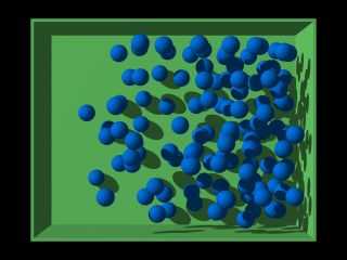
My idea to place evenly distributed random bubbles is this:
Imagine an NX*NY*NZ-array of 1*1*1-boxes. Every box either is empty or
contains one bubble with a probability P (which may depend on the position
of the box). The bubble must stay within the box, but may occupy any
position within (so the radius must be <0.5). To create more irregularity,
each "x-y-sheet" of boxes is translated by a random y amount. Each x-row
of boxes is additionally translated by a random x-amount. A complete scene
follows; just copy this whole post to POV-Ray and render it with the
command line options shown below.
Sputnik
--
----------------------------
fr### [at] computermuseum fh-kiel fh-kiel de
----------------------------
*/
// random bubbles
// -F +D +W800 +H600 +A0.1 +AM2 +R3
#declare NX = 8; // number of bubbles in x-direction (right)
#declare NY = 6; // number of bubbles in y-direction (up)
#declare NZ = 5; // number of bubbles in z-direction (away)
#declare Rmax = 0.3; // max. bubble radius (<0.5)
#declare Rmin = Rmax;//*0.7; // min. bubble radius (<=Rmax)
#declare Rand = seed(1234);
#declare BubbleTex = texture {
pigment { color rgb <0, .5, 1> }
finish { ambient .3 }
}
light_source { <-100, 60, -80>, rgb 1 }
camera { location -4*NX*z look_at 0 angle 20 }
// loop through NX*NY*NZ possible bubble positions
union {
#declare Z = 0;
#while (Z<NZ)
#declare Y = rand(Rand); // vary y of each x-y-plane of bubbles
#while (Y<NY)
#declare X = rand(Rand); // vary x of each x-row of bubbles
#while (X<NX)
// create a sphere with probability P
#declare P = X/NX;
#if (rand(Rand)<P)
// chose a random radius R
#declare R = Rmin+(Rmax-Rmin)*rand(Rand);
// put sphere with radius R at a random position
// completely inside box{<NX,NY,NZ>,<NX+1,NY+1,NZ+1>}
#declare ShiftMax = 1-2*R;
sphere { < X+R+ShiftMax*rand(Rand),
Y+R+ShiftMax*rand(Rand),
Z>,
R
}
#end//if
#declare X = X+1;
#end//while X
#declare Y = Y+1;
#end//while Y
#declare Z = Z+1;
#end//while Z
texture { BubbleTex }
translate -0.5*<NX+1, NY+1, 0>
}//union
// container for all possible bubbles
difference {
box { <-NX/2-0.6, -NY/2-0.6, -Rmax >, <NX/2+0.6, NY/2+0.6, NZ-0.9+Rmax > }
box { <-NX/2-0.5, -NY/2-0.5, -Rmax-0.1>, <NX/2+0.5, NY/2+0.5, NZ-1+Rmax> }
texture { pigment { color rgb <.5, 1, .5> } finish { ambient .3 } }
no_shadow
} de
----------------------------
*/
// random bubbles
// -F +D +W800 +H600 +A0.1 +AM2 +R3
#declare NX = 8; // number of bubbles in x-direction (right)
#declare NY = 6; // number of bubbles in y-direction (up)
#declare NZ = 5; // number of bubbles in z-direction (away)
#declare Rmax = 0.3; // max. bubble radius (<0.5)
#declare Rmin = Rmax;//*0.7; // min. bubble radius (<=Rmax)
#declare Rand = seed(1234);
#declare BubbleTex = texture {
pigment { color rgb <0, .5, 1> }
finish { ambient .3 }
}
light_source { <-100, 60, -80>, rgb 1 }
camera { location -4*NX*z look_at 0 angle 20 }
// loop through NX*NY*NZ possible bubble positions
union {
#declare Z = 0;
#while (Z<NZ)
#declare Y = rand(Rand); // vary y of each x-y-plane of bubbles
#while (Y<NY)
#declare X = rand(Rand); // vary x of each x-row of bubbles
#while (X<NX)
// create a sphere with probability P
#declare P = X/NX;
#if (rand(Rand)<P)
// chose a random radius R
#declare R = Rmin+(Rmax-Rmin)*rand(Rand);
// put sphere with radius R at a random position
// completely inside box{<NX,NY,NZ>,<NX+1,NY+1,NZ+1>}
#declare ShiftMax = 1-2*R;
sphere { < X+R+ShiftMax*rand(Rand),
Y+R+ShiftMax*rand(Rand),
Z>,
R
}
#end//if
#declare X = X+1;
#end//while X
#declare Y = Y+1;
#end//while Y
#declare Z = Z+1;
#end//while Z
texture { BubbleTex }
translate -0.5*<NX+1, NY+1, 0>
}//union
// container for all possible bubbles
difference {
box { <-NX/2-0.6, -NY/2-0.6, -Rmax >, <NX/2+0.6, NY/2+0.6, NZ-0.9+Rmax > }
box { <-NX/2-0.5, -NY/2-0.5, -Rmax-0.1>, <NX/2+0.5, NY/2+0.5, NZ-1+Rmax> }
texture { pigment { color rgb <.5, 1, .5> } finish { ambient .3 } }
no_shadow
}
Post a reply to this message
Attachments:
Download 'Bubbles.jpg' (14 KB)
Preview of image 'Bubbles.jpg'

|
 |
|  |
|  |
|
 |
|
 |
|  |
|  |
|
 |
OK, I'm *thick*... It just occurred to me... I'm planning to use this as the
backdrop WHEN NO-ONE IS LOGGED IN! So you don't NEED to be able to see icons
above it before THERE WON'T BE ANY!
God I'm dense sometimes... :'-(
Will keep the cool #1 image :-)
Andrew.
Post a reply to this message
|
 |
|  |
|  |
|
 |
|
 |
|  |
|  |
|
 |
> Aligning of rounded and non-rounded objects is difficult, only a mis-
> alignment will look right. You can see this by close inspection of
> characters standing on their base line: those with a round bottom
> actually are slightly below the base line!
Hmmm... I can believe that...
> My idea to place evenly distributed random bubbles is this:
Was thinking something vaguely similar myself... I think your idea might
work better though. (It's late, haven't really studied it too much yet - but
I will do later ;-)
Thanks.
Andrew.
Post a reply to this message
|
 |
|  |
|  |
|
 |
|
 |
|  |
|  |
|
 |
I agree with those who prefer the first image, although either would
certainly be an improvement over that gross green microsoft color.
The bubbles don't look all that much like bubbles to me, though...have
you played around with iridesence at all?
Hope you'll post the final version!
-Ed
Post a reply to this message
|
 |
|  |
|  |
|
 |
|
 |
|  |
|  |
|
 |
> I agree with those who prefer the first image, although either would
> certainly be an improvement over that gross green microsoft color.
No arguments here! :-)
> The bubbles don't look all that much like bubbles to me, though...have
> you played around with iridesence at all?
Ooo, hey - no, I hadn't thought of that... that could look really good...
Thanks.
Andrew.
Post a reply to this message
|
 |
|  |
|  |
|
 |
|
 |
|  |
|
 |


![]()