 |
 |
|
 |
|
 |
|  |
|  |
|
 |
|
 |
|  |
|  |
|
 |
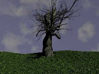
Django asked that I re-do my irtc winter image
(http://www.irtc.org/ftp/pub/stills/2002-04-30/tmwinter.jpg), but in summer.
I decided to do some additional work on the textures (hence my rock-texture a
couple of days ago).
I'm chuffed with my new bark.
... and thanks to GT for the grass.
--
#macro A(V,B,C,R)#while(B-256)#if(V-128/B>=0)sphere{0,.5translate<C-4R-1,9>
pigment{rgb<1-C/8R/2C/8>}}#local V=V-128/B;#end#local B=B*2;#local C=C+1;#
end#end A(234,1,0,2)A(85,1,0,1)A(81,1,0,0)light_source{-5 1}//Tom Melly
Post a reply to this message
Attachments:
Download 'tree_wip_1.jpg' (113 KB)
Preview of image 'tree_wip_1.jpg'

|
 |
|  |
|  |
|
 |
|
 |
|  |
|  |
|
 |
"Tom Melly" <tom### [at] tomandlu co co uk> wrote in message
news:3e2ec0c8@news.povray.org...
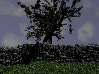
and with leaves and stone wall... uk> wrote in message
news:3e2ec0c8@news.povray.org...
and with leaves and stone wall...
Post a reply to this message
Attachments:
Download 'tree_wip_2.jpg' (119 KB)
Preview of image 'tree_wip_2.jpg'

|
 |
|  |
|  |
|
 |
|
 |
|  |
|  |
|
 |
What I liked best was the tangle of branches and the tactility of the
bark. Both those elements are downplayed in the second version. I
think the leaves silhouette could take on some poignancy against the
sky, but the wall is crowding the scene somehow. Maybe if the wall was
lower or the tree partially dead?
Post a reply to this message
|
 |
|  |
|  |
|
 |
|
 |
|  |
|  |
|
 |
"Tom Melly" <tom### [at] tomandlu co co uk> wrote
> I'm chuffed with my new bark.
>
.. and so you should be. Excellent texturing.
Any chance of a look at the code
John
--
Run Fast
Run Free
Run Linux uk> wrote
> I'm chuffed with my new bark.
>
.. and so you should be. Excellent texturing.
Any chance of a look at the code
John
--
Run Fast
Run Free
Run Linux
Post a reply to this message
|
 |
|  |
|  |
|
 |
|
 |
|  |
|  |
|
 |
i agree!
but i think a solution could be to put the wall behind the tree!
the shadows just need some fill lighting
nice tree Tom!
Jim Charter wrote:
> What I liked best was the tangle of branches and the tactility of the
> bark. Both those elements are downplayed in the second version. I
> think the leaves silhouette could take on some poignancy against the
> sky, but the wall is crowding the scene somehow. Maybe if the wall
> was lower or the tree partially dead?
>
Post a reply to this message
|
 |
|  |
|  |
|
 |
|
 |
|  |
|  |
|
 |
"Doctor John" <jgu### [at] netscape net> wrote in message
news:3e2efb58$1@news.povray.org...
> >
> .. and so you should be. Excellent texturing.
>
> Any chance of a look at the code
>
I'll post once I've tidied up - thanks. net> wrote in message
news:3e2efb58$1@news.povray.org...
> >
> .. and so you should be. Excellent texturing.
>
> Any chance of a look at the code
>
I'll post once I've tidied up - thanks.
Post a reply to this message
|
 |
|  |
|  |
|
 |
|
 |
|  |
|  |
|
 |
Hmm, thanks Ben and Jim - yeah, I feel the leaves are hiding too much, but
better lighting might resolve that. I did try cutting down on the leaves, but Lu
complained.
Moving the wall sounds a good idea - except that my intent was to render the
same scene as the winter version (still, that's screwed now anyway, since I
won't be able to reproduce *exactly* the same tree in both versions).
Post a reply to this message
|
 |
|  |
|  |
|
 |
|
 |
|  |
|  |
|
 |
3e2ec0c8@news.povray.org...
> I decided to do some additional work on the textures (hence my
rock-texture a
> couple of days ago).
That tree is just great and well-textured, it looks like one of these great
Andrew Wyeth sycamore tree paintings.
(best link I could find,
sorry)http://www.cs.utk.edu/~plank/chppic/tmp/98.12.25/dec25008.jpg
...but could you fix that sky? It must be the darkest summer sky I've ever
seen, even in UK... I'm just looking at a reference photo and the blue is
rgb <98,144,204>/255 while yours is an ominous rgb <97,97,123>/255. (it's a
WIP, I know, I know)
G.
--
**********************
http://www.oyonale.com
**********************
- Graphic experiments
- POV-Ray and Poser computer images
- Posters
Post a reply to this message
|
 |
|  |
|  |
|
 |
|
 |
|  |
|  |
|
 |
WaheeEEEY!
I'm not sure about that grass, but what a tree! Man, that's fantastic!!! You
should do this for a living or something... (Or maybe you do? How would I
know... LOL)
But seriously - it looks realistic, and it looks dramatic and eye-catching.
Lovely shapes and gorgeous textures... What more do you need? 8-D
Well... <smiles sweetly> actually, something or other seems to have chopped
bits out of the smaller twigs. Oh, and about that second version... the wall
looks somehow wrong - maybe just too many shaddows - and the leaves do hide
too much. They look a good shape though - probably just needs different
lighting.
Did I mention "wow"?
Andrew.
Post a reply to this message
|
 |
|  |
|  |
|
 |
|
 |
|  |
|  |
|
 |
"Gilles Tran" <tra### [at] inapg inra inra fr> wrote in message
news:3e304455$1@news.povray.org...
>
> That tree is just great and well-textured, it looks like one of these great
> Andrew Wyeth sycamore tree paintings.
> (best link I could find,
> sorry)http://www.cs.utk.edu/~plank/chppic/tmp/98.12.25/dec25008.jpg
>
http://www.gallery-ii.com/wyeth_pennsylvania_landscape.htm maybe? (nice - prior
to hunting, the only Wyeth I knew was Christina's World)
> ...but could you fix that sky? It must be the darkest summer sky I've ever
> seen, even in UK... I'm just looking at a reference photo and the blue is
> rgb <98,144,204>/255 while yours is an ominous rgb <97,97,123>/255. (it's a
> WIP, I know, I know)
<0.5,0.5,0.85> but with light 0.5 ;) - but I'll try your suggestion. At some
moment I'm going to play with volumetric clouds. I have some nice cloud code
around from old megapov, but I haven't worked out yet if it translates to 3.5 at
all.
I'm currently working on the grass and rock textures - and looking forward to
trying out the double/triple layered grass that others have played with - a
green layer, a dead layer and a 'straw' layer (i.e. a few high thin yellow
strands). fr> wrote in message
news:3e304455$1@news.povray.org...
>
> That tree is just great and well-textured, it looks like one of these great
> Andrew Wyeth sycamore tree paintings.
> (best link I could find,
> sorry)http://www.cs.utk.edu/~plank/chppic/tmp/98.12.25/dec25008.jpg
>
http://www.gallery-ii.com/wyeth_pennsylvania_landscape.htm maybe? (nice - prior
to hunting, the only Wyeth I knew was Christina's World)
> ...but could you fix that sky? It must be the darkest summer sky I've ever
> seen, even in UK... I'm just looking at a reference photo and the blue is
> rgb <98,144,204>/255 while yours is an ominous rgb <97,97,123>/255. (it's a
> WIP, I know, I know)
<0.5,0.5,0.85> but with light 0.5 ;) - but I'll try your suggestion. At some
moment I'm going to play with volumetric clouds. I have some nice cloud code
around from old megapov, but I haven't worked out yet if it translates to 3.5 at
all.
I'm currently working on the grass and rock textures - and looking forward to
trying out the double/triple layered grass that others have played with - a
green layer, a dead layer and a 'straw' layer (i.e. a few high thin yellow
strands).
Post a reply to this message
|
 |
|  |
|  |
|
 |
|
 |
|  |


![]()