 |
 |
|
 |
|
 |
|  |
|  |
|
 |
|
 |
|  |
|  |
|
 |
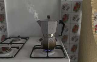
A close up of the coffee percolator with steam and bluish fire.
Render time is not significant (>11 hours), since the last two-three lines took 3
hours to render (still have to figure why) so I had to kill the render (this is a
cropped image).
As always C&C is welcome.
P.S. This time the autocontrast correction gave me a very bright image, so I didn't
use it. This is understandable, since the range of brightness in this shot is reduced
compared to the other one (this is the dark area of the main scene).
--
Jonathan.
Post a reply to this message
Attachments:
Download 'vaporeEfuoco.jpg' (86 KB)
Preview of image 'vaporeEfuoco.jpg'

|
 |
|  |
|  |
|
 |
|
 |
|  |
|  |
|
 |
Woow I discovered your image while my own coffee was percolating so I had
flavour as well :c)
Is it me or can we see the media container shape at the left edge of the
steam? (I guess a spheres union)
I like the blue flames.
Well are you not used to medias? They significantly slow down render .
May I ask you what radiosity setting do you use?
It is going to be a GREAT image (I'm currently trying to catch your
lightning style)
Marc
3de5b622@news.povray.org...
> A close up of the coffee percolator with steam and bluish fire.
> Render time is not significant (>11 hours), since the last two-three lines
took 3
> hours to render (still have to figure why) so I had to kill the render
(this is a
> cropped image).
> As always C&C is welcome.
>
> P.S. This time the autocontrast correction gave me a very bright image, so
I didn't
> use it. This is understandable, since the range of brightness in this shot
is reduced
> compared to the other one (this is the dark area of the main scene).
>
>
> --
> Jonathan.
>
>
>
>
Post a reply to this message
|
 |
|  |
|  |
|
 |
|
 |
|  |
|  |
|
 |
JRG wrote:
>
> A close up of the coffee percolator with steam and bluish fire.
> Render time is not significant (>11 hours), since the last two-three lines took 3
> hours to render (still have to figure why) so I had to kill the render (this is a
> cropped image).
> As always C&C is welcome.
Nice, but you should clean that coffee pot. ;-)
Concerning the lighting, i think when reflection is involved it is usually
a good idea to use Jaime's technique for the radiosity calculation, i.e.
take the radiosity data with dummy textures without reflection and reuse
it. It might be necessary to do this precalculation at a higher
resolution but it usually leads to fast and smooth results.
Christoph
--
POV-Ray tutorials, include files, Sim-POV,
HCR-Edit and more: http://www.tu-bs.de/~y0013390/
Last updated 15 Nov. 2002 _____./\/^>_*_<^\/\.______
Post a reply to this message
|
 |
|  |
|  |
|
 |
|
 |
|  |
|  |
|
 |
:-o
--
Jaime Vives Piqueres
La Persistencia de la Ignorancia
http://www.ignorancia.org
Post a reply to this message
|
 |
|  |
|  |
|
 |
|
 |
|  |
|  |
|
 |
On Thu, 28 Nov 2002 09:07:16 +0100
Christoph Hormann <chr### [at] gmx de> wrote:
> Nice, but you should clean that coffee pot. ;-)
Never! Only when a percolator gets that used it begins to make good
coffe. Seriously!
> Concerning the lighting, i think when reflection is involved it is
> usually a good idea to use Jaime's technique for the radiosity
> calculation, i.e. take the radiosity data with dummy textures without
> reflection and reuse it. It might be necessary to do this
> precalculation at a higher resolution but it usually leads to fast and
> smooth results.
Hmmm... actually I always render the precalculation at half resolution
but with higher settings than I will use with the real scene. I usually
get ride of the artifacts raising the error_bound a bit on the final
render.
--
Jaime Vives Piqueres
La Persistencia de la Ignorancia
http://www.ignorancia.org de> wrote:
> Nice, but you should clean that coffee pot. ;-)
Never! Only when a percolator gets that used it begins to make good
coffe. Seriously!
> Concerning the lighting, i think when reflection is involved it is
> usually a good idea to use Jaime's technique for the radiosity
> calculation, i.e. take the radiosity data with dummy textures without
> reflection and reuse it. It might be necessary to do this
> precalculation at a higher resolution but it usually leads to fast and
> smooth results.
Hmmm... actually I always render the precalculation at half resolution
but with higher settings than I will use with the real scene. I usually
get ride of the artifacts raising the error_bound a bit on the final
render.
--
Jaime Vives Piqueres
La Persistencia de la Ignorancia
http://www.ignorancia.org
Post a reply to this message
|
 |
|  |
|  |
|
 |
|
 |
|  |
|  |
|
 |
JRG wrote:
> A close up of the coffee percolator with steam and bluish fire.
That is very good, but my coffee pot, which is exactly the same, has steam
come out of the hole near the lid hinge as well as the spout.
--
Your connection failed because: /pub/lunch
Post a reply to this message
|
 |
|  |
|  |
|
 |
|
 |
|  |
|  |
|
 |
As with the last image, most of the scene looks stunning. What I would
change is the texture for the top part of the perculator. The bottom is
great, but the upper part looks too spotted IMO. More like a bozo
pattern than stains. You could try making a material_map so that you
have more control of where the stains are and how they are shaped.
/ martin
Post a reply to this message
|
 |
|  |
|  |
|
 |
|
 |
|  |
|  |
|
 |
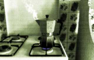
Sorry, I am on a roll and I couldn't resist :)
Peter Popov ICQ : 15002700
Personal e-mail : pet### [at] vip bg
TAG e-mail : pet### [at] tag bg
TAG e-mail : pet### [at] tag povray povray org org
Post a reply to this message
Attachments:
Download 'vaporeefuoco.jpg' (98 KB)
Preview of image 'vaporeefuoco.jpg'

|
 |
|  |
|  |
|
 |
|
 |
|  |
|  |
|
 |
Impressive work!
Now I know why I am not so good. Being decaffed makes you depoved as
well, it seems (at least the opposite seems to be true :) )
Peter Popov ICQ : 15002700
Personal e-mail : pet### [at] vip bg
TAG e-mail : pet### [at] tag bg
TAG e-mail : pet### [at] tag povray povray org org
Post a reply to this message
|
 |
|  |
|  |
|
 |
|
 |
|  |
|  |
|
 |
How dare you render something so frikkin' realistic?! Aaarrgh. Why do you
keep raising the bar? I'll never catch up! :)
--
Anthony Bennett
Post a reply to this message
|
 |
|  |
|  |
|
 |
|
 |
|  |


![]()