 |
 |
|
 |
|
 |
|  |
|  |
|
 |
|
 |
|  |
|  |
|
 |
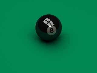
I made this as a desktop image for the computer I have beside my pool table
(for listening to mp3s while playing 8-ball).
It is really simple: 1 sphere, 1 plane, 4 boxes and 5 cylinders (used to
create the "8").
The plane has a quilted normal.
The scene is lit by the 4 boxes that have hight ambient and no diffuse, no
normal light sources.
Render time: ~ 1h 15m on a P3 500Mhz.
I'm almost happy with it but for some things:
1. The reflections in the ball. Maybe it is that there is nothing to reflect
in the upper part (except for the lights). Suggestions anybody?
2. There are some radiosity artifacts under the ball. This is my first
radiosity only scene, so I could really need some advice here.
3. There are some moire patterns near the corners (jpg compression took away
some of it). What are good aa settings for getting rid of them without the
render taking ages?
--
Daniel Nilsson
Post a reply to this message
Attachments:
Download '8-ball-03.jpg' (47 KB)
Preview of image '8-ball-03.jpg'

|
 |
|  |
|  |
|
 |
|
 |
|  |
|  |
|
 |
RE #1. I have rendered lots of cue balls. Some for commercial print. Try
giving the ball a higher ambient value & lower the amount of reflection.
The white part of the ball is reflecting way too much of the green. It
should be much whiter.
RE #2. Radiosity is not my fotre. Sometimes I get good results & sometimes
I don't.
RE #3. Would focal blur work for you?
The only other thing that 'bothers' me about your pic is the shade of green.
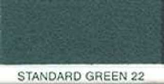
It's too grassy. Look at the attached cloth swatch. It's cooler & darker.
"Daniel Nilsson" <dan### [at] daniel-nilsson com> wrote in message
news:3dd14fba@news.povray.org...
> I made this as a desktop image for the computer I have beside my pool
table
> (for listening to mp3s while playing 8-ball).
> It is really simple: 1 sphere, 1 plane, 4 boxes and 5 cylinders (used to
> create the "8").
> The plane has a quilted normal.
> The scene is lit by the 4 boxes that have hight ambient and no diffuse, no
> normal light sources.
> Render time: ~ 1h 15m on a P3 500Mhz.
>
> I'm almost happy with it but for some things:
> 1. The reflections in the ball. Maybe it is that there is nothing to
reflect
> in the upper part (except for the lights). Suggestions anybody?
> 2. There are some radiosity artifacts under the ball. This is my first
> radiosity only scene, so I could really need some advice here.
> 3. There are some moire patterns near the corners (jpg compression took
away
> some of it). What are good aa settings for getting rid of them without the
> render taking ages?
>
> --
> Daniel Nilsson
>
>
> com> wrote in message
news:3dd14fba@news.povray.org...
> I made this as a desktop image for the computer I have beside my pool
table
> (for listening to mp3s while playing 8-ball).
> It is really simple: 1 sphere, 1 plane, 4 boxes and 5 cylinders (used to
> create the "8").
> The plane has a quilted normal.
> The scene is lit by the 4 boxes that have hight ambient and no diffuse, no
> normal light sources.
> Render time: ~ 1h 15m on a P3 500Mhz.
>
> I'm almost happy with it but for some things:
> 1. The reflections in the ball. Maybe it is that there is nothing to
reflect
> in the upper part (except for the lights). Suggestions anybody?
> 2. There are some radiosity artifacts under the ball. This is my first
> radiosity only scene, so I could really need some advice here.
> 3. There are some moire patterns near the corners (jpg compression took
away
> some of it). What are good aa settings for getting rid of them without the
> render taking ages?
>
> --
> Daniel Nilsson
>
>
>
Post a reply to this message
Attachments:
Download 'felt_large.jpg' (3 KB)
Preview of image 'felt_large.jpg'

|
 |
|  |
|  |
|
 |
|
 |
|  |
|  |
|
 |
news: 3dd14fba@news.povray.org...
> I'm almost happy with it but for some things:
> 1. The reflections in the ball. Maybe it is that there is nothing to
reflect
> in the upper part (except for the lights). Suggestions anybody?
I'd try variable reflection 0,1
Marc
Post a reply to this message
|
 |
|  |
|  |
|
 |
|
 |
|  |
|  |
|
 |
It looks to me like the "window" is directly above the pool table. Maybe
placing the window to the left of the ball where a window would usually be,
and oriented like it's on a wall would help. I think it's very good
already. The highlight just seems to big and not oriented correctly tho.
Andrew Wilcox
Post a reply to this message
|
 |
|  |
|  |
|
 |
|
 |
|  |
|  |
|
 |
"Tony Vigil" <tjv### [at] hotmail com> schreef in bericht
news:3dd159b4$1@news.povray.org...
> RE #1. I have rendered lots of cue balls. Some for commercial print. Try
> giving the ball a higher ambient value & lower the amount of reflection.
> The white part of the ball is reflecting way too much of the green. It
> should be much whiter.
Whatever you do, DON'T use an ambient value higher than 0 for non-light-emitting
objects. A higher diffuse value and a lower reflection value (for the white
part), and maybe some blurred reflection, would be nice though.
BTW: I really like the normal on the plane! :)
cu!
--
camera{location-z*3}#macro G(b,e)b+(e-b)*(C/50)#end#macro L(b,e,k,l)#local C=0
;#while(C<50)sphere{G(b,e),.1pigment{rgb G(k,l)}finish{ambient 1}}#local C=C+1
;#end#end L(y-x,y,x,x+y)L(y,-x-y,x+y,y)L(-x-y,-y,y,y+z)L(-y,y,y+z,x+y)L(0,x+y,
<.5,1,.5>,x)L(0,x-y,<.5,1,.5>,x) // ZK http://www.povplace.be.tf com> schreef in bericht
news:3dd159b4$1@news.povray.org...
> RE #1. I have rendered lots of cue balls. Some for commercial print. Try
> giving the ball a higher ambient value & lower the amount of reflection.
> The white part of the ball is reflecting way too much of the green. It
> should be much whiter.
Whatever you do, DON'T use an ambient value higher than 0 for non-light-emitting
objects. A higher diffuse value and a lower reflection value (for the white
part), and maybe some blurred reflection, would be nice though.
BTW: I really like the normal on the plane! :)
cu!
--
camera{location-z*3}#macro G(b,e)b+(e-b)*(C/50)#end#macro L(b,e,k,l)#local C=0
;#while(C<50)sphere{G(b,e),.1pigment{rgb G(k,l)}finish{ambient 1}}#local C=C+1
;#end#end L(y-x,y,x,x+y)L(y,-x-y,x+y,y)L(-x-y,-y,y,y+z)L(-y,y,y+z,x+y)L(0,x+y,
<.5,1,.5>,x)L(0,x-y,<.5,1,.5>,x) // ZK http://www.povplace.be.tf
Post a reply to this message
|
 |
|  |
|  |
|
 |
|
 |
|  |
|  |
|
 |
Maybe a stained glass type light fixture instead of just the white lights?
How about a pool cue someplace leaning against the table that gets
reflected? other balls on the table getting relfected maybe?
Nice "8" though. I agree with someone who said the white needs to be
brighter.
Daniel Nilsson <dan### [at] daniel-nilsson com> wrote in message
news:3dd14fba@news.povray.org...
> I made this as a desktop image for the computer I have beside my pool
table
> (for listening to mp3s while playing 8-ball).
> It is really simple: 1 sphere, 1 plane, 4 boxes and 5 cylinders (used to
> create the "8").
> The plane has a quilted normal.
> The scene is lit by the 4 boxes that have hight ambient and no diffuse, no
> normal light sources.
> Render time: ~ 1h 15m on a P3 500Mhz.
>
> I'm almost happy with it but for some things:
> 1. The reflections in the ball. Maybe it is that there is nothing to
reflect
> in the upper part (except for the lights). Suggestions anybody?
> 2. There are some radiosity artifacts under the ball. This is my first
> radiosity only scene, so I could really need some advice here.
> 3. There are some moire patterns near the corners (jpg compression took
away
> some of it). What are good aa settings for getting rid of them without the
> render taking ages?
>
> --
> Daniel Nilsson
>
>
> com> wrote in message
news:3dd14fba@news.povray.org...
> I made this as a desktop image for the computer I have beside my pool
table
> (for listening to mp3s while playing 8-ball).
> It is really simple: 1 sphere, 1 plane, 4 boxes and 5 cylinders (used to
> create the "8").
> The plane has a quilted normal.
> The scene is lit by the 4 boxes that have hight ambient and no diffuse, no
> normal light sources.
> Render time: ~ 1h 15m on a P3 500Mhz.
>
> I'm almost happy with it but for some things:
> 1. The reflections in the ball. Maybe it is that there is nothing to
reflect
> in the upper part (except for the lights). Suggestions anybody?
> 2. There are some radiosity artifacts under the ball. This is my first
> radiosity only scene, so I could really need some advice here.
> 3. There are some moire patterns near the corners (jpg compression took
away
> some of it). What are good aa settings for getting rid of them without the
> render taking ages?
>
> --
> Daniel Nilsson
>
>
>
Post a reply to this message
|
 |
|  |
|  |
|
 |
|
 |
|  |
|  |
|
 |
It would be cool if you had the other balls scattered around in the scene
off camera but still reflected in the 8-ball.
Corey
Post a reply to this message
|
 |
|  |
|  |
|
 |
|
 |
|  |
|  |
|
 |
Daniel Nilsson wrote:
>
> 1. The reflections in the ball. Maybe it is that there is nothing to reflect
> in the upper part (except for the lights). Suggestions anybody?
The reflection seems WAY too strong. Try reducing it a lot.. say, to a
fifth of it's current value (I'm guessing, so fiddle around).
Alternately, you could try using variable reflection, which might be
more accurate for an 8-ball; I don't have one to examine myself.
The white part needs to be brighter. I don't know if this is a
pigmentation problem, a lighting problem, or if you've reduced the
diffuse finish of the ball to compensate for the reflection (if so,
recalculate a new diffuse finish to correspond to the much lower
reflection you should be using. If not, consider doing this to get more
realistic reflective objects; anything that reflects most of the light
hitting it won't diffuse very much).
You might consider making the black parts just SLIGHTLY whiter than pure
black. Very few things in the world even approach being so utterly black
that they can't be illuminated at all, which is the effect that rgb 0
will produce in POV-Ray.
As far as your environment.. adding more things to reflect will not only
make your reflections more interesting, but they'll provide more
surfaces for radiosity to interact with, which in turn will make your
lighting more interesting. I highly recommend filling in the blanks. As
to what to add to the scene: well, you HAVE a pool table! So stand next
to it and look around. What else do you have?
> 2. There are some radiosity artifacts under the ball. This is my first
> radiosity only scene, so I could really need some advice here.
Increase count. There are other factors that affect the number, size,
and general appearance of radiosity artifacts, but when it comes to just
getting rid of them, it mainly boils down to count.
-Xplo
Post a reply to this message
|
 |
|  |
|  |
|
 |
|
 |
|  |
|  |
|
 |
Good start!
> I'm almost happy with it but for some things:
> 1. The reflections in the ball. Maybe it is that there is nothing to
reflect
> in the upper part (except for the lights). Suggestions anybody?
(If you are using 3.5) Try using fresnel type variable reflection (my
favourite!) use conserve_energy and set ior between maybe 1.2 and 1.4 (play
around til you get what you want. As others said, don't use ambient greater
than 0 (unless you really want to of course). Adjust the diffuse value
instead.
> 2. There are some radiosity artifacts under the ball. This is my first
> radiosity only scene, so I could really need some advice here.
> 3. There are some moire patterns near the corners (jpg compression took
away
> some of it). What are good aa settings for getting rid of them without the
> render taking ages?
Not much advice to give here that hasn't already been given.
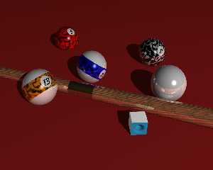
BTW here is one of the very first images I ever made after discovering POV.
The Image has a date stamp of 12/8/1997. Perhaps I should redo the image
sometime using the new techniques. (I don't have the source anymore though)
-tgq
Post a reply to this message
Attachments:
Download 'pool3.jpg' (53 KB)
Preview of image 'pool3.jpg'

|
 |
|  |
|  |
|
 |
|
 |
|  |
|  |
|
 |
"Tony Vigil" <tjv### [at] hotmail com> wrote in message
news:3dd159b4$1@news.povray.org...
> RE #1. I have rendered lots of cue balls. Some for commercial print.
Try
> giving the ball a higher ambient value & lower the amount of reflection.
> The white part of the ball is reflecting way too much of the green. It
> should be much whiter.
I will not increase the ambient (ambient > 0 is for light sources) but I
will try lower reflection. Yes, the white should be much whiter, I probably
will increase diffuse.
> RE #3. Would focal blur work for you?
Maybe.
> The only other thing that 'bothers' me about your pic is the shade of
green.
> It's too grassy. Look at the attached cloth swatch. It's cooler &
darker.
Yes, it is too green, I will add some grayness to it.
Thanks for the feedback.
--
Daniel Nilsson com> wrote in message
news:3dd159b4$1@news.povray.org...
> RE #1. I have rendered lots of cue balls. Some for commercial print.
Try
> giving the ball a higher ambient value & lower the amount of reflection.
> The white part of the ball is reflecting way too much of the green. It
> should be much whiter.
I will not increase the ambient (ambient > 0 is for light sources) but I
will try lower reflection. Yes, the white should be much whiter, I probably
will increase diffuse.
> RE #3. Would focal blur work for you?
Maybe.
> The only other thing that 'bothers' me about your pic is the shade of
green.
> It's too grassy. Look at the attached cloth swatch. It's cooler &
darker.
Yes, it is too green, I will add some grayness to it.
Thanks for the feedback.
--
Daniel Nilsson
Post a reply to this message
|
 |
|  |
|  |
|
 |
|
 |
|  |


![]()