 |
 |
|
 |
|
 |
|  |
|  |
|
 |
|
 |
|  |
|  |
|
 |
Hi again!
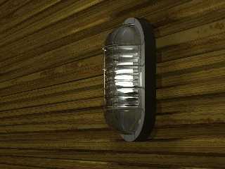
Now I have made some more work on the lamp. I increased the number of metal
things that holds the glass and did some work on the glass. I think it looks
much better now.
I did not (as suggested in previous postings) make a better light bulb, it
is still the simple sphere/cylinder csg. It is not so visible now so I don't
think anyone will notice.
Render time was about 5 hours on a PIII 500mhz. I probably could lover the
quality of area lights a bit to speed it up.
There are actually two identical lamps in the scene, the other is on the
wall across the room. I think I will make a simplified lamp and use it
instead of the one not in view.
The next time a get some time to work on the scene I will make some more
sauna objects. I'll keep you posted.
--
Daniel Nilsson
Post a reply to this message
Attachments:
Download 'lamp2.jpg' (101 KB)
Preview of image 'lamp2.jpg'

|
 |
|  |
|  |
|
 |
|
 |
|  |
|  |
|
 |
A great improvement over the last one. You might
want to turn your eye to the wood texture ... :)
Aaron
Aaron Gillies
New York City
x3rxes[*]yahoo.com
Post a reply to this message
|
 |
|  |
|  |
|
 |
|
 |
|  |
|  |
|
 |
> Hi again!
Hi!
> Now I have made some more work on the lamp. I increased the
> number of metal things that holds the glass and did some work
> on the glass. I think it looks much better now.
Yes, to me it looks much like a real lamp. The glass is really
nice.
I understand that this is only a part of your scene. Looking
forward to see your complete scene.
-Kedar
Post a reply to this message
|
 |
|  |
|  |
|
 |
|
 |
|  |
|  |
|
 |
Nice Lamp!
Just round the sharp corner of the housing a little (half the size of the
metal things or less) and it looks perfect!
On the other hand, the glass is eye-catching! So perhaps nobody will notice
the housing...
Post a reply to this message
|
 |
|  |
|  |
|
 |
|
 |
|  |
|  |
|
 |
Looks very good! I have 2 things that might / might not be an improvement:
1) The bulb is lit, but not really lit.. It doesn't seem to light up the
scene.. If you take a camera in real life and focus on a bulb, you will get
either a white glow all over the picture, or the rest of the scene will be
very dark because the camera adjusts it's light sensitivity... This allows
us to understand how strong a bulb usually is ... This is often not
simulated in raytracings, thus they look fake.. I'm not sure how a photo
would look with a very weak bulb, but I'd expect some glow in all cases,
along with some indication on the wall, that the light's intensity fall off.
2) The glass looks thick. Is that normal?
But it's very good so far. It's strange I don't remember your earlier post,
and I don't think I ever miss a post here.
Regards,
Hugo
Post a reply to this message
|
 |
|  |
|  |
|
 |
|
 |
|  |


![]()