 |
 |
|
 |
|
 |
|  |
|  |
|
 |
|
 |
|  |
|  |
|
 |
Hi,
I am Armin. This is my first posting (although not the first image I ever
made).
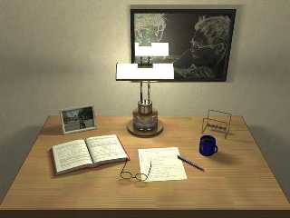
I did the modelling completely in Blender. I took the two pictures in NY and
at
the beach when some of my friends where visiting me. I applied one of the
edge
detect filters of "Gimp" to the one at the wall. Obviously I also used
image maps
for the pages of the book, the single sheet of paper and the cup with the
Povray
logo. All other textures are Povray textures.
The table is made out of single parts. I used a maco to vary the color of
the wood,
and to displace the wood textures randomly. I also used the crand function
to make
it look a little rough. There is an additional, partially transparent layer
on top of the
table with a bozo texture, so that is doesn't look to clean.
For the lamp I used area lights. I first used scattering media but it
doesn't look
any different then using a high emmission value, which is much faster.
I would like to get some comments and suggestions how I can further improve
photorealism.
Armin
Post a reply to this message
Attachments:
Download 'short_break (Small).JPG' (36 KB)
Preview of image 'short_break (Small).JPG'

|
 |
|  |
|  |
|
 |
|
 |
|  |
|  |
|
 |
Arim,
Very nice image! It looks quite realistic. The only thing which to my eye seems
off is the coffee cup. Is it a little too small relative to the other items ?
Bill P.
Post a reply to this message
|
 |
|  |
|  |
|
 |
|
 |
|  |
|  |
|
 |
Impressive! I espesially like the table wood texture, looks great!
Why is the POV-Ray logo on the cup the wrong way?
Maybe the book should 'bend' a bit more?
For some reason the glasses was the first thing I looked at when I saw the
picture.. somehow they looked like they floated at first glance..?
The paper is a bit too flat? All the papers I write on tend to get very
un-flat (especially in the corners) after a couple of minutes.. But that
might just be me..
Very nice lighting!
-Peter
Post a reply to this message
|
 |
|  |
|  |
|
 |
|
 |
|  |
|  |
|
 |
It's nice, but I think it's a bit too clean.
The book is too flat. Maybe you can lift
one or two pages a bit up.
The other thing is, the centered view is
sometimes good, but here I would prefer
another point of view - more perspective.
Try a position a bit lower and perhaps
from the right side. Then the horizon should
be under the middle of the image.
And finally I think that the reflection of the
lamp is a bit too strong.
Just a few thoughts. Think about.
Greetz
Flo
Post a reply to this message
|
 |
|  |
|  |
|
 |
|
 |
|  |
|  |
|
 |
"new### [at] lantic net" <vze### [at] verizon net" <vze### [at] verizon net> wrote in
news:3d726fde@news.povray.org
very nice :)
I suggest to add photons - they would be usefull in glasses, and in
reflection of i.e. lamp
--
#macro g(U,V)(.4*abs(sin(9*sqrt(pow(x-U,2)+pow(y-V,2))))*pow(1-min(1,(sqrt(
pow(x-U,2)+pow(y-V,2))*.3)),2)+.9)#end#macro p(c)#if(c>1)#local l=mod(c,100
);g(2*div(l,10)-8,2*mod(l,10)-8)*p(div(c,100))#else 1#end#end light_source{
y 2}sphere{z*20 9pigment{function{p(26252423)*p(36455644)*p(66656463)}}}//M net> wrote in
news:3d726fde@news.povray.org
very nice :)
I suggest to add photons - they would be usefull in glasses, and in
reflection of i.e. lamp
--
#macro g(U,V)(.4*abs(sin(9*sqrt(pow(x-U,2)+pow(y-V,2))))*pow(1-min(1,(sqrt(
pow(x-U,2)+pow(y-V,2))*.3)),2)+.9)#end#macro p(c)#if(c>1)#local l=mod(c,100
);g(2*div(l,10)-8,2*mod(l,10)-8)*p(div(c,100))#else 1#end#end light_source{
y 2}sphere{z*20 9pigment{function{p(26252423)*p(36455644)*p(66656463)}}}//M
Post a reply to this message
|
 |
|  |
|  |
|
 |
|
 |
|  |


![]()