 |
 |
|
 |
|
 |
|  |
|  |
|
 |
|
 |
|  |
|  |
|
 |
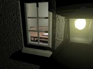
Shadows should be black this time... :)
I've re-done the window too, I think it looks more like a window should now.
I'm not sure whether I should go back to having a granite window sill more
like old farmhouses.
I'd like to make the "bulb" more realistic (any ideas?) and then I'll turn
my attentions indoors.
Post a reply to this message
Attachments:
Download 'looking-in.jpg' (45 KB)
Preview of image 'looking-in.jpg'

|
 |
|  |
|  |
|
 |
|
 |
|  |
|  |
|
 |
John Vodden wrote:
> Shadows should be black this time... :)
Oh yes!
> I've re-done the window too, I think it looks more like a window should now.
Much better.
> I'd like to make the "bulb" more realistic (any ideas?)
How about:
#declare LightBulb=union{
sphere { <0, 0, 0>, 3 }
cone { <0, 1.4553, 0>, 2.6234, <0, 3.3, 0>, 1.6 }
cylinder { <0, 3.3, 0>, <0, 4.6, 0>, 1.6 }
torus { 1.2, 0.4 translate <0, 4.6, 0> }
texture { pigment { White } finish { ambient 1.0 } }
no_shadow
}
I used that in this image:
http://home4.inet.tele.dk/ibras/rosenb75.htm
I also used a small arealight inside the bulb (instead of a pointlight),
to avoid too sharp shadows.
/Ib
Post a reply to this message
|
 |
|  |
|  |
|
 |
|
 |
|  |
|  |
|
 |
"Ib Rasmussen" <ib### [at] ibras dk> wrote in message
news:3D6### [at] ibras dk> wrote in message
news:3D6### [at] ibras dk...
>
> How about:
>
> #declare LightBulb=union{
> sphere { <0, 0, 0>, 3 }
> cone { <0, 1.4553, 0>, 2.6234, <0, 3.3, 0>, 1.6 }
> cylinder { <0, 3.3, 0>, <0, 4.6, 0>, 1.6 }
> torus { 1.2, 0.4 translate <0, 4.6, 0> }
> texture { pigment { White } finish { ambient 1.0 } }
> no_shadow
> }
>
> I used that in this image:
>
> http://home4.inet.tele.dk/ibras/rosenb75.htm
>
>
> I also used a small arealight inside the bulb (instead of a pointlight),
> to avoid too sharp shadows.
Thanks, I'll try something like that and see how it comes out. dk...
>
> How about:
>
> #declare LightBulb=union{
> sphere { <0, 0, 0>, 3 }
> cone { <0, 1.4553, 0>, 2.6234, <0, 3.3, 0>, 1.6 }
> cylinder { <0, 3.3, 0>, <0, 4.6, 0>, 1.6 }
> torus { 1.2, 0.4 translate <0, 4.6, 0> }
> texture { pigment { White } finish { ambient 1.0 } }
> no_shadow
> }
>
> I used that in this image:
>
> http://home4.inet.tele.dk/ibras/rosenb75.htm
>
>
> I also used a small arealight inside the bulb (instead of a pointlight),
> to avoid too sharp shadows.
Thanks, I'll try something like that and see how it comes out.
Post a reply to this message
|
 |
|  |
|  |
|
 |
|
 |
|  |
|
 |


![]()