 |
 |
|
 |
|
 |
|  |
|  |
|
 |
|
 |
|  |
|  |
|
 |
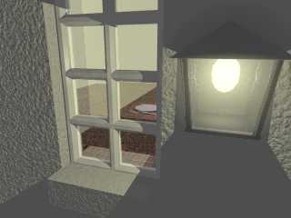
This was going to be a lonliness entry but I don't now think I'll have time
to get it right before the deadline. Loneliness in the sense of the viewer
being out in the dark at night but also lonliness on the part of the
occupant of the house, as the table is laid for one.
I'm looking for ideas atm as to how I can make it look better/more
realistic, comments and such-like.
Thanks
John
Post a reply to this message
Attachments:
Download 'looking-in.jpg' (44 KB)
Preview of image 'looking-in.jpg'

|
 |
|  |
|  |
|
 |
|
 |
|  |
|  |
|
 |
John:
Good image and modelling job. :)
I had the exact same idea for the IRTC, but as usual, I didn't get
around to it in time. :(
How about making the outside of the building darker,
or maybe even almost completely dark, to contrast with the inside?
Aaron
Aaron Gillies
New York City
x3rxes[`]yahoo.com
"John Vodden" <jav### [at] gmx co co uk> wrote in message
news:3d690d0a@news.povray.org...
> This was going to be a lonliness entry but I don't now think I'll have
time
> to get it right before the deadline. Loneliness in the sense of the viewer
> being out in the dark at night but also lonliness on the part of the
> occupant of the house, as the table is laid for one.
>
> I'm looking for ideas atm as to how I can make it look better/more
> realistic, comments and such-like.
>
> Thanks
> John
>
>
> uk> wrote in message
news:3d690d0a@news.povray.org...
> This was going to be a lonliness entry but I don't now think I'll have
time
> to get it right before the deadline. Loneliness in the sense of the viewer
> being out in the dark at night but also lonliness on the part of the
> occupant of the house, as the table is laid for one.
>
> I'm looking for ideas atm as to how I can make it look better/more
> realistic, comments and such-like.
>
> Thanks
> John
>
>
>
Post a reply to this message
|
 |
|  |
|  |
|
 |
|
 |
|  |
|  |
|
 |
"Aaron Gillies" <no### [at] spam com> wrote in message
news:3d6910e4$1@news.povray.org...
> John:
>
> Good image and modelling job. :)
>
> I had the exact same idea for the IRTC, but as usual, I didn't get
> around to it in time. :(
>
> How about making the outside of the building darker,
> or maybe even almost completely dark, to contrast with the inside?
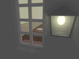
Thanks for the suggestion, darkening the outside does seem to fit very well
with the theme of the picture: I've given the light from the outside light a
lot of fade so that it's presence doesn't give that bright flood-lit effect
of the previous example. Something about the window frame now looks a bit
false now though but I can't place my finger on it so can't fix it!
Also does anyone have any idea what might be causing that dramatic shadow
that appears to be inside the window running across the table? The scene is
lit from two lights: one inside and one outside and there is nothing
blocking that position from the inside light. If I don't put glass in the
window then that shadow isn't there so I'm guessing it's some feature of the
glass that looks like a shadow rather than an actual shadow inside but I
can't explain it. I actually prefer the light-level that is within the
shadow but I'd like it to all be the same! com> wrote in message
news:3d6910e4$1@news.povray.org...
> John:
>
> Good image and modelling job. :)
>
> I had the exact same idea for the IRTC, but as usual, I didn't get
> around to it in time. :(
>
> How about making the outside of the building darker,
> or maybe even almost completely dark, to contrast with the inside?
Thanks for the suggestion, darkening the outside does seem to fit very well
with the theme of the picture: I've given the light from the outside light a
lot of fade so that it's presence doesn't give that bright flood-lit effect
of the previous example. Something about the window frame now looks a bit
false now though but I can't place my finger on it so can't fix it!
Also does anyone have any idea what might be causing that dramatic shadow
that appears to be inside the window running across the table? The scene is
lit from two lights: one inside and one outside and there is nothing
blocking that position from the inside light. If I don't put glass in the
window then that shadow isn't there so I'm guessing it's some feature of the
glass that looks like a shadow rather than an actual shadow inside but I
can't explain it. I actually prefer the light-level that is within the
shadow but I'd like it to all be the same!
Post a reply to this message
|
 |
|  |
|  |
|
 |
|
 |
|  |
|  |
|
 |
I meant to include the new image in that last post... here it is.
Post a reply to this message
Attachments:
Download 'looing-in1.jpg' (30 KB)
Preview of image 'looing-in1.jpg'

|
 |
|  |
|  |
|
 |
|
 |
|  |
|  |
|
 |
> Thanks for the suggestion, darkening the outside does seem to fit very well
> with the theme of the picture: I've given the light from the outside light a
> lot of fade so that it's presence doesn't give that bright flood-lit effect
> of the previous example.
I'm watching this on a cheap TFT-screen, so I could be wrong, but the
shadows still seems too bright. If you are using ambient, try turning it
down or off, so the shadows becomes almost black.
> Something about the window frame now looks a bit
> false now though but I can't place my finger on it so can't fix it!
As I see it, the window lacks a frame :-). It only has a sash. OK, I'm
not sure about the naming of the various parts, but usually a window has
fixed part mounted on the wall (the frame?) and a moving part hinged
to the frame (the sash?) in which the glass pane is mounted. The frame
and sash could be about the same thickness (5-6 cm) but the parts, that
divide up the pane (muntins?) should only be about half that thickness.
Also the outside window sill should slope downwards, to avoid
accumulating rain water, that will rot the window frame.
/Ib
-------------------
http://www.ibras.dk
Post a reply to this message
|
 |
|  |
|  |
|
 |
|
 |
|  |
|  |
|
 |
"Ib Rasmussen" <ib### [at] ibras dk> wrote in message
news:3D6### [at] ibras dk> wrote in message
news:3D6### [at] ibras dk...
>
> I'm watching this on a cheap TFT-screen, so I could be wrong, but the
> shadows still seems too bright. If you are using ambient, try turning it
> down or off, so the shadows becomes almost black.
I see it like you, overall lack of contrast. Maybe higher assumed_gamma
would help. Active matrix TFT LCD here too, and also cheap ;-) Anyway, I
don't think that's the reason. dk...
>
> I'm watching this on a cheap TFT-screen, so I could be wrong, but the
> shadows still seems too bright. If you are using ambient, try turning it
> down or off, so the shadows becomes almost black.
I see it like you, overall lack of contrast. Maybe higher assumed_gamma
would help. Active matrix TFT LCD here too, and also cheap ;-) Anyway, I
don't think that's the reason.
Post a reply to this message
|
 |
|  |
|  |
|
 |
|
 |
|  |
|  |
|
 |
I've gone through and put "gamma 0" everywhere where it might need it!
Hopefully that'll help it. I think my moniter must be darker than most,
although I never managed to work out what the display-gamma actually is for
this machine.
I'll repost it once I've remodelled the window, I'd like to get this
contrast sorted as a contrast is an important part of the "feel" that this
picture is meant to have.
"hughes b" <omn### [at] charter net> wrote in message
news:3d6a0039$1@news.povray.org...
> "Ib Rasmussen" <ib### [at] ibras net> wrote in message
news:3d6a0039$1@news.povray.org...
> "Ib Rasmussen" <ib### [at] ibras dk> wrote in message
> news:3D6### [at] ibras dk> wrote in message
> news:3D6### [at] ibras dk...
> >
> > I'm watching this on a cheap TFT-screen, so I could be wrong, but the
> > shadows still seems too bright. If you are using ambient, try turning it
> > down or off, so the shadows becomes almost black.
>
> I see it like you, overall lack of contrast. Maybe higher assumed_gamma
> would help. Active matrix TFT LCD here too, and also cheap ;-) Anyway, I
> don't think that's the reason.
>
> dk...
> >
> > I'm watching this on a cheap TFT-screen, so I could be wrong, but the
> > shadows still seems too bright. If you are using ambient, try turning it
> > down or off, so the shadows becomes almost black.
>
> I see it like you, overall lack of contrast. Maybe higher assumed_gamma
> would help. Active matrix TFT LCD here too, and also cheap ;-) Anyway, I
> don't think that's the reason.
>
>
Post a reply to this message
|
 |
|  |
|  |
|
 |
|
 |
|  |
|  |
|
 |
"John Vodden" <jav### [at] gmx co co uk> wrote in message
news:3d6a22b1@news.povray.org...
> I've gone through and put "gamma 0" everywhere where it might need it!
> Hopefully that'll help it. I think my moniter must be darker than most,
> although I never managed to work out what the display-gamma actually is
for
> this machine.
gamma 0? Not sure you are talking about POV-Ray and might be setting it in a
image editor instead? I meant global_settings {assumed_gamma 2.2} or more
than the 1.0 as suggested in the help and the default Insert Menu.
Have you seen the Scene Help section 5.2.2.2.2 (yes, that's the numbers)
yet? Should be able to get an idea of what to use for Display_Gamma in
pov-ray\renderer\povray.ini, although I still don't set assumed_gamma to 1.0
and either leave it out or make it 2.2 as well. It's still a confusing issue
to me too, I can't readily check image output on various monitors to see
what the changes might be. uk> wrote in message
news:3d6a22b1@news.povray.org...
> I've gone through and put "gamma 0" everywhere where it might need it!
> Hopefully that'll help it. I think my moniter must be darker than most,
> although I never managed to work out what the display-gamma actually is
for
> this machine.
gamma 0? Not sure you are talking about POV-Ray and might be setting it in a
image editor instead? I meant global_settings {assumed_gamma 2.2} or more
than the 1.0 as suggested in the help and the default Insert Menu.
Have you seen the Scene Help section 5.2.2.2.2 (yes, that's the numbers)
yet? Should be able to get an idea of what to use for Display_Gamma in
pov-ray\renderer\povray.ini, although I still don't set assumed_gamma to 1.0
and either leave it out or make it 2.2 as well. It's still a confusing issue
to me too, I can't readily check image output on various monitors to see
what the changes might be.
Post a reply to this message
|
 |
|  |
|  |
|
 |
|
 |
|  |
|  |
|
 |
> I've gone through and put "gamma 0" everywhere where it might need it!
That should be "ambient 0" I hope. As hughes b writes, gamma should only
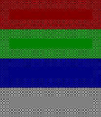
be set once, and not to 0. I should be 2.2 for pcs and 1.0 for macs, IIRC.
You can use the attached image for a simple gamma adjustment of your
monitor. The center of each colour field should appear the same as the
frame, if your screen is set correctly.
/Ib
Post a reply to this message
Attachments:
Download 'gamma.gif' (3 KB)
Preview of image 'gamma.gif'

|
 |
|  |
|  |
|
 |
|
 |
|  |
|  |
|
 |
It looks like it is ambient values to me as well.
Put the following at the top of the scene file:
global_settings {
ambient_light rgb 0
}
And then go through and pull out all of the ambient
settings in the finish part of the textures.
Aaron
Aaron Gillies
New York City
x3rxes[*]yahoo.com
Post a reply to this message
|
 |
|  |
|  |
|
 |
|
 |
|  |


![]()