 |
 |
|
 |
|
 |
|  |
|  |
|
 |
From: Jaime Vives Piqueres
Subject: Another glass of water (7+21 Kb)
Date: 11 May 2002 05:04:06
Message: <3cdcde29@news.povray.org>
|
|
 |
|  |
|  |
|
 |
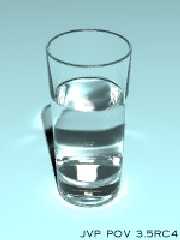
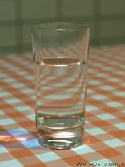
this test. I was trying to see if my lighting macro worked fine with glass
and photons, and casually I also intended to obtain well balanced images,
without the need of external postprocessing. Not for "purism", but rather
to have it achieved on one pass: I'm lazy, do you remember? :)
IMHO, these two images do not benefit from any autocontrast, normalizing,
color enhacing, unsharp mask, etc... I'm still not satisfied with photons,
but I supose it's only matter of decreasing photon spacing. I also tried an
area_light version, but my patience is very limited...
--
Jaime Vives Piqueres
La Persistencia de la Ignorancia
http://www.ignorancia.org
Post a reply to this message
Attachments:
Download 'glassware1.jpg' (8 KB)
Download 'glassware2.jpg' (22 KB)
Preview of image 'glassware1.jpg'

Preview of image 'glassware2.jpg'

|
 |
|  |
|  |
|
 |
|
 |
|  |
|  |
|
 |
Jaime Vives Piqueres <jai### [at] ignorancia org> wrote:
> IMHO, these two images do not benefit from any autocontrast,
> normalizing, color enhacing, unsharp mask, etc...
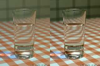
See attached image with side by side (one on the right has had a slight
contrast tweak) and IMO looks much better.
--
Rick
Kitty5 WebDesign - http://Kitty5.com
POV-Ray News & Resources - http://Povray.co.uk
TEL : +44 (01270) 501101 - FAX : +44 (01270) 251105 - ICQ : 15776037
PGP Public Key
http://pgpkeys.mit.edu:11371/pks/lookup?op=get&search=0x231E1CEA org> wrote:
> IMHO, these two images do not benefit from any autocontrast,
> normalizing, color enhacing, unsharp mask, etc...
See attached image with side by side (one on the right has had a slight
contrast tweak) and IMO looks much better.
--
Rick
Kitty5 WebDesign - http://Kitty5.com
POV-Ray News & Resources - http://Povray.co.uk
TEL : +44 (01270) 501101 - FAX : +44 (01270) 251105 - ICQ : 15776037
PGP Public Key
http://pgpkeys.mit.edu:11371/pks/lookup?op=get&search=0x231E1CEA
Post a reply to this message
Attachments:
Download 'post.jpg' (41 KB)
Preview of image 'post.jpg'

|
 |
|  |
|  |
|
 |
|
 |
|  |
|  |
|
 |
Jaime Vives Piqueres wrote:
>
> this test. I was trying to see if my lighting macro worked fine with glass
> and photons, and casually I also intended to obtain well balanced images,
> without the need of external postprocessing. Not for "purism", but rather
> to have it achieved on one pass: I'm lazy, do you remember? :)
I look forward to the completion and release of your lighting macro (you
ARE releasing it eventually, right..?).
One flaw I notice in the second pic is that the focal blur and change in
contrast makes the glass appear to be pasted on top of the background;
it also has a uniformly faint shadow that might account for the illusion
as well.
-Xplo
Post a reply to this message
|
 |
|  |
|  |
|
 |
|
 |
|  |
|  |
|
 |
"Rick [Kitty5]" <ric### [at] kitty5 com> wrote in message
news:3cdcfb22@news.povray.org...
> Jaime Vives Piqueres <jai### [at] ignorancia com> wrote in message
news:3cdcfb22@news.povray.org...
> Jaime Vives Piqueres <jai### [at] ignorancia org> wrote:
> > IMHO, these two images do not benefit from any autocontrast,
> > normalizing, color enhacing, unsharp mask, etc...
>
> See attached image with side by side (one on the right has had a slight
> contrast tweak) and IMO looks much better.
IMO, it ruins the blur on the tile wall and causes the glass to look
cut/pasted in.
I think the image might have benefited by having some of the yellow
reduced (easily accomplished in POV), but there are other, more on-topic
places to discuss and demonstrate second party methods of doing that. org> wrote:
> > IMHO, these two images do not benefit from any autocontrast,
> > normalizing, color enhacing, unsharp mask, etc...
>
> See attached image with side by side (one on the right has had a slight
> contrast tweak) and IMO looks much better.
IMO, it ruins the blur on the tile wall and causes the glass to look
cut/pasted in.
I think the image might have benefited by having some of the yellow
reduced (easily accomplished in POV), but there are other, more on-topic
places to discuss and demonstrate second party methods of doing that.
Post a reply to this message
|
 |
|  |
|  |
|
 |
|
 |
|  |
|  |
|
 |
"Jaime Vives Piqueres" <jai### [at] ignorancia org> wrote in message
news:3cdcde29@news.povray.org...
>
> this test. I was trying to see if my lighting macro worked fine with glass
> and photons, and casually I also intended to obtain well balanced images,
> without the need of external postprocessing. Not for "purism", but rather
> to have it achieved on one pass: I'm lazy, do you remember? :)
I really haven't followed this newsgroup for long so I have to ask what
exactly is this lighting macro of yours? org> wrote in message
news:3cdcde29@news.povray.org...
>
> this test. I was trying to see if my lighting macro worked fine with glass
> and photons, and casually I also intended to obtain well balanced images,
> without the need of external postprocessing. Not for "purism", but rather
> to have it achieved on one pass: I'm lazy, do you remember? :)
I really haven't followed this newsgroup for long so I have to ask what
exactly is this lighting macro of yours?
Post a reply to this message
|
 |
|  |
|  |
|
 |
|
 |
|  |
|  |
|
 |
Jaime Vives Piqueres wrote:
>
> this test. I was trying to see if my lighting macro worked fine with glass
> and photons, and casually I also intended to obtain well balanced images,
> without the need of external postprocessing. Not for "purism", but rather
> to have it achieved on one pass: I'm lazy, do you remember? :)
>
> IMHO, these two images do not benefit from any autocontrast,
normalizing,
> color enhacing, unsharp mask, etc... I'm still not satisfied with photons,
> but I supose it's only matter of decreasing photon spacing. I also tried
an
> area_light version, but my patience is very limited...
Simple but yet it makes envious of your skills. You are the master of
photorealism. I really don't see the minor 'flaws' the others have
mentioned.
--
-Jide
Post a reply to this message
|
 |
|  |
|  |
|
 |
|
 |
|  |
|  |
|
 |
Awesome! I especially like the photons in the first image.
> IMHO, these two images do not benefit from any autocontrast,
normalizing,
> color enhacing, unsharp mask, etc... I'm still not satisfied with photons,
> but I supose it's only matter of decreasing photon spacing. I also tried
an
> area_light version, but my patience is very limited...
What's the render time?
-Peter
Post a reply to this message
|
 |
|  |
|  |
|
 |
|
 |
|  |
|  |
|
 |
No one else said it, but.... WOW!
I'm going to make one of these my desktop just so people inquiry as to why I
have a *photograph* of a glass of water as my background.
Skip
Post a reply to this message
|
 |
|  |
|  |
|
 |
|
 |
|  |
|  |
|
 |
Woah... wait a second...
you posted two images. Originally, when I first looked at them, I was
comparing the first to the second, believing the second was a photo that you
had based the first one off of.
Now I realize the second was also a POV-Ray render.
Good job =)
- Slime
[ http://www.slimeland.com/ ]
Post a reply to this message
|
 |
|  |
|  |
|
 |
|
 |
|  |
|  |
|
 |
> I really haven't followed this newsgroup for long so I have to ask what
> exactly is this lighting macro of yours?
Jaime's light macros can be found here:
http://www.ignorancia.org/lightsys/
It helps you set up lights in POV that interacts realistically.
Hugo
Post a reply to this message
|
 |
|  |
|  |
|
 |
|
 |
|  |


![]()