 |
 |
|
 |
|
 |
|  |
|  |
|
 |
|
 |
|  |
|  |
|
 |
Hi all.
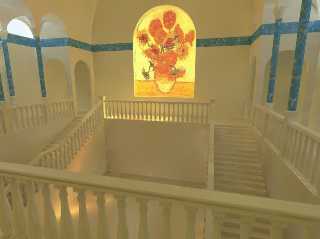
Well I've been trying to do some more modelling lately after spending
most of my time playing with iso-landscapes and media clouds, and this
is it so far. All hand-coded except the picture (Van Gogh, of course)
and the top of the pillars (web model, although I may do them myself).
No proper textures are even started yet and the blue is just to break it
up a bit. Still much, much, much more to do, but thought I'd just show
what I've got so far. Indoor scenes are so much nicer now that radiosity
works well.
Kev
---
Outgoing mail is certified Virus Free.
Checked by AVG anti-virus system (http://www.grisoft.com).
Version: 6.0.351 / Virus Database: 197 - Release Date: 19/04/02
Post a reply to this message
Attachments:
Download 'Image1.jpg' (48 KB)
Preview of image 'Image1.jpg'

|
 |
|  |
|  |
|
 |
|
 |
|  |
|  |
|
 |
Wow. A few objects here and there and some nice textures, and that'll be
amazing.
- Slime
[ http://www.slimeland.com/ ]
[ http://www.slimeland.com/images/ ]
Post a reply to this message
|
 |
|  |
|  |
|
 |
|
 |
|  |
|  |
|
 |
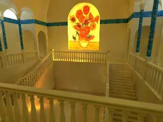
I like it! Especially the light on the railing and wall.
Could use a little more contrast though. Did a quick levels adjustment in
photoshop (attached) to look at the effect.
jkb
Post a reply to this message
Attachments:
Download 'Image1-l.jpg' (92 KB)
Preview of image 'Image1-l.jpg'

|
 |
|  |
|  |
|
 |
|
 |
|  |
|  |
|
 |
> I like it! Especially the light on the railing and wall.
>
> Could use a little more contrast though. Did a quick levels adjustment in
> photoshop (attached) to look at the effect.
>
> jkb
Quite an improvement IMO however it also brings out some of the radiosity
artefacts.
Post a reply to this message
|
 |
|  |
|  |
|
 |
|
 |
|  |
|  |
|
 |
The higher contract makes painting glow like there are some strong
artificial light sources behind it. The original is more like the sun's
shining through the glass painting.
--
Apache
http://geitenkaas.dns2go.com/experiments/
apa### [at] yahoo com com
Post a reply to this message
|
 |
|  |
|  |
|
 |
|
 |
|  |
|  |
|
 |
Uh, not to be contrary to the artist, but it *is* properly
textured. Learn to recognize what you have. Look at it, man.
It's beautiful. It's Greece, or a fantasy of ancient sun-loved
lands. If you make those banisters into wood, or the pillars
into cliche-ridden raytraced marble, it will suck the life and
beauty from this sun-filled image.
What object could you possible add to it that would *add* to the
image?
And the level adjusted image in this thread is not an improvement
over the subtlety of contrast between light and shadow in the
original.
IMO.
-peter
Kevin Ellis wrote:
>
> Hi all.
>
> Well I've been trying to do some more modelling lately after spending
> most of my time playing with iso-landscapes and media clouds, and this
> is it so far. All hand-coded except the picture (Van Gogh, of course)
> and the top of the pillars (web model, although I may do them myself).
> No proper textures are even started yet and the blue is just to break it
> up a bit. Still much, much, much more to do, but thought I'd just show
> what I've got so far. Indoor scenes are so much nicer now that radiosity
> works well.
>
> Kev
>
> ---
> Outgoing mail is certified Virus Free.
> Checked by AVG anti-virus system (http://www.grisoft.com).
> Version: 6.0.351 / Virus Database: 197 - Release Date: 19/04/02
>
> [Image]
--
Modeling slave for:
"Ballet pour ma fille."
http://www.applesnake.net
Post a reply to this message
|
 |
|  |
|  |
|
 |
|
 |
|  |
|  |
|
 |
> What object could you possible add to it that would *add* to the
> image?
How about some kind of elegant stature in an alcove set into the wall
beneath the wonderful window?
Post a reply to this message
|
 |
|  |
|  |
|
 |
|
 |
|  |
|  |
|
 |
Thomas Lake wrote:
>
> > What object could you possible add to it that would *add* to the
> > image?
>
> How about some kind of elegant stature in an alcove set into the wall
> beneath the wonderful window?
Nah, the plainness of the space meshes great with the color
variations. To me this appears more a composition about
light/shade and space than texture, and adding something so
detailed and "weighty" of content seems unbalanced. Even the
radiance artifacts give the walls a sort of stucco/dry brush
painted look. Ah well:
The creator thought it was far from finished, so what do I know?
:o)
-peter
--
Modeling slave for:
"Ballet pour ma fille."
http://www.applesnake.net
Post a reply to this message
|
 |
|  |
|  |
|
 |
|
 |
|  |
|  |
|
 |
Nice looking image so far, of course the camera angle needs to be tweaked
a bit because as is it's a bit out of shape.
That colour scheme looks very meditaranian, it looks cool and fresh.
--
sphere{z*5,1pigment{rgb.5}finish{reflection.3specular.5}}box{<-50,-3,-50>
<50,-2,50>pigment{checker/*\__\\__/ * \_\\__*/scale 2}finish{ambient.7}}
light_source/*__\\__\\__\\__\\__\( ~ )\__\\__\\__\\__\\*/{<2,5,1>*4,1}
/*\\__\\__\\__\\__\\__\\__\\__\\__\~ -/__\\__\\__\\__\\__\\*//* Steve */
Post a reply to this message
|
 |
|  |
|  |
|
 |
|
 |
|  |


![]()