 |
 |
|
 |
|
 |
|  |
|  |
|
 |
|
 |
|  |
|  |
|
 |
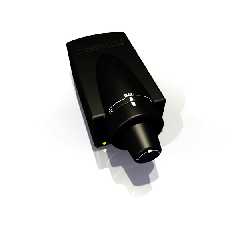
Well, as promised, after my exam in the morning (I missed only 1 question if
you were wondering), I played with it all afternoon and evening yesterday,
perfecting my model, and adding some better textures. I used focal_blur, but
I guess I made the aperture too low. Oh, well. I don't feel like waiting for
another render, so here you go. Enjoy. :)
Post a reply to this message
Attachments:
Download 'volumedial2.jpg' (33 KB)
Preview of image 'volumedial2.jpg'

|
 |
|  |
|  |
|
 |
|
 |
|  |
|  |
|
 |
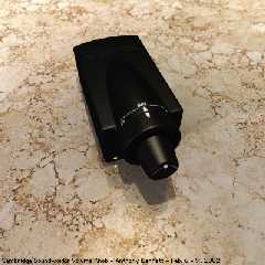
Here's the improved render I promised. You like?
Post a reply to this message
Attachments:
Download 'volumedial3.jpg' (79 KB)
Preview of image 'volumedial3.jpg'

|
 |
|  |
|  |
|
 |
|
 |
|  |
|  |
|
 |
> Here's the improved render I promised. You like?
Hi Tony!
It's much better now. :o) The ground texture is one thing, but I see
you've improved the black texture too, and that's especially important.. I
easily see the shape now! I just think about, maybe it could benefit from
some blurred reflection.. It would add to the realism, although there's not
so much ...to reflect... as yet, except the ground.
As you might know: taking additional normal samples can be extremely slow..
It's mainly slow when a blurred surface reflects on itself, but I found a
little trick: Decrease max_trace_level in global settings to 3 or 4
(however this will unfortunately affect the whole scene) and use just 4 or 5
samples for the reflection blur.. Set adc_bailout to 1/128.. That's pretty
quick, and it seems you're using a small granite pattern to simulate
microfacets, so ... it will look pretty smooth.
It's just a suggestion - you may have noticed that I'm a nerd for realism..
I have a digital camera that made me realize how realistic real life looks.
:o) It looks great and I want this in my renders too.. Anyway, you're
getting much closer to the real look.
Regards,
Hugo
Post a reply to this message
|
 |
|  |
|  |
|
 |
|
 |
|  |
|  |
|
 |
news:3c65a18a@news.povray.org...
> Here's the improved render I promised. You like?
Yes I do. Another pretty example of photorealism.
Keep up the good work.
Bye.
--
Txemi Jendrix
tji### [at] euskalnet net
http://www.geocities.com/txemijendrix net
http://www.geocities.com/txemijendrix
Post a reply to this message
|
 |
|  |
|  |
|
 |
|
 |
|  |
|  |
|
 |
> Hi Tony!
Hi, Hugo!
> It's much better now. :o) The ground texture is one thing, but I see
> you've improved the black texture too, and that's especially important.
Actually, I didn't do much to the black texture, but I did reposition the
lights to properly show off the contours.
> I easily see the shape now! I just think about, maybe it could benefit
from
> some blurred reflection.. It would add to the realism, although there's
not
> so much ...to reflect... as yet, except the ground.
Well, yes, you're right. It would be more physically accurate with blurred
reflection, but as there are no actual light objects (i.e. lamps, bulbs) to
reflect, you would not have seen any highlights on it at all, so I opted for
specular. If/when I integrate this into a real scene, I will redo the
texture.
> As you might know: taking additional normal samples can be extremely slow.
I really don't feel that it's so slow... Unless you make it reflect against
other blurred textures, but especially when you use it on transparent
objects, *then* it's slow - to the point of being impractical.
<snips trick> I'll keep it in mind, thanks.
> it seems you're using a small granite pattern to simulate
> microfacets, so ... it will look pretty smooth.
Actually, I just tweaked the image_map of the granite (desaturated, played
with levels), and used that as a bump_map. I wasn't really going for blurred
reflection, just trying to give the surface a more 3D feel.
> I have a digital camera that made me realize how realistic real life
looks.
I want a digital camera... waaa....
> Anyway, you're getting much closer to the real look.
Thanks. Although this should be my last render with this model. I would like
to move on and do others. It's satisfactory for me as-is. It's not
hyper-realistic, but realistic enough for me. :)
Post a reply to this message
|
 |
|  |
|  |
|
 |
|
 |
|  |
|  |
|
 |
> Yes I do. Another pretty example of photorealism.
> Keep up the good work.
Thanks! Will do. :)
Post a reply to this message
|
 |
|  |
|  |
|
 |
|
 |
|  |
|  |
|
 |
I liked very much the textures of everything. I've never seen a Cambridge
Soudworks (my computer sound system sucks) Volume knob, but I can say that
you render looks VERY realistic.
Congratulations,
Fernando.
"Tony[B]" <ben### [at] catholic org> wrote in message
news:3c65a18a@news.povray.org...
> Here's the improved render I promised. You like?
>
>
> org> wrote in message
news:3c65a18a@news.povray.org...
> Here's the improved render I promised. You like?
>
>
>
Post a reply to this message
|
 |
|  |
|  |
|
 |
|
 |
|  |
|  |
|
 |
> I liked very much the textures of everything. I've never seen a Cambridge
> Soundworks (my computer sound system sucks) Volume knob, but I can
> say that you render looks VERY realistic.
Thank you! I attribute it to a number of factors:
1) using Jaime's lighting includes
2) using radiosity
3) using a bitmap of real marble for the texture of the marble
4) using focal_blur
5) making the marble slightly transparent and using a bright fade_color
(this may or may not have helped, but it didn't hurt :)
Still, it's not hyper-real, as I would have liked. I wish I could put my
finger on what it lacks. I know something about the plastic just isn't
right. I wish I knew what. <sigh>
Post a reply to this message
|
 |
|  |
|  |
|
 |
|
 |
|  |
|  |
|
 |
> Here's the improved render I promised. You like?
much better :)
--
Rick
Kitty5 WebDesign - http://Kitty5.com
POV-Ray News & Resources - http://Povray.co.uk
TEL : +44 (01270) 501101 - FAX : +44 (01270) 251105 - ICQ : 15776037
PGP Public Key
http://pgpkeys.mit.edu:11371/pks/lookup?op=get&search=0x231E1CEA
Post a reply to this message
|
 |
|  |
|  |
|
 |
|
 |
|  |
|  |
|
 |
Nice plastic. This has a super clean look that I like.
Tony[B] <ben### [at] catholic org> wrote in message
news:3c65a18a@news.povray.org... org> wrote in message
news:3c65a18a@news.povray.org...
Post a reply to this message
|
 |
|  |
|  |
|
 |
|
 |
|  |


![]()