|
 |
Hi again,
Now that I have done my first pict post, I can send some older images. 8-p
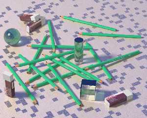
I did crayon.jpg two month ago, I didn't know where I was going, I just
wanted to see if I could model a pencil, it resulted not that realistic
but quite pleasant still (to me :-). I made the prints on the side with
two height fields to make it more real than just a flat image map. An
other funny thing is that the floor is of a uniform color, with just a
normal section (see below). The scene was rendered with photons, area
light and a bit of focal bluring.
texture {
pigment { color rgb <1.0, 0.8, 0.6> }
finish { reflection 0.3 }
normal {
average
normal_map {
[1.0 cells]
[1.0 granite scale 0.5]
}
}
}
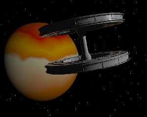
The space station was inspired from a picture of a space station
inspired by the station of the movie "2001 a space odyssee", resulting
in something that is not quite the original. I put the logo of my
company on it, because I was at work when I did it. The planet and
starfield (random spheres, because I also did an animation of this
scene) are a bit raw and still some more work.
Comments and advices welcome,
JC
Post a reply to this message
Attachments:
Download 'crayon.jpg' (145 KB)
Download 'space_station.jpg' (40 KB)
Preview of image 'crayon.jpg'

Preview of image 'space_station.jpg'

|
 |
|
 |
Hi!
> I did crayon.jpg two month ago
Nice image, but perhaps a little warmer colors would do it good? Perhaps
making one of the light sources a little more red, or use radiosity+a
warm colored sky_sphere. That's just my taste though, the floor is
great!
>because I was at work when I did it.
In you lunchbreak I hope? =)
The model is great, the planet could need a more complex texture though,
perhaps an image_map?
-Peter
Post a reply to this message
|
 |
|
 |
Peter Hertel wrote:
> Hi!
>
>
>>I did crayon.jpg two month ago
>
> Nice image, but perhaps a little warmer colors would do it good? Perhaps
> making one of the light sources a little more red, or use radiosity+a
> warm colored sky_sphere. That's just my taste though, the floor is
> great!
Yes, you're right I think, I need to work on color balance and playing
with lighting. I usually just use basic rgb 1.0 lights. :-)
>>because I was at work when I did it.
>
> In you lunchbreak I hope? =)
> The model is great, the planet could need a more complex texture though,
> perhaps an image_map?
>
> -Peter
>
>
Thanks for the advices,
JC
Post a reply to this message
|
 |


![]()