|
 |
Hi Folks,
Thanks for the comments on my previous image.
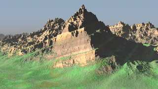
This is the current iteration of my terraced landscape isosurface.
The two improvements (in my eyes at least) are getting terraces of
varied height and better textures.
Still a WIP 'though ...
Bye for now,
Mike Andrews.
Post a reply to this message
Attachments:
Download 'terrace2.jpg' (50 KB)
Preview of image 'terrace2.jpg'

|
 |
|
 |
Michael Andrews wrote:
> Hi Folks,
>
> Thanks for the comments on my previous image.
>
> This is the current iteration of my terraced landscape isosurface.
>
> The two improvements (in my eyes at least) are getting terraces of
> varied height and better textures.
>
That's wonderful! The upper part looks almost like a photo with the
atmospheric fading. The bottom half isn't as convincing but I can't quite
put my finger on it, perhaps it's just the lack of detail. I assume you'll
be adding some clouds later on.
Anyway I love it.
--
-Jide
Post a reply to this message
|
 |
|
 |
Jide wrote:
> That's wonderful! The upper part looks almost like a photo with the
> atmospheric fading. The bottom half isn't as convincing but I can't quite
> put my finger on it, perhaps it's just the lack of detail. I assume you'll
> be adding some clouds later on.
Great looking image! But if we really want realism...
Upper half: Atmospheric fading effect is good, but shadowed parts are
too flat. This cries out for radiosity. Also, while the cliff edges look
fantastic, the mountain tops are too pointy. Erosion (thermal mostly),
keeps cliffs looking nice, but rounds off the tops of peaks. Look at
structures in the Grand Canyon for example - the cliffs are sharp but
the tops are rounded.
Bottom half: Grass is unconvincing. Because of the roughness of grass,
we don't expect a grassy plane to show such crisp underlying terrain
structures. Also, grass usually only grows in soil, which is more prone
to erosion, hence smoother. This would look great if the heightfield was
blurred in the grassy areas. The colour is also a bit iffy.
Great work!
-- Simon
Post a reply to this message
|
 |


![]()