 |
 |
|
 |
|
 |
|  |
|  |
|
 |
|
 |
|  |
|  |
|
 |
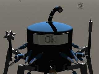
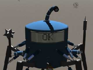
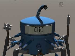
These three images use three lighting models;
#1 has one area light, with ambient set to 0 for all textures.
#2 has the same light, and an ambient setting of .1.
#3 has the same light, at a slightly lower intensity, plus two faint
shadowless lights at right angles to the main light. The ambient
value of all textures is 0.
Post a reply to this message
Attachments:
Download 'test1.jpg' (69 KB)
Download 'test2.jpg' (70 KB)
Download 'test3.jpg' (70 KB)
Preview of image 'test1.jpg'

Preview of image 'test2.jpg'

Preview of image 'test3.jpg'

|
 |
|  |
|  |
|
 |
|
 |
|  |
|  |
|
 |
eeeeeeeeeeeeeeeeeeeeeeevvvviiiiiiiiiiiiilllllllllllllllllllllllllll!
(a quote from a recent Spongebob episode!)
Post a reply to this message
|
 |
|  |
|  |
|
 |
|
 |
|  |
|  |
|
 |
where's the difference ?
Post a reply to this message
|
 |
|  |
|  |
|
 |
|
 |
|  |
|  |
|
 |
Jan Walzer wrote:
>
> where's the difference ?
The part of TC that is in the shade is much more natural-looking, at
least to my eye.
I also notice that some of the stuff in the first (ambient = 0) pic
is still visible, which means my textures aren't consistent...
Post a reply to this message
|
 |
|  |
|  |
|
 |
|
 |
|  |
|  |
|
 |
now, from the lack of any environment, I'm not able to tell
any scene to be real...
But if I'd imagine a nice background/environment to what I'm seeing,
wouldn't be able to tell any of three to be wrong ...
so it _is_ promising, but probably I shouldn't have answered at all
as I'm not able to tell any right/wrong lighting...
(thinking about this: I often have problems setting up my own lighting)
Post a reply to this message
|
 |
|  |
|  |
|
 |
|
 |
|  |
|  |
|
 |
I would expect more to be visible than is in the first two, but I'm not
sure how accurate the third is. (Is this supposed to be outdoor?) It's
a matter of the perception of contrast; photographic compression would
be a great feature for POV.
--
David Fontaine <dav### [at] faricy net> ICQ 55354965
My raytracing gallery: http://davidf.faricy.net/ net> ICQ 55354965
My raytracing gallery: http://davidf.faricy.net/
Post a reply to this message
|
 |
|  |
|  |
|
 |
|
 |
|  |
|  |
|
 |
On Tue, 04 Jun 2002 20:42:51 +0200, John VanSickle <evi### [at] hotmail com>
wrote:
> These three images use three lighting models;
> #1 has one area light, with ambient set to 0 for all textures.
> #2 has the same light, and an ambient setting of .1.
> #3 has the same light, at a slightly lower intensity, plus two faint
> shadowless lights at right angles to the main light. The ambient
> value of all textures is 0.
Nice tests. What is the question ?
ABX
BTW: Have you compared this with radiosity ? I know that You don't want
radiosity for 20-minutes per frame animation but could be worth to compare
result. com>
wrote:
> These three images use three lighting models;
> #1 has one area light, with ambient set to 0 for all textures.
> #2 has the same light, and an ambient setting of .1.
> #3 has the same light, at a slightly lower intensity, plus two faint
> shadowless lights at right angles to the main light. The ambient
> value of all textures is 0.
Nice tests. What is the question ?
ABX
BTW: Have you compared this with radiosity ? I know that You don't want
radiosity for 20-minutes per frame animation but could be worth to compare
result.
Post a reply to this message
|
 |
|  |
|  |
|
 |
|
 |
|  |
|  |
|
 |
I'd say number 3 is best because it shows the shape better than ambient
light ever does.
Regards,
Hugo
Post a reply to this message
|
 |
|  |
|  |
|
 |
|
 |
|  |
|  |
|
 |
The third looks best, IMO. I'm surprised shadowless lights worked so
well. The 'OK' on the robot's lcd is a little ominous....
John VanSickle wrote:
> These three images use three lighting models;
>
> #1 has one area light, with ambient set to 0 for all textures.
> #2 has the same light, and an ambient setting of .1.
> #3 has the same light, at a slightly lower intensity, plus two faint
> shadowless lights at right angles to the main light. The ambient
> value of all textures is 0.
>
--
Samuel Benge
sbe### [at] caltel com com
Post a reply to this message
|
 |
|  |
|  |
|
 |
|
 |
|  |
|  |
|
 |
I prefer #3 because it shows more detail on the front. However, I
guess this bot is supposed to be menacing and #2 would be my choice
with its "face" in shadow. #1's shadow is too harsh for my eyes.
Alf
Post a reply to this message
|
 |
|  |
|  |
|
 |
|
 |
|  |


![]()