 |
 |
|
 |
|
 |
|  |
|  |
|
 |
|
 |
|  |
|  |
|
 |
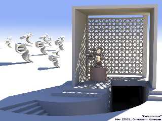
I started this picture quite some time ago, but it got delayed due to lack
of time.
Render time is 31 hours using a previously saved radiosity file. The most
problematic thing is the single figure under the shelter, the texture is
partly reflective but it did not really turn out as expected.
The figures themselves are blobs with components placed using 'trace' on
an isosurface object from several sides.
Christoph
--
POV-Ray tutorials, IsoWood include,
TransSkin and more: http://www.tu-bs.de/~y0013390/
Last updated 05 May. 2002 _____./\/^>_*_<^\/\.______
Post a reply to this message
Attachments:
Download 'expectation1.jpg' (140 KB)
Preview of image 'expectation1.jpg'

|
 |
|  |
|  |
|
 |
|
 |
|  |
|  |
|
 |
This is pretty neat..
I like it alot.. it's BRIGHT.. :)
I Like the back wall.. the pattern is good.. How did you do that.. is that a
CSG Difference?
"Christoph Hormann" <chr### [at] gmx de> wrote in message
news:3CF36F78.9CCDEFB6@gmx.de...
>
> I started this picture quite some time ago, but it got delayed due to lack
> of time.
>
> Render time is 31 hours using a previously saved radiosity file. The most
> problematic thing is the single figure under the shelter, the texture is
> partly reflective but it did not really turn out as expected.
>
> The figures themselves are blobs with components placed using 'trace' on
> an isosurface object from several sides.
>
> Christoph
>
> --
> POV-Ray tutorials, IsoWood include,
> TransSkin and more: http://www.tu-bs.de/~y0013390/
> Last updated 05 May. 2002 _____./\/^>_*_<^\/\.______ de> wrote in message
news:3CF36F78.9CCDEFB6@gmx.de...
>
> I started this picture quite some time ago, but it got delayed due to lack
> of time.
>
> Render time is 31 hours using a previously saved radiosity file. The most
> problematic thing is the single figure under the shelter, the texture is
> partly reflective but it did not really turn out as expected.
>
> The figures themselves are blobs with components placed using 'trace' on
> an isosurface object from several sides.
>
> Christoph
>
> --
> POV-Ray tutorials, IsoWood include,
> TransSkin and more: http://www.tu-bs.de/~y0013390/
> Last updated 05 May. 2002 _____./\/^>_*_<^\/\.______
Post a reply to this message
|
 |
|  |
|  |
|
 |
|
 |
|  |
|  |
|
 |
in news:3CF36F78.9CCDEFB6@gmx.de Christoph Hormann wrote:
> I started this picture quite some time ago,
To me, somehow the composition "wringes", but I can't put my finger on it.
I feel like moving the reflective statue to the right side, but it would
not improve, probably opposite. Chopping off parts of the image doesn't
help either. Maybe flip horizontal and then move the statue to the left.
The staircase should then also bend to the left.
I like this "ultra clean cool" and almost overexposed atmosphere/mood the
image has. Also the herd of figures moving along the great plane, nice.
Ingo
Post a reply to this message
|
 |
|  |
|  |
|
 |
|
 |
|  |
|  |
|
 |
"Dave Bates {[Norman]}" wrote:
>
> This is pretty neat..
> I like it alot.. it's BRIGHT.. :)
Thanks!
>
> I Like the back wall.. the pattern is good.. How did you do that.. is that a
> CSG Difference?
>
It's a heightfield, generated with POV and blurred in paint shop pro.
Christoph
--
POV-Ray tutorials, IsoWood include,
TransSkin and more: http://www.tu-bs.de/~y0013390/
Last updated 05 May. 2002 _____./\/^>_*_<^\/\.______
Post a reply to this message
|
 |
|  |
|  |
|
 |
|
 |
|  |
|  |
|
 |
ingo wrote:
>
> To me, somehow the composition "wringes", but I can't put my finger on it.
I'm not sure what you mean with 'wringes'.
> I feel like moving the reflective statue to the right side, but it would
> not improve, probably opposite. Chopping off parts of the image doesn't
> help either. Maybe flip horizontal and then move the statue to the left.
> The staircase should then also bend to the left.
Before i added the stairs i used a smaller view, but the overall
composition was the same.
> I like this "ultra clean cool" and almost overexposed atmosphere/mood the
> image has. Also the herd of figures moving along the great plane, nice.
Thank you.
Christoph
--
POV-Ray tutorials, IsoWood include,
TransSkin and more: http://www.tu-bs.de/~y0013390/
Last updated 05 May. 2002 _____./\/^>_*_<^\/\.______
Post a reply to this message
|
 |
|  |
|  |
|
 |
|
 |
|  |
|  |
|
 |
First, excuse me for rudly cutting your work to pieces, I did it to
figure out for myself why I was not comfortable with the composition.
in news:3CF387FA.BC39237B@gmx.de Christoph Hormann wrote:
>
> I'm not sure what you mean with 'wringes'.
>
Like when wringing the water out of a wet towel. There is a
'unpleasant' tension in the image.
When looking at an image it is pleasant when the eye has a line or path
that it can follow. A classic line for example starts at the lower
lefthand side, goes up the diagonal, goes to the other side of the image
and maybe goes down and back to near the starting point. Objects of
interest are then placed on the path of the eye using the golden ratio.
On one of these points is the main object, a moment of rest for the eye.
In your image my eyes jump left-right-left-right..., there is no moment
of relaxation. Both the herd and the statue continuesly ask for
attention.
To figure out where the 'problem' is I used an old painters trick (look
at the painting trough a mirror) and flipped the image verically and
horizontally. In all positions the image should be balanced.
In your image it always was as if I'm looking at two images, not one.
This is due to the fact that the image is light on the left side and
dark on the right and that the area's covered by both sides are close to
equal. Also the position of the point of attention in the dark side (the
reflective statue) is very close to the center of the image.
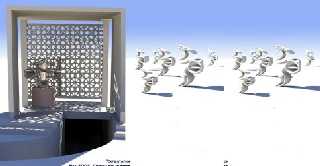
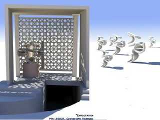
So what I did, first move the statue away from the center, no
improvement. Then flip the image (step1.jpg), still not right. Actually
it puts more emphasis on the 50/50 division of the image. Maybe make an
extra hole in the wal to connect the two parts of the scene better. Mmm,
the big problem stays the symmetric division of the image. Lets extend
the image more to the left (step2.jpg). Better.
The eye now moves from left to right and up, stops at the frame goes
down over the white plane and start again with the statue. A smooth
movement.
Hope this explains what I said in my earlier post.
Ingo
Post a reply to this message
Attachments:
Download 'Step2.jpg' (17 KB)
Download 'Step1.jpg' (15 KB)
Preview of image 'Step2.jpg'

Preview of image 'Step1.jpg'

|
 |
|  |
|  |
|
 |
|
 |
|  |
|  |
|
 |
ingo wrote:
>
> First, excuse me for rudly cutting your work to pieces, I did it to
> figure out for myself why I was not comfortable with the composition.
No problem, but the shadows are all wrong... ;-)
>
> Like when wringing the water out of a wet towel. There is a
> 'unpleasant' tension in the image.
>
> [...]
Ah, this tension is intended, i wanted it to have a kind of unbalanced
atmosphere. None the less your 'modifications' look quite interesting,
maybe i will try something like that.
Christoph
--
POV-Ray tutorials, IsoWood include,
TransSkin and more: http://www.tu-bs.de/~y0013390/
Last updated 05 May. 2002 _____./\/^>_*_<^\/\.______
Post a reply to this message
|
 |
|  |
|  |
|
 |
|
 |
|  |
|  |
|
 |
I like it :) Those are some high rad settings. What processor speed are
you using?
The meaning of the title is obscure to me though...
~Sam
Christoph Hormann wrote:
> I started this picture quite some time ago, but it got delayed due to lack
> of time.
>
> Render time is 31 hours using a previously saved radiosity file. The most
> problematic thing is the single figure under the shelter, the texture is
> partly reflective but it did not really turn out as expected.
>
> The figures themselves are blobs with components placed using 'trace' on
> an isosurface object from several sides.
>
> Christoph
>
>
>
> ------------------------------------------------------------------------
>
Post a reply to this message
|
 |
|  |
|  |
|
 |
|
 |
|  |
|  |
|
 |
Samuel Benge wrote:
>
> I like it :)
Thanks.
> Those are some high rad settings. What processor speed are
> you using?
An Athlon 1 GHz, the radiosity settings are not extremely high, but
together with area light and a lot of blob components things turn out
quite slow...
> The meaning of the title is obscure to me though...
>
What's obscure about it?
Christoph
--
POV-Ray tutorials, IsoWood include,
TransSkin and more: http://www.tu-bs.de/~y0013390/
Last updated 05 May. 2002 _____./\/^>_*_<^\/\.______
Post a reply to this message
|
 |
|  |
|  |
|
 |
|
 |
|  |
|  |
|
 |
Christoph Hormann wrote:
> I started this picture quite some time ago, but it got delayed due to lack
> of time.
>
> Render time is 31 hours using a previously saved radiosity file. The most
> problematic thing is the single figure under the shelter, the texture is
> partly reflective but it did not really turn out as expected.
>
> The figures themselves are blobs with components placed using 'trace' on
> an isosurface object from several sides.
>
> Christoph
>
>
>
> ------------------------------------------------------------------------
>
How are you keeping the ground plane white to the horizon? I get a blue
tinge at the edges when I try something like this. Can you post the
source for this somewhere?
-earthdog
BTW --
Great image. I don't know what it is, but it has a very cool, relaxing
feel...
Post a reply to this message
|
 |
|  |
|  |
|
 |
|
 |
|  |


![]()