 |
 |
|
 |
|
 |
|  |
|  |
|
 |
|
 |
|  |
|  |
|
 |
Hi folks!
I've begun constructing the image in which the
Gerbera Flower I'm working on will have its
"beauty-shot": In full glory and detail!
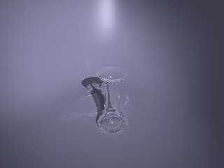
This is the scene so far:
A spotlight
A Vase
A Curved background
The background is designed to have a planar
area for the vase to stand on, then curves upward.
It curves towards the camera to the sides of
the image, so you're looking at something
similiar to a semi-circle.
I think the background is too sterile though, so
any suggestions on what do with the textures,
or different background (but keep in mind, its
supposed to be focusing on the flower, not
an awesome background which takes years
to trace... ;-)
Oh, by the way, both background and vase
have been made using my WIP of Mesh-Modelling
Macros.
--
Tim Nikias
Homepage: http://www.digitaltwilight.de/no_lights/index.html
Post a reply to this message
Attachments:
Download 'comp2_f.jpg' (12 KB)
Preview of image 'comp2_f.jpg'

|
 |
|  |
|  |
|
 |
|
 |
|  |
|  |
|
 |
That's a great shape, for backgrounds sometimes I'll just use a bozo
or agate pattern and for the colour map use say Beige and Beige/1.25
so that it's not a bright glaring confusing background but has some
variation.
--
#local i=.1;#local I=(i/i)/i;#local l=(i+i)/i;#local ll=(I/i)/l;box{<-ll,
-((I/I)+l),-ll><ll,-l,ll>pigment{checker scale l}finish{ambient((I/l)/I)+
(l/I)}}sphere{<i-i,l-l,(I/l)>l/l pigment{rgb((I/l)/I)}finish{reflection((
I/l)/I)-(l/I)specular(I/l)/I}}light_source{<I-l,I+I,(I-l)/l>l/l} // Steve
Post a reply to this message
|
 |
|  |
|  |
|
 |
|
 |
|  |
|  |
|
 |
Thanks for the suggestion, I'll try that one...
Steve wrote:
> That's a great shape, for backgrounds sometimes I'll just use a bozo
> or agate pattern and for the colour map use say Beige and Beige/1.25
> so that it's not a bright glaring confusing background but has some
> variation.
>
--
Tim Nikias
Homepage: http://www.digitaltwilight.de/no_lights/index.html
Post a reply to this message
|
 |
|  |
|  |
|
 |
|
 |
|  |
|  |
|
 |
Nice modeling on the vase.
If you want to keep the setup you have here for your beauty shot, I would
suggest a curtain behind the flower. Another possibility would be to use a
photograph behind the flower and place the flower in a window or on a
candle-lit table. I think that right now, the flower may not take up enough
of the frame to really grab attention.
-Shay
Tim Nikias <tim### [at] gmx de> wrote in message
news:3CB8C345.A3087F19@gmx.de... de> wrote in message
news:3CB8C345.A3087F19@gmx.de...
Post a reply to this message
|
 |
|  |
|  |
|
 |
|
 |
|  |
|  |
|
 |
I just had another idea which I think would look great. Put your flower in
front of a stucco wall. You wouldn't need anything but a plane with a normal
on it. You could then light the flower with "sunlight" for an awesome
radiosity and photon display.
-Shay
Shay <sah### [at] simcoparts com> wrote in message
news:3cbad7e0$1@news.povray.org... com> wrote in message
news:3cbad7e0$1@news.povray.org...
Post a reply to this message
|
 |
|  |
|  |
|
 |
|
 |
|  |
|  |
|
 |
Shay wrote:
> I just had another idea which I think would look great. Put your flower in
> front of a stucco wall.
Of course, if the stucco was an isosurface with ragged holes in it, you could
have an isosurface brick wall peeking out from behind. This is a very popular
look for restaurants in this part of the world.
Post a reply to this message
|
 |
|  |
|  |
|
 |
|
 |
|  |
|  |
|
 |
Dave Dunn <poi### [at] aol com> wrote in message
news:3CBB51FE.FB24723F@aol.com...
>
> Of course, if the stucco was an isosurface with ragged holes in it, you
could
> have an isosurface brick wall peeking out from behind. This is a very
popular
> look for restaurants in this part of the world.
>
That would be great. Since the background would no longer be a solid color,
focal blur would help keep attention on the flower.
-Shay com> wrote in message
news:3CBB51FE.FB24723F@aol.com...
>
> Of course, if the stucco was an isosurface with ragged holes in it, you
could
> have an isosurface brick wall peeking out from behind. This is a very
popular
> look for restaurants in this part of the world.
>
That would be great. Since the background would no longer be a solid color,
focal blur would help keep attention on the flower.
-Shay
Post a reply to this message
|
 |
|  |
|  |
|
 |
|
 |
|  |


![]()