 |
 |
|
 |
|
 |
|  |
|  |
|
 |
|
 |
|  |
|  |
|
 |
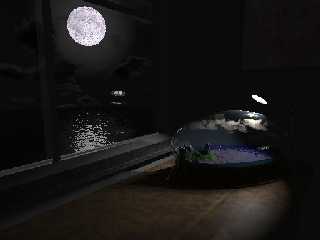
I've traced long days with focal blur, but gave
up after it took a day for some 40 lines (and I was
heading for 768) when it reached the glassbowl
you'll see in the image. I'll go for antialiasing,
but will someday have my computer running
mad with the focal version.
I don't have much time, RL did not have too much
good experiences lately, and RL also expects
me to stay away from my computer after the
18. of february, so I'm kinda running late
for my entry on the IRTC. It's my first go,
and I thought that maybe posting it here could
hand me some interesting comments and suggestions.
Several things up front:
-I know, the image is dark. Its best viewed in a dark
room, fullscreen (or with black background). Hey,
its a night image!
-The only two image-maps used were needed for
the accurate moon-texture (a real sphere, by the
way) and the image on the wall (a different idea
I posted some time ago, also concerned with
the "Worlds within Worlds" topic).
-No media are used!
-The spotlight should not be set to arealights,
since I'd lose the cloud's shadows, and tracing
time goes beyond the time I have.
I do want to give very detailed explanations in
my IRTC-Accompanying Text-File (and the ZIP
should conain really everything needed for tracing),
but I'll answer all questions nontheless...
Hope somebody likes it!
--
Tim Nikias
Homepage: http://www.digitaltwilight.de/no_lights/index.html
Post a reply to this message
Attachments:
Download 'wip.jpg' (26 KB)
Preview of image 'wip.jpg'

|
 |
|  |
|  |
|
 |
|
 |
|  |
|  |
|
 |
My suggestions:
1. put another one or two small objects on the desk, like, someone's glasses
or something.
2. make the moon a bit smaller... unless that would ruin the moon <-> lamp
analogy.
3. if that groove in the desk is just a normal, use a CSG instead, and try
adding a very slight normal map to the whole desk.
4. use a very slight shadowless light somewhere in the room to simulate
radiosity; the upper right of the picture has very non-varied lighting. Try
putting this light somewhere inside or near the world-in-a-glass.
5. Maybe increase the overall lighting some?
Cool image.
- Slime
[ http://www.slimeland.com/ ]
[ http://www.slimeland.com/images/ ]
Post a reply to this message
|
 |
|  |
|  |
|
 |
|
 |
|  |
|  |
|
 |
This Slime-Guy wrote:
> My suggestions:
>
> 1. put another one or two small objects on the desk, like, someone's glasses
> or something.
>
I'm thinkning about that all the time, but can't come up with something
I find fitting for the topic and the mood I'd like to achieve. Also, the
image doesn't show the newest camera-angle, which is a focussed
a little higher to make the empty table-space less visible.
> 2. make the moon a bit smaller... unless that would ruin the moon <-> lamp
> analogy.
>
I already did as compared to previous posts, but I think some smaller
would be possible...
> 3. if that groove in the desk is just a normal, use a CSG instead, and try
> adding a very slight normal map to the whole desk.
>
It is a mesh, and there is a very slight normal applied... Hm...
> 4. use a very slight shadowless light somewhere in the room to simulate
> radiosity; the upper right of the picture has very non-varied lighting. Try
> putting this light somewhere inside or near the world-in-a-glass.
>
I'll also thought about this one and was on the edge of adding it. You just
gave me the nudge over the edge...
> 5. Maybe increase the overall lighting some?
>
What, the image is too dark? Well, okay, I think a tiny little bit may be
appropriate... ;)
>
> Cool image.
>
>
Thanks!
--
Tim Nikias
Homepage: http://www.digitaltwilight.de/no_lights/index.html
Post a reply to this message
|
 |
|  |
|  |
|
 |
|
 |
|  |
|  |
|
 |
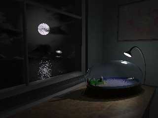
So, after Slime's suggestions, I've made some
scene-adjustments and did a quick render for
you guys out there to look at.
I've added a shadowless light to simulate some
sort of radiosity and to lighten the scene
a little.
Hony, I've shrunk the moon... ;)
And made some texturing adjustments. The
light artifacts on the walls are due to the normal,
but that'll be fixed.
So, what do you think now?
--
Tim Nikias
Homepage: http://www.digitaltwilight.de/no_lights/index.html
Post a reply to this message
Attachments:
Download 'wip2.jpg' (26 KB)
Preview of image 'wip2.jpg'

|
 |
|  |
|  |
|
 |
|
 |
|  |
|  |
|
 |
Hi Tim,
A nice idea which has come a long way since your first posts. You are
right - the image is dark. I had to make some gamma corrections to it to see
all the detail on the back wall. Have a look at your assumed gamma setting
and maybe increase the brightness of your lights.
Hope you manage to complete the image before your deadline!
Cheers,
Ian.
http://www.outerarm.demon.co.uk/graphics/graphics.html
Post a reply to this message
|
 |
|  |
|  |
|
 |
|
 |
|  |
|  |
|
 |
The lighting looks *much* more realistic to me. Now the only things that
strike me are:
1. the groove on the desk... seems like it should be deeper, or there should
be more of them, or it shouldn't be there at all
2. a little bit of land and a shoreline and maybe some rocks outside the
window would be good, so it doesn't look like the house is *right* on the
water
3. the clouds don't look right on the horizon.... i suspect a layered
sky_sphere texture. try a plane instead.
4. consider working on the water texture, it looks sort of plastic-ish,
although i doubt i could do much better.
- Slime
[ http://www.slimeland.com/ ]
[ http://www.slimeland.com/images/ ]
Post a reply to this message
|
 |
|  |
|  |
|
 |
|
 |
|  |
|  |
|
 |
>
> 1. the groove on the desk... seems like it should be deeper, or there should
> be more of them, or it shouldn't be there at all
>
I'll use more.
> 2. a little bit of land and a shoreline and maybe some rocks outside the
> window would be good, so it doesn't look like the house is *right* on the
> water
>
I'll look if I can come up with the time for that...
> 3. the clouds don't look right on the horizon.... i suspect a layered
> sky_sphere texture. try a plane instead.
>
There are in fact 30 spheres with radius 2600 (or something around
that) using a texture, but I'll see, what I can do...
> 4. consider working on the water texture, it looks sort of plastic-ish,
> although i doubt i could do much better.
>
Well, I didn't use specular or phong highlighting, but just reflection,
but perhaps the exponent has to be adjusted a little. Again, I'll
look into it...
Thanks for the suggestions!
--
Tim Nikias
Homepage: http://www.digitaltwilight.de/no_lights/index.html
Post a reply to this message
|
 |
|  |
|  |
|
 |
|
 |
|  |
|  |
|
 |
The assumed gamma is 1 (as mentioned in the docs,
1 should be used), and my set Display_Gamma is 2.2. And
it is supposed to be a dark, night image. If you'll
look at my own reply, you'll see version 2 enhanced with
a shadowless light. That should be better.
>
> Hope you manage to complete the image before your deadline!
>
I hope so too, but I think I'm very near a version which I could
be satisfied with to send in. Doesn't mean I have to stop working
on it, does it?
Thanks!
--
Tim Nikias
Homepage: http://www.digitaltwilight.de/no_lights/index.html
Post a reply to this message
|
 |
|  |
|  |
|
 |
|
 |
|  |
|
 |


![]()