 |
 |
|
 |
|
 |
|  |
|  |
|
 |
|
 |
|  |
|  |
|
 |
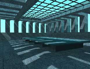
A rather old WIP. I'm not quite sure how to finish it.
Post a reply to this message
Attachments:
Download 'sunroom.jpg' (76 KB)
Preview of image 'sunroom.jpg'

|
 |
|  |
|  |
|
 |
|
 |
|  |
|  |
|
 |
it seems with so much window space that the room would generally be a lot
brighter and with fewer hard edge, well defined shadows. i guess that might
depend on what the material is inside the room.
so maybe your image is right. i dunno.
it'd be nice to see something in the room, like plants or vases, etc.
Coridon Henshaw <che### [at] sympatico ca> wrote in message
news:Xns### [at] 204 ca> wrote in message
news:Xns### [at] 204 213 213 191 191 226...
>
> A rather old WIP. I'm not quite sure how to finish it.
>
> 226...
>
> A rather old WIP. I'm not quite sure how to finish it.
>
>
Post a reply to this message
|
 |
|  |
|  |
|
 |
|
 |
|  |
|  |
|
 |
one word: 'atmospheric media' (ok 2)
-tgq
"Coridon Henshaw" <che### [at] sympatico ca> wrote in message
news:Xns### [at] 204 ca> wrote in message
news:Xns### [at] 204 213 213 191 191 226...
>
> A rather old WIP. I'm not quite sure how to finish it.
>
> 226...
>
> A rather old WIP. I'm not quite sure how to finish it.
>
>
Post a reply to this message
|
 |
|  |
|  |
|
 |
|
 |
|  |
|  |
|
 |
> it seems with so much window space that the room would generally be a lot
> brighter and with fewer hard edge, well defined shadows. i guess that
might
> depend on what the material is inside the room.
Yeah, did you use radiosity?
I'd say take your pick between scattering media and radiosity, maybe both if
you're feeling patient. =)
- Slime
[ http://www.slimeland.com/ ]
[ http://www.slimeland.com/images/ ]
Post a reply to this message
|
 |
|  |
|  |
|
 |
|
 |
|  |
|  |
|
 |
On 2 Dec 2001 18:12:40 -0500, Coridon Henshaw wrote:
>
>A rather old WIP. I'm not quite sure how to finish it.
Nice work so far, it reminds me of an image that TonyB did
some time ago, he finished it of with some very cartoon looking
people standing around looking out of the windows.
I know a potted palm tree in the corner.
--
Cheers
Steve email mailto:ste### [at] zeropps uklinux uklinux net
%HAV-A-NICEDAY Error not enough coffee 0 pps.
web http://www.zeropps.uklinux.net/
or http://start.at/zero-pps
2:24am up 57 days, 18:09, 1 user, load average: 1.03, 1.06, 1.05 net
%HAV-A-NICEDAY Error not enough coffee 0 pps.
web http://www.zeropps.uklinux.net/
or http://start.at/zero-pps
2:24am up 57 days, 18:09, 1 user, load average: 1.03, 1.06, 1.05
Post a reply to this message
|
 |
|  |
|  |
|
 |
|
 |
|  |
|  |
|
 |
"Slime" <noo### [at] hotmail com> wrote in news:3c0ba97e@news.povray.org:
>> it seems with so much window space that the room would generally be a
>> lot brighter and with fewer hard edge, well defined shadows. i guess
>> that might depend on what the material is inside the room.
> Yeah, did you use radiosity?
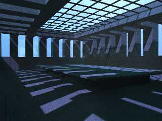
Yep. All the nondirect lighting is from radiosity. There's only one light
source and no >0 ambient finishes.
> I'd say take your pick between scattering media and radiosity, maybe
> both if you're feeling patient. =)
I've been messing around with adding a scattering media but I haven't been
able to find settings which will produce the sun-shining-through-windows
effect without either blacking out the skysphere or creating ugly
artifacts.
Note the *reflections* in the media behind the end pillars (there's no
glass between the pillars) and the oddities in the shadows cast by the
cieling grillwork (4th pillar on the right). Increasing the intervals
doesn't help.
Here's the media box I used in the attached image. For scale, the room box
is 32x16x32 with the world origin at the center of the floor.
box {<1,1,1>*-75 <1,1,1>*75 pigment {rgbf 1} hollow
interior
{
media
{
scattering {4, (Yellow+White)/200 extinction 1}
method 3
}
}} com> wrote in news:3c0ba97e@news.povray.org:
>> it seems with so much window space that the room would generally be a
>> lot brighter and with fewer hard edge, well defined shadows. i guess
>> that might depend on what the material is inside the room.
> Yeah, did you use radiosity?
Yep. All the nondirect lighting is from radiosity. There's only one light
source and no >0 ambient finishes.
> I'd say take your pick between scattering media and radiosity, maybe
> both if you're feeling patient. =)
I've been messing around with adding a scattering media but I haven't been
able to find settings which will produce the sun-shining-through-windows
effect without either blacking out the skysphere or creating ugly
artifacts.
Note the *reflections* in the media behind the end pillars (there's no
glass between the pillars) and the oddities in the shadows cast by the
cieling grillwork (4th pillar on the right). Increasing the intervals
doesn't help.
Here's the media box I used in the attached image. For scale, the room box
is 32x16x32 with the world origin at the center of the floor.
box {<1,1,1>*-75 <1,1,1>*75 pigment {rgbf 1} hollow
interior
{
media
{
scattering {4, (Yellow+White)/200 extinction 1}
method 3
}
}}
Post a reply to this message
Attachments:
Download 'sunroom.jpg' (80 KB)
Preview of image 'sunroom.jpg'

|
 |
|  |
|  |
|
 |
|
 |
|  |
|  |
|
 |
How about a Water Pool? It suits the sunlight, doesn't it? It also suits
nicely with the Cyan color.
Interesting image! I like impressionistic images. Good-Luck!
Coridon Henshaw wrote:
> A rather old WIP. I'm not quite sure how to finish it.
>
> [Image]
Post a reply to this message
|
 |
|  |
|  |
|
 |
|
 |
|  |
|  |
|
 |
> scattering {4, (Yellow+White)/200 extinction 1}
That seems to be hardly visible. Increase the amount of color (lower the
number 200) a bit, and if it looks bad, fiddle with the sampling parameters.
Personally, I'm having a hard time figuring out exactly how the sampling
parameters work with method 3... but increase the AA_level or whatever it's
called to something higher and increase the minimum number of samples to
something like 20 or so. Maybe try method 1, if you fiddle with that you can
usually get it to look pretty decent, in my experience.
- Slime
[ http://www.slimeland.com/ ]
[ http://www.slimeland.com/images/ ]
Post a reply to this message
|
 |
|  |
|  |
|
 |
|
 |
|  |
|  |
|
 |
"Slime" <noo### [at] hotmail com> wrote in news:3c13239c$1@news.povray.org:
>> scattering {4, (Yellow+White)/200 extinction 1}
> That seems to be hardly visible. Increase the amount of color (lower
> the number 200) a bit, and if it looks bad, fiddle with the sampling
> parameters.
Keep in mind that the overall media intensity is dependant on the size of
its container object and I'm not applying the media to a unit box.
If I double the intensity of the media then I can get the sunbeam effect
that this scene seems to need, but only at the expense of the sky turning
indigo. I can compensate for the darkened sky by doubling the intensity of
the sun, but then I have massive problems with artifacts.
> Personally, I'm having a hard time figuring out exactly how the
> sampling parameters work with method 3...
The basic method seems to be to leave samples and intervals alone and do
all artifact removal with aa_levels and aa_threshold.
> Maybe try method 1, if you fiddle with that you can usually get it to
> look pretty decent, in my experience.
I've found method 2 easiest to work with as it produces non-grainy images
much, much faster than is possible with method 1. com> wrote in news:3c13239c$1@news.povray.org:
>> scattering {4, (Yellow+White)/200 extinction 1}
> That seems to be hardly visible. Increase the amount of color (lower
> the number 200) a bit, and if it looks bad, fiddle with the sampling
> parameters.
Keep in mind that the overall media intensity is dependant on the size of
its container object and I'm not applying the media to a unit box.
If I double the intensity of the media then I can get the sunbeam effect
that this scene seems to need, but only at the expense of the sky turning
indigo. I can compensate for the darkened sky by doubling the intensity of
the sun, but then I have massive problems with artifacts.
> Personally, I'm having a hard time figuring out exactly how the
> sampling parameters work with method 3...
The basic method seems to be to leave samples and intervals alone and do
all artifact removal with aa_levels and aa_threshold.
> Maybe try method 1, if you fiddle with that you can usually get it to
> look pretty decent, in my experience.
I've found method 2 easiest to work with as it produces non-grainy images
much, much faster than is possible with method 1.
Post a reply to this message
|
 |
|  |
|  |
|
 |
|
 |
|  |


![]()