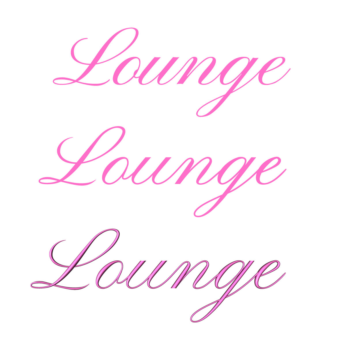
OK, I finished the word I wanted to make and it turned out fairly well. It's
certainly not perfect but close enough, and I'm pleased with the appearance.
Using a cursive font complicated things a little but forced me to improve the
code. I'll post the improved code in the povray.text.scene-files section.
This picture shows the original TrueType font on the top, the rounded font with
only emission for lighting in the middle, and the rounded font with regular
lighting on the bottom.
Have a wonderful day folks!
Kind regards,
Dave Blandston
Post a reply to this message
Attachments:
Download 'comparison.jpg' (119 KB)
Preview of image 'comparison.jpg'
|